Download
1 / 69
710 likes | 995 Views
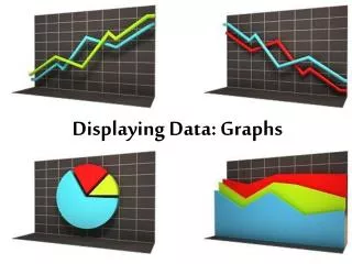
Displaying Data: Graphs. Objective. Students will be able to collect, record, organize, and display data using frequency tables, single bar graphs, or single line graphs. Objective.

E N D
Objective Students will be able to collect, record, organize, and display data using frequency tables, single bar graphs, or single line graphs.
Objective Students will be able to formulate and answer questions by interpreting and analyzing displays of data, including frequency tables, single bar graphs, or single line graphs.
Sometimes, it is easier to understand data if it is organized and displayed. • Frequency Table • Line Graph • Bar Graph • Pie Chart • Pictograph You can organizedata by:
Frequency Table • Shows the number of times something occurs. • This shows how many times a number on a dice was rolled.
Bar Graphs • Bar graphs are another way to show data. • Double bar graphs help you to compare data.
Line Graphs Line graphs are good for showing changes in data over time when working with dates. • Double line graphs can help you show even more data and compare data.
Pictographs • Pictographs are often used to show data in newspapers and magazines because they get your attention. • Each picture represents a specific number of data.
Pie Charts/Graphs • Circle or pie charts are another way to show data, and compare data to percentages or fractions of a whole.
Frequency Table These headings do not change This tells us what we have
Frequency Table I Do
Frequency Table Weekly Restroom Use Total # of Visits 1 2 3 4 5 6 7 0 0 1 3 0 1 2 I Do I III I II
Frequency Table Directions: Read the information below. Give your table a title. Label your top row.
Frequency Table: Activities How did you do? Does your table look the same? How did you do imputing the data? Does the data match? We Do
Frequency Table One dice per pair, one frequency chart per student Dice is rolled not thrown, bounced, etc…. Students take turn rolling the dice. All students write down the information. In partners, roll the dice 30 times. For each roll mark down which number the dice landed on. When you are finished, count up the tallies and write the number in the correct column. Save this data for tomorrow’s activity. Don’t forget to label your table and give it a title.
Bar Graphs Bar Graphs display data so that it can be easily understood. You can use graphs to compare sets of data.
Bar Graphs How to make a bar graph:1. Use the data from the table to choose the right scale. All scales start at 0. 2. Draw and label the scale on the vertical axis. 3. Draw and label the horizontal axis. 4. List the name of each item. 5. Draw vertical bars to represent each number. 6. Title the graph.
Bar Graphs 1. What day did Courtney do the most sit-ups? 2. On which day did Courtney do the least sit-ups? 3. How many sit-ups did Courtney do on Friday? 4. On which two days did Courtney do the same amount of sit-ups?
Bar Graphs 5. How many students have a bird? 6. Which animal did the students have the most of? 7. Which animal was least owned by students'? 8. What number does the scale start at?
Bar Graphs Weekly Restroom Use 7 6 5 4 3 2 1 # of Students 1 2 3 4 5 6 7 Total # of Visits
Bar Graphs Bar Graph page, a pencil, colored pencils You may use a whisper voice if needed. If your colored pencils are not sharpened, use crayons. All students work. Using the Frequency Table you created for the dice rolling game create a bar graph. Make sure you have a title and two headings. You may use colored pencils to make the graph easier to understand.
Line Graphs A line graph uses points and lines on a grid to show change over a period of time.
Line Graphs How to make a line graph:1. Use the data from the table to choose an appropriate scale. All scales start at 0.2. Draw and label the scale on the vertical axis. 3. Draw and label the horizontal axis. 4. List the name of each item.5. Locate the points on the graph.6. Connect the points with line segments.7. Write the title of the line graph.
Line Graphs What grade did Frank get on the third test? First find test number 3 on the horizontal axis. Then move up until you hit the point. You see that Frank got a 100 on the third test.
Line Graphs On which day were the most cookies sold? What is the title of this graph? About how many cookies were sold on Tuesday?
Line Graphs What is the name of the vertical axis? On which day did Nicole do the least amount of push-ups? How many push-ups did Nicole do on Thursday? About how many push-ups did Nicole do on Sunday?
Line Graphs Weekly Bathroom Use # of Students and Total # of Times 6 5 4 3 2 1 I Do 1 2 3 4 5 6 7
Line Graphs Line Graph page, a pencil, ruler You may use a whisper voice if needed. Use rulers in the appropriate manner. All students work. Using the Frequency Table you created for the dice rolling game create a line graph. Make sure you have a title and the topics. You may use a ruler to make the graph easier to understand.
Pictographs Weekly Bathroom Use 7 6 5 4 3 2 1 # of Times Restroom Was Used I Do = 1 Student
Pictographs Pictograph page, a pencil, colored pencils You may use a whisper voice if needed. If your colored pencils are not sharpened, use crayons. All students work. Using the Frequency Table you created for the dice rolling game and create a pictograph. Make sure you have small pictures to represent the information. You may use colored pencils to make the graph easier to understand.