Download

1 / 32
340 likes | 549 Views
16 Mathematics of Normal Distributions. 16.1 Approximately Normal Distributions of Data 16.2 Normal Curves and Normal Distributions 16.3 Standardizing Normal Data 16.4 The 68-95-99.7 Rule 16.5 Normal Curves as Models of Real-Life Data Sets 16.6 Distribution of Random Events

E N D
16 Mathematics of Normal Distributions 16.1 Approximately Normal Distributions of Data 16.2 Normal Curves and Normal Distributions 16.3 Standardizing Normal Data 16.4 The 68-95-99.7 Rule 16.5 Normal Curves as Models of Real-Life Data Sets 16.6 Distribution of Random Events 16.7 Statistical Inference
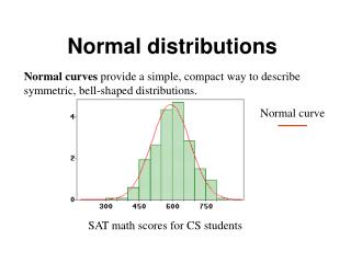
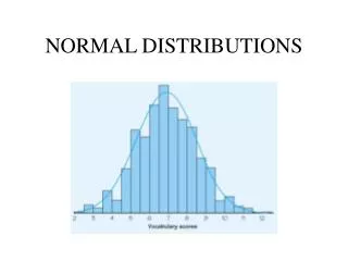
Example 16.1 Distribution of Heights of NBA Players This table is a frequency table giving the heights of 430 NBA players listed onteam rosters at the start of the 2008–2009 season.
Example 16.1 Distribution of Heights of NBA Players The bar graph for this data setis shown.
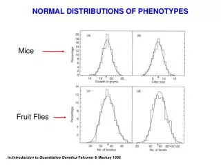
Example 16.1 Distribution of Heights of NBA Players We can see that the bar graph fits roughly the pattern of asomewhat skewed (off-center) bell-shaped curve (the orange curve).
Example 16.1 Distribution of Heights of NBA Players An idealized bell-shaped curve for this data (the red curve) is shown for comparison purposes. The data would be even more bell-shaped if it weren’t for all the 6’7” to 7’ players.
Example 16.1 Distribution of Heights of NBA Players This is not a quirk of nature but rather a reflection of the way NBA teams draft players.
Example 16.2 2007 SAT Math Scores The table on the next slide shows the scores of N = 1,494,531 college-bound seniors on the mathematics section of the 2007 SAT. (Scores range from 200 to 800 and are groupedin class intervals of 50 points.) The table shows the score distribution and the percentage of test takers in each class interval.
Example 16.2 2007 SAT Math Scores Here is a bar graph of the data.
Example 16.2 2007 SAT Math Scores The orange bell-shaped curve traces the pattern of the data in the bar graph. If the data followed a perfect bell curve, it would follow the red curveshown in the figure.
Example 16.2 2007 SAT Math Scores Unlike the curves in Fig.16-3, here the orange and red curvesare very close.
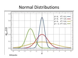
Approximately Normal Distribution The two very different data sets discussed in Examples 16.1 and 16.2 haveone thing in common–both can be described as having bar graphs that roughlyfit a bell-shaped pattern. In Example 16.1, the fit is crude; in Example 16.2, it isvery good. In either case, we say that the data set has an approximately normaldistribution.
Normal Distribution The word normal in this context is to be interpreted as meaning thatthe data fits into a special type of bell-shaped curve; the word approximately is areflection of the fact that with real-world data we should not expect an absolutelyperfect fit. A distribution of data that has a perfect bell shape is called a normaldistribution.
Normal Curves Perfect bell-shaped curves are called normal curves. Every approximatelynormal data set can be idealized mathematically by a corresponding normalcurve (the red curves in Examples 16.1 and 16.2). This is important because wecan then use the mathematical properties of the normal curve to analyze anddraw conclusions about the data.
Normal Curves The tighter the fit between the approximatelynormal distribution and the normal curve, the better our analysis and conclusionsare going to be. Thus, to understand real-world data sets that have an approximately normal distribution, we first need to understand some of the mathematical properties of normal curves.
Data Set As usual, we will use the letter N to represent the size of the data set. In real-life applications, data sets can range in size from reasonably small (a dozen or sodata points) to very large (hundreds of millions of data points), and the larger thedata set is, the more we need a good way to describe and summarize it.
Example 14.1 Stat 101 Test Scores Like students everywhere, the students in the Stat 101 class have one question foremost on their mind when they look at the results: How did I do? Eachstudent can answer this question directly from the table. It’s the next questionthat is statistically much more interesting. How did the class as a whole do? Toanswer this last question, we will have to find a way to package the resultsinto a compact, organized, and intelligible whole.
Example 14.2 Stat 101 Test Scores: Part 2 The first step in summarizing the information in Table 14-1 is to organize thescores in a frequency table such as Table 14-2. In this table, the number beloweach score gives the frequency of the score–that is, the number of students gettingthat particular score.
Example 14.2 Stat 101 Test Scores: Part 2 We can readily see from Table 14-2 that there was onestudent with a score of 1, one with a score of 6, two with a score of 7, six with ascore of 8, and so on. Notice that the scores with a frequency of zero are not listedin the table.
Example 14.2 Stat 101 Test Scores: Part 2 We can doeven better. Figure 14-1 (next slide) shows the same information in a much more visual waycalled a bar graph, with the test scores listed in increasing order on a horizontalaxis and the frequency of each test score displayed by the heightof the columnabove that test score. Notice that in the bar graph, even the test scores with afrequency of zero show up–there simply is no column above these scores.
Example 14.2 Stat 101 Test Scores: Part 2 Figure 14-1
Example 14.2 Stat 101 Test Scores: Part 2 Bar graphs are easy to read, and they are a nice way to present a good general picture of the data. With a bar graph, for example, it is easy to detectoutliers–extreme data points that do not fit into the overall pattern of thedata. In this example there are two obvious outliers–the score of 24 (head andshoulders above the rest of the class) and the score of 1 (lagging way behindthe pack).
Example 14.2 Stat 101 Test Scores: Part 2 Sometimes it is more convenient to express the bar graph in terms ofrelative frequencies –that is, the frequencies given in terms of percentages ofthe total population. Figure 14-2 shows a relative frequency bar graph for theStat 101 data set. Notice that we indicated on the graph that we are dealingwith percentages rather than total counts and that the size of the data set is N = 75.
Example 14.2 Stat 101 Test Scores: Part 2 Figure 14-2
Example 14.2 Stat 101 Test Scores: Part 2 This allows anyone whowishes to do so to compute the actual frequencies. For example,Fig. 14-2 indicates that 12% of the75 students scored a 12 on theexam, so the actual frequency isgiven by 75 0.12 = 9students. The change from actual frequencies to percentages (or vice versa)does not change the shape of thegraph–it is basically a change ofscale.
Bar Graph versus Pictogram Frequency charts that use iconsor pictures instead of bars to showthe frequencies are commonly referred to as pictograms. The point ofa pictogram is that a graph is oftenused not only to inform but also toimpress and persuade, and, in suchcases, a well-chosen icon or picturecan be a more effective tool thanjust a bar. Here’s a pictogram displaying the same data as in figure 14-2.
Bar Graph versus Pictogram Figure 14-3
Example 14.3 Selling the XYZ Corporation This figure is a pictogram showing the growth in yearly sales of theXYZ Corporation between 2001 and 2006. It’s a good picture to show at ashareholders meeting,but the picture is actually quite misleading.
Example 14.3 Selling the XYZ Corporation This figure shows apictogram for exactlythe same data with amuch more accurateand sobering picture ofhow well the XYZ Corporation had beendoing.
Example 14.3 Selling the XYZ Corporation The difference between the two pictograms can be attributed to a coupleof standard tricks of the trade: (1) stretching the scale of the vertical axis and(2) “cheating” on the choice of starting value on the vertical axis. As an educatedconsumer, you should always be on the lookout for these tricks. In graphicaldescriptions of data, a fine line separates objectivity from propaganda.