Download
1 / 23
230 likes | 386 Views
Accessibility Evaluation. Accessibility Evaluation Tools. Complete List of Web Accessibility Evaluation Tools http://www.w3.org/WAI/RC/tools/complete For Web Accessibility – Bobby

E N D
Accessibility Evaluation Tools • Complete List of Web Accessibility Evaluation Tools http://www.w3.org/WAI/RC/tools/complete • For Web Accessibility – Bobby • “Bobby™ 5.0 is a web accessibility desktop testing tool designed to help expose barriers to accessibility and encourage compliance with existing accessibility guidelines, including Section 508 of the U.S. Rehabilitation Act and the W3C's Web Content Accessibility Guidelines (WCAG). • Bobby spiders through a website and tests to see if it meets accessibility requirements, including readability by screen readers, the provision of text equivalents for all images, animated elements and audio and video displays. During a scan, Bobby checks HTML against select accessibility guidelines and then reports on the accessibility of each web page.”
Accessibility Evaluation Tools • The free tool was officially closed by the owners, IBM, in 2008. • The software is now available as part of IBM's Rational Policy Tester Accessibility Edition. • Currently, the Web Accessibility Evaluation Tool (WAVE) provides this free service at wave.webaim.org
Evaluating Accessibility • We’re going to focus is on a few ‘first checks’. The following cover just a few accessibility issues . • A web page could seem to pass these checks, yet still have accessibility barriers. • More robust evaluation is needed to evaluate all issues comprehensively.
Check - Page Title • Page titles are: • shown in the window title bar in some browsers • shown in browser’s tabs when there are multiple web pages open • shown in search engine results • used for browser bookmarks/favorites • read by screen readers • (In the web page markup they are the <title> within the <head>.)
Check - Page Title • The first thing screen readers say when the user goes to a different web page is the page title. • So good page titles are particularly important for orientation - to help people know where they are and move between pages open in their browser.
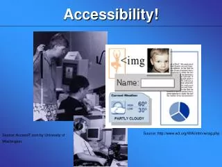
Check - Image text alternatives ("alt text") • Text alternatives ("alt text") convey the purpose of an image, including pictures, illustrations, charts, etc. • They are used by people who cannot see the image. (e.g, people who are blind and use screen readers can hear the alt text read out; people who have turned off images to speed download or save bandwidth can see the alt text.)
Check - Image text alternatives ("alt text") • The text should be functional and provide an equivalent user experience, not necessarily describe the image. • E.g, appropriate text alternative for a zoom button ( ) would be “zoom", not "magnifying glass".)
Check - Image text alternatives ("alt text") • Every image should have alt defined. • If an image conveys information useful for interacting with or understanding the web page content, then it needs alt text. • If an image is just decorative and people don't need to know about the image, it should have null alt (which looks like this in the markup: alt="" with no space between the quotes).
Check - Headings • Web pages often have sections of information separated by visual headings, for example, heading text is bigger and bold (like “Check - Headings" right above this sentence :-). • To make these work for everyone, the headings need to be marked up properly as Headings (<h1> to <h6>) in the web page code . • That way people can navigate to the headings - including people who cannot use a mouse and use only the keyboard, and people who use a screen reader.
Check - Headings • Heading levels should have a meaningful hierarchy, e.g.: • Heading Level 1 <h1> • Heading Level 2 <h2> • Heading Level 3 <h3> • Heading Level 3 <h3> • Heading Level 2 <h2> • Heading Level 3 <h3> • Heading Level 4 <h4> • Heading Level 4 <h4> • Heading Level 2 <h2>
Check - Contrast Ratio ("colour contrast") • Some people cannot read text if there is not sufficient contrast between the text and background, for example, grey text on a light background.
Check - Contrast Ratio ("colour contrast") • High contrast (for example, dark text on light background or bright text on dark background) is required by some people with visual impairments, including many older people who lose contrast sensitivity from ageing.
Check - Contrast Ratio ("colour contrast") • While some people need high contrast, for others — including people with some types of reading disabilities such as dyslexia - bright colours (high luminance) are not readable. They need low luminance.
Check - Contrast Ratio ("colour contrast") • Web browsers should allow people to change the colour of text and background, and web pages need to work when people change colours.
Check - Zoom • Some people need to enlarge web content in order to read it. Some need to change other aspects of text display: font, space between lines, and more. • Enlargement is generally provided by browser zoom functionality, and the web page needs to be designed to work when zoomed. • All major browsers provide zoom functionality that zooms all of the page, including text, images, and buttons. Some browsers provide functionality to zoom only the text. (currently only Firefox and Safari, as far as we know) If possible, you should check zoom text only.
Check - Zoom • When pages are not designed well, they can be unusable when zoomed - sometimes columns and sections overlap, the space between lines disappears, lines of text become too long, or text disappears.
Check - Keyboard access and visual focus • Many people cannot use a mouse and rely on the keyboard to interact with the Web. • People who are blind and some sighted people with mobility impairments rely on the keyboard or on assistive technologies and strategies that rely on keyboard commands, such as voice input. • Websites need to enable people to access all content and functionality - links, forms, media controls, etc. - through a keyboard. Keyboard focus should be visible and logical through the page elements.
Check: Forms • Labels, keyboard access, clear instructions, and effective error handling are important for forms accessibility. • Form fields and other form controls usually have visible labels, such as "E-mail Address:" as the label for a text field.When these labels are marked up correctly, people can interact with them using only the keyboard, using voice input, and using screen readers. • Also, the label itself becomes clickable, which enables a person who has difficulty clicking on small radio buttons or checkboxes to click anywhere on the label text.
Check: Multimedia (video, audio) alternatives • Information in podcasts or other audio is not available to people who are deaf or some people who are hard of hearing, unless it is provided in an alternative format such as captions and text transcripts. • Visual information in videos is not available to people who are blind or some people what have low vision, unless it is provided in an alternative format such as audio or text. (Text can be read by a screen reader or Braille display, or enlarged and reformatted for people with low vision.)
Check: Plain Content View • This is designed to help you understand how some people "see" the web page differently. • Web pages are often designed with multiple columns, sections, colours, and other visual aspects that help organize information for people who see the page in its default display. • While it is useful to have an experienced screen reader user check web pages, anyone can get an initial idea of potential accessibility barriers for screen reader users and others who change the way the page is presented by removing images, removing styles for how the page is usually displayed, and linearisingthe page to get a plain content view.
More Checks… • These checks are not definitive; a web page could seem to pass these checks, yet still have accessibility barriers. • There are other accessibility issues not covered in these easy checks, for example: • Links • Data table markup • Avoiding content that causes seizures • Providing users enough time to read and use content • …
Class Exercise: Accessibility Evaluation • In pairs, take the homepage of one of the following sites and evaluate its accessibility using the handout provided: • http://www.tcd.ie • http://www.irishtimes.com • http://www.education.ie • http://www.rte.ie • http://www.youtube.com • http://www.amazon.co.uk