Download
1 / 28
280 likes | 486 Views
Describing Distributions Numerically Chapter 5. Created by Jackie Miller, The Ohio State University. When we think of a typical value, we usually look for the center of the distribution. For a unimodal, symmetric distribution, it’s easy to find the center—it’s just the center of symmetry.

E N D
Describing Distributions Numerically Chapter 5 Created by Jackie Miller, The Ohio State University
When we think of a typical value, we usually look for the center of the distribution. For a unimodal, symmetric distribution, it’s easy to find the center—it’s just the center of symmetry. Center: Finding the Median
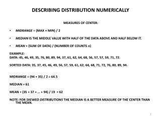
As a measure of center, the midrange (the average of the minimum and maximum values) is very sensitive to skewed distributions and outliers. The median is a more reasonable choice for center than the midrange. Center: Finding the Median (cont.)
The median is the value with exactly half the data values below it and half above it. It is the middle data value (once the data values have been ordered) that divides the histogram into two equal areas. It has the same units as the data. Center: Finding the Median (cont.)
Always report a measure of spread along with a measure of center when describing a distribution numerically. The range of the data is the difference between the maximum and minimum values: Range = max – min A disadvantage of the range is that a single extreme value can make it very large and, thus, not representative of the data overall. Spread: Home on the Range
The interquartile range (IQR) allows us to ignore extreme data values and concentrate on the middle of the data. To find the IQR, we first need to know what quartiles are… The Interquartile Range
Quartiles divide the data into four equal sections. The lower quartile is the median of the half of the data below the median. The upper quartile is the median of the half of the data above the median. The difference between the quartiles is the IQR, so IQR = upper quartile – lower quartile The Interquartile Range (cont.)
The lower and upper quartiles are the 25th and 75thpercentiles of the data, so… The IQR contains the middle 50% of the values of the distribution, as shown in Figure 5.3 from the text: The Interquartile Range (cont.)
The five-number summary of a distribution reports its median, quartiles, and extremes (maximum and minimum). Example: The five-number summary for the DALE data is The Five-Number Summary
A boxplot is a graphical display of the five-number summary. Boxplots are particularly useful when comparing groups. Boxplots
Draw a single vertical axis spanning the range of the data. Draw short horizontal lines at the lower and upper quartiles and at the median. Then connect them with vertical lines to form a box. Constructing Boxplots
Erect “fences” around the main part of the data. The upper fence is 1.5 IQRs above the upper quartile. The lower fence is 1.5 IQRs below the lower quartile. Note: the fences only help with constructing the boxplot and should not appear in the final display. Constructing Boxplots (cont.)
Use the fences to grow “whiskers.” Draw lines from the ends of the box up and down to the most extreme data values found within the fences. If a data value falls outside one of the fences, we do not connect it with a whisker. Constructing Boxplots (cont.)
Add the outliers by displaying any data values beyond the fences with special symbols. We often use a different symbol for “far outliers” that are farther than 3 IQRs from the quartiles. Constructing Boxplots (cont.)
The following set of boxplots compares the effectiveness of various coffee containers: What does this graphical display tell you? Comparing Groups With Boxplots
Medians do a good job of identifying the center of skewed distributions. When we have symmetric data, the mean is a good measure of center. We find the mean by adding up all of the data values and dividing by n, the number of data values we have. Summarizing Symmetric Distributions
The mean is notated by The formula for the mean is given by The Mean
Regardless of the shape of the distribution, the mean is the point at which a histogram of the data would balance: Mean or Median?
In symmetric distributions, the mean and median are approximately the same in value, so either measure of center may be used. For skewed data, though, it’s better to report the median than the mean as a measure of center. Mean or Median? (cont.)
A more powerful measure of spread than the IQR is the standard deviation, which takes into account how far each data value is from the mean. A deviation is the distance that a data value is from the mean. Since adding all deviations together would total zero, we square each deviation and find an average of sorts for the deviations. What About Spread?
The variance, notated by s2, is found using the formula Variance
The standard deviation, s, is just the square root of the variance. In other words, The standard deviation is measured in the same units as the original data. Standard Deviation
When telling about a quantitative variable, always report the shape of its distribution, along with a center and a spread. If the shape is skewed, report the median and IQR. If the shape is symmetric, report the mean and standard deviation and possibly the median and IQR as well. Shape, Center, and Spread
If there are any clear outliers and you are reporting the mean and standard deviation, report them with the outliers present and with the outliers removed. The differences may be quite revealing. Note: The median and IQR are not likely to be affected by the outliers. What About Outliers?
Do a reality check—don’t let technology do your thinking for you. Don’t forget to sort the values before finding the median or percentiles. Don’t compute numerical summaries of a categorical variable. Watch out for multiple modes—multiple modes might indicate multiple groups in your data. What Can Go Wrong?
Be aware of slightly different methods—different statistics packages and calculators may give you different answers for the same data. Beware of outliers. Make a picture (make a picture, make a picture). Be careful when comparing groups that have very different spreads. What Can Go Wrong? (cont.)
We describe distributions in terms of shape, center, and spread. For symmetric distributions, it’s safe to use the mean and standard deviation; for skewed distributions, it’s better to use the median and interquartile range. Always make a picture—don’t make judgments about which measures of center and spread to use by just looking at the data. Key Concepts