Download
1 / 19
190 likes | 286 Views
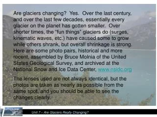
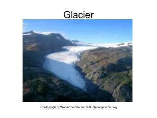
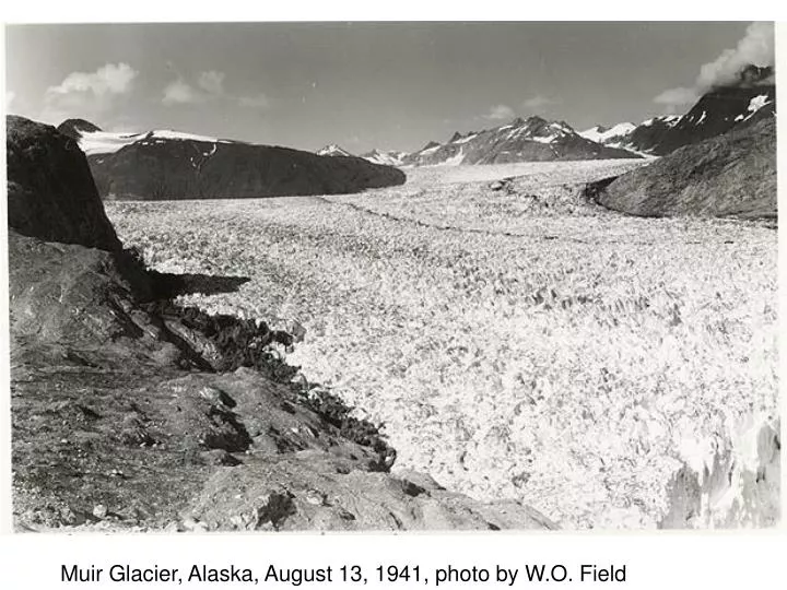
Muir Glacier, Alaska, August 13, 1941, photo by W.O. Field. Muir Glacier, Alaska, August 31, 2004, photo by B.F. Molnia. Where does our oil come from?. How much money do I spend on gas:

E N D
Where does our oil come from? • How much money do I spend on gas: • My car gets about 22 mpg on average. Over the past 5 years, I’ve averaged 20,000 miles per year. So, I purchase about 900 gallons of gas each year. • Over the past 5 years, the average cost of a gallon of gas was $2.65/gallon. So, I spend about $2400 per year on gas. • Some math (but there are caveats): • Crude oil is about 70% of the cost per gallon. • So, how much money am I spending on U.S. and imported oil? http://www.eia.doe.gov/
Where does our money go? In 2008, the 5 largest suppliers of crude oil: Canada (19.3%) Saudi Arabia (11.8%) Mexico (10.1%) Venezuela (9.2%) Nigeria (7.7%) In 2008: U.S. Imported (57%) or 11.1M barrels per day U.S. Domestic: (43%) or 8.4M barrels per day In 2008: Average price was about $90 per barrel; Dollars per day to purchase imported oil: Canada (19.3%) = 193M US $/day Saudi Arabia (11.8%) = 118M US $/day Mexico (10.1%) = 101M US $/day Venezuela (9.2%) = 92M US $/day Nigeria (7.7%) = 77M US $/day In 2008: Total $ for the entire year Canada (19.3%) = 185 Doug $ Saudi Arabia (11.8%) = 113 Doug $ Mexico (10.1%) = 97 Doug $ Venezuela (9.2%) = 88 Doug $ Nigeria (7.7%) = 74 Doug $
What can we do? Drive a Plug-In Hybrid Electric Vehicle Use Wind, Solar, and Batteries Wind, Solar, & Batteries + home wind is enough to power as little as a couple of rooms to as much as the entire home + solar can also provide similar power amounts - upfront costs take a decade or more to pay-off Ford Escape PHEV (2012): + up to 40 miles on electric + could result in no $ to foreign oil + $ remain in U.S. + decreased CO2 emissions - PHEVs are more expensive the gas versions
Answering Climate Change Questions Much of this is from Richard Alley (Penn State Professor) and publications in Geophysical Research Letters. Alley’s notes can be found here: http://serc.carleton.edu/NAGTWorkshops/climatechange08/program.html
350,000 Years of Temperature and CO2 As ice core records from Vostok, Antarctica show, the temperature near the South Pole has varied by more than 20º F during the past 350,000 years in a regular pattern that constitutes the ice age/interglacial cycles. Changes in carbon dioxide concentrations (in blue) track closely with changes in temperature (in red) during these cycles, but carbon dioxide levels are now higher than at any time during the past 650,000 years. Understanding and Responding to Climate Change: Highlights of National Academies Reports, 2008.
Climate Has Always Changed, What’s the Big Deal Now? • A: “Indeed, natural changes have happened, with continental drift altering atmospheric CO2 over tens of millions of years, wiggles in the orbit causing ice ages and CO2 changes over tens of thousands of years, and other natural changes. Earth and life are still here. If we didn’t have a special concern for humans, and for the other species that we know, climate change might not be a big deal.” Richard Alley • “Shown here is the history of three trace gases that warm the planet (carbon dioxide or CO2, nitrous oxide and methane) over the last [two] thousand years, [...] from the IPCC WG1 Third Assessment Report in 2003. Further back in time, natural changes have occurred in these, and in the climate, but the recent changes are mostly due to us. Water vapor is not shown, although it is an important greenhouse gas. Water vapor put into the air rains or snows out quickly, in just over a week on average, so we cannot put it up fast enough to make much difference. The only way we know to change water vapor a lot is to change the temperature, because warmer air picks up more water vapor from the ocean.” Richard Alley Q: Why do these concentrations increase only in the last 200 years, compared to this 2000 year record? A: Industrial revolution and beyond.
Why Are We Responsible for the Recent Changes? A: “The human cause of rising CO2 is very clear—we know from oil-tanker shipments and coal trains how much fossil fuel is being burned, burning uses oxygen and the drop in atmospheric oxygen is of the size expected to explain the burning (but with plenty of oxygen left to breathe), and other isotopic indicators agree that we are responsible for the rising CO2. The warming effect of CO2 has been known for over a century, and was clarified especially well by military research linked to World War II.” Richard Alley “The bottom of this figure shows the recent rise in CO2. If the CO2 comes from burning, rather than from volcanoes or the ocean, then O2 in the atmosphere should be dropping to supply the O2 in the CO2. The upper panel shows the dropping oxygen.” Richard Alley 1990 2006 http://explorations.ucsd.edu/Features/Keeling_Curve/
Is The World Warming? A: Yes • Line plot of global mean land-ocean temperature index, 1880 to present. The dotted black line is the annual mean and the solid red line is the five-year mean. The green bars show uncertainty estimates. • “Warming is shown by thermometers in the air, including those far from cities, thermometers taken aloft by balloons or looking down from space, thermometers placed in the ocean and in boreholes in rock, and by changes in where and when biological events happen and ice thaws. Note that weather still exists—chilly days and weeks do happen, and a La Nina event in the Pacific or other natural events can make a whole year colder than the previous one. But if you take any of the major measures of global temperature, and any time long enough to smooth out the bumps from weather, you find that warming is occurring.” Richard Alley http://data.giss.nasa.gov/gistemp/graphs/
What Has Happened Since 1998? • Investors Business Daily, Nov. 4, 2008, editorial, “The latest warming trend, which appears to have ended in 1998, is the result of the end of the Little Ice Age, which extended from roughly the 16th century to the 19th.” • Easterling and Wehner, 2009, Is the climate warming or cooling?, Geophys. Res. Lett., 36, “Numerous websites, blogs and articles in the media have claimed that the climate is no longer warming, and is now cooling. Here we show that periods of no trend or even cooling of the globally averaged surface air temperature are found in the last 34 years of the observed record, and in climate model simulations of the 20th and 21st century forced with increasing greenhouse gases. We show that the climate over the 21st century can and likely will produce periods of a decade or two where the globally averaged surface air temperature shows no trend or even slight cooling in the presence of longer-term warming.” Q: Did the warming end in 1985? In 1989? A: No. So, why should it end in 1998 or 2008? http://www.investors.com/NewsAndAnalysis/Article.aspx?id=449378&Ntt=Alarmists+still+heated+even+as+world+cools
800,000 Years of Temperature and CO2 The Dome C temperature anomaly record with respect to the mean temperature of the last millennium(based on original deuterium data interpolated to a 500-yr resolution) Lüthi et al., Nature 2008. Glacial terminations are indicated using Roman numerals in subscript (for example TI); Marine Isotope Stages (MIS) are given in italic numerals.
Temperature for 1000 Years Surface temperature reconstructions made by six different research teams (colored lines) are shown along with the instrumental record of global surface temperature (black line). Each team used a different method and different set of “proxy” data to produce its temperature estimate. The uncertainty in each reconstruction generally increases going backward in time (as indicated by the gray shading). All the curves indicate that the last few decades of the 20th century were warmer than any comparable period during at least the past four centuries, and probably longer. Source: Surface Temperature Reconstructions for the Last 2000 Years (National Research Council, 2006)
What Might Happen in the Next 100 Years Climate models often are used to help inform policy decisions. The graph on the left shows the projected global mean temperature change for several different scenarios of future emissions based on assumptions of future population growth, economic development, life style choices, technological change, and availability of energy alternatives. Each line represents the average of many different models run using the same scenario. The images on the right show the projected geographical pattern of annual mean surface air temperature changes at the end of the century (relative to the average temperatures for the period 1980–1990) for the scenarios A2 and B1 (red and blue lines). The projected warming by the end of the 21st century is less extreme in the B1 scenario, which assumes significant reductions in greenhouse gas emissions, than in the A2 scenario, which assumes “business as usual.” In both scenarios, land areas are expected to warm more than oceans, and the greatest warming is projected at high latitudes. Source: Climate Change 2007: The Physical Science Basis, Intergovernmental Panel on Climate Change 2007.
10,000 Years of CO2 Atmospheric concentrations of carbon dioxide during the past 10,000 years (large panel) and since 1750 (inset panel) show a rapid increase in carbon dioxide. Measurements are shown from ice cores (symbols with different colors for different studies) and atmospheric samples (the red line, which is data from the Keeling curve shown below). Source: Climate Change 2007: The Physical Science Basis, Intergovernmental Panel on Climate Change. Summary of CO2 and Temperature: Carbon dioxide appears to have acted like a feedback during the cycles, reinforcing temperature changes initiated by natural variations in Earth’s orbit. In contrast, carbon dioxide levels were nearly constant during the past several thousand years until human activities began emitting large amounts of carbon dioxide into the atmosphere, amplifying the natural greenhouse effect. Thus, while carbon dioxide may have acted as a feedback in the past, it is acting as a forcing in the current climate.
Climate Models: With and Without Human Influences Blue=Nature Only Pink=Humans+Nature Black=What Happened Model simulations of 20th century climate variations more closely match observed temperature when both natural and human influences are included. Black line shows observed temperatures. Blue-shaded regions show projections from models that only included natural forcings (solar activity and volcanoes). Red-shaded regions show projections from models that include both natural and human forcings. Source: Climate Change 2007: The Physical Science Basis, Intergovernmental Panel on Climate Change 2007.
“Business As Usual” Average Global warming, oC, to 2095