Download
1 / 20
200 likes | 471 Views
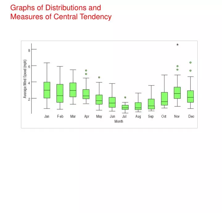
Graphs of Distributions and Measures of Central Tendency. Types of Graphs you should be able to make and interpret:. Histograms. Stem and Leaf Plots. Dotplots. Boxplots. For Quantitative Data, always describe the Shape, Center, and Spread. Sketch a picture of the following Shapes:

E N D
Types of Graphs you should be able to make and interpret: Histograms Stem and Leaf Plots Dotplots Boxplots
For Quantitative Data, always describe the Shape, Center, and Spread Sketch a picture of the following Shapes: Symmetric: Uniform: Skewed Right: Skewed left: Bimodal: Skewed right with an outlier Your personal note: I can remember the difference between skewed right and skewed left by thinking of ______________ __________________________________________________________________________________ __________________________________________________________________________________
Which description of shape goes with each picture? (symmetric,
Vocabulary for 1.1....Sort the Vocabulary words into 3 groups Center, Shape, Spread expected value variance standard deviation outlier mean median mode skewed right skewed left symmetric
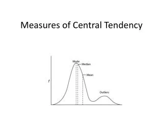
Which Center Should I Use? Because the median considers only the order of values, it is resistant to values that are extraordinarily large or small; it simply notes that they are one of the “big ones” or “small ones” and ignores their distance from center. Would the outlier "100" affect the median or mean more? If we change the "100" to "1000", would the mean change?______ Would the median change?________ 1 2 3 3 7 100 To choose between the mean and median, start by looking at the data. If the histogram is symmetric and there are no outliers, use the mean. However, if the histogram is skewed or with outliers, you are better off with the median. Personal Question: At the end of the 6 weeks, if your test grades were 100, 100, 90, 60, would you rather I reported the mean or the median to your parents on the progress report? Would you feel the same way if your scores are 60, 68, 68, 100?
Describe the shape. Then find the mean and median of the distribution. Determine which measure of center describes the data better. Shape:__________ Mean:__________ Median:________ Which is the better measure of center? a) Mean b) Median c) Mean or median is the same
Describe the shape. Then find the mean and median of the distribution. Determine which measure of center describes the data better. Shape:__________ Mean:__________ Median:________ Which is the better measure of center? a) Mean b) Median c) Mean or median is the same
Describe the shape. Then find the mean and median of the distribution. Determine which measure of center describes the data better. Shape:__________ Mean:__________ Median:________ Which is the better measure of center? a) Mean b) Median c) Mean or median is the same
Make a dotplot and a histogram of the data displayed in the frequency distribution below. Then calculate its mean and median. 2 3 4 5 6 Dotplot of Data Frequency 24 6 8 10 Mean:_____ median:_____ Shortcut way to find the mean and median_________________ __________________________ __________________________ 2 3 4 5 6 Histogram of Data
You Try....Find the expected value of the probability distribution below:
TI-84 Calculator Commands to find means and medians of frequency or probability distributions: Step 1: Enter data in L1 and probabilities or frequencies in L2 (note: stat/edit gets you to the lists) Step 2: Press Stat/Calc/1-var stat L1,L2/enter (note: to get L1 and L2, press keys 2nd/1 and 2nd/2) Practice with your calculator the problems that we did earlier:
The interquartile range, or IQR, is the difference between the 1st and 3rd quartiles, or Q3 – Q1. It represents the middle 50% of the data.
Make a box-and-whisker plot of the data. Find the interquartile range. {6, 8, 7, 5, 10, 6, 9, 8, 4} Step 1 Order the data from least to greatest. 4, 5, 6, 6, 7, 8, 8, 9, 10 Step 2 Find the minimum, maximum, median, and quartiles. IRQ = 8.5 – 5.5 = 3
Using the data in the dotplot, make a boxplot. What is the 5 number summary: minimum:___________ lower quartile:________ median:________ upper quartile:_______ maximum:__________ 75 80 85 90 Boxplot of Data Compare the two graphs.... What do you see with a dotplot that you don't see in a boxplot?________________________ What do you see in a boxplot that you don't see in a dotplot? _____________________________________________
Create a stem and leaf plot display to show the number of home runs hit by Mark McGwire during the 1986-2001 seasons. Describe using the 3 main features of a distribution (center, shape, spread). Mention any unusual features. Add Hank Aaron's homeruns to the other side of the stem and leaf plot. Compare Hank Aaron's homeruns per year to Mark McGwire. 13 27 26 44 30 39 40 34 45 44 24 32 44 39 29 44 38 47 34 40 20 12 10