Download
1 / 25
250 likes | 529 Views
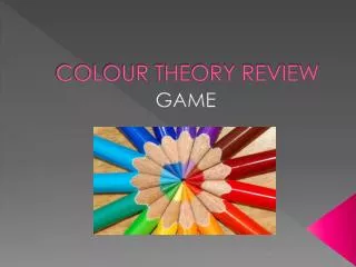
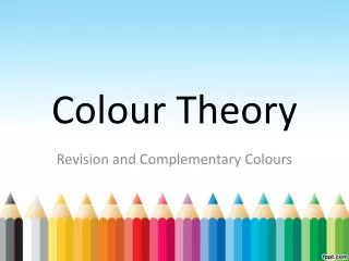
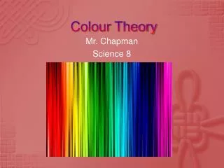
COLOUR THEORY. TGJ 3M Communications Technology. Colour is used to compliment all elements and tie them together. Use colours that create harmony in your design. Colour can create emotion and leave a lasting impression. Importance of Colour. Red, Blue and Yellow

E N D
COLOUR THEORY TGJ 3MCommunications Technology
Colour is used to compliment all elements and tie them together. • Use colours that create harmony in your design. • Colour can create emotion and leave a lasting impression. Importance of Colour
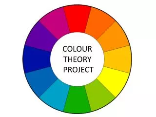
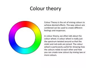
Red, Blue and Yellow • They are the building blocks used to create all other colours. Primary Colours
Violet, Green and Orange • When two of the Primary colours are mixed together, a Secondary colour is made. Secondary Colours
Mixing the Primary and Secondary colours produces Tertiary colours. Tertiary Colours
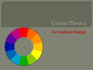
Follow certain “paths” within the colour wheel to create a colour scheme. • You want to find a visually appealing set of colours that agree with each other. • Keep it simple – limit the number of colours in your design. Colour Schemes
Directly across from one another on the colour wheel. • Complimentary colours create visual electricity. Complimentary Colours
The two colours on either side of the complimentary colour. Split-Complimentary Colours
These colours form a triangle within the colour wheel. • The twelve colors include the three primaries, three secondaries and two sets of three tertiaries. Triad Colours
Three coloursthat are next to each other on the color wheel. They usually match well and create serene and comfortable designs. • Often found in nature i.e. sunset or ocean. • Pleasing to the eye. Analogous Colours
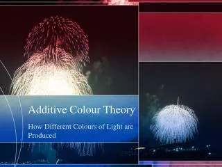
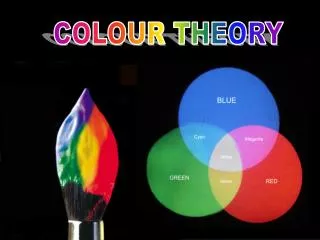
RGB (red, green, blue) is used for computer display. • The RGB color model is an additive color model in which red, green, and blue light are added together in various ways to reproduce a broad array of colors. The name of the model comes from the initials of the three additive primary colors, red, green, and blue. RGB Colour
RGB (red, green, blue) is used for computer display. • Each pixel displayed on the screen has a red, green and blue component. • The combination of these, make up millions of possible colours! RGB Colour
Colours used in all commercial printing (magazines, brochures, etc.), they are also known as Process colours. • Inks are: CMYK Colour
It is layers of these CMYK colours that make up the printed image below. CMYK Colour
Tiny dots of cyan, magenta, yellow and black transparent ink are laid on top of one another to create an image. CMYK Colour
Specify different values of CMYK to create a colour. CMYK Colour
Spot colours are created without screens or dots and is a single ink colour. • It can be an addition to one of the process colours. • Is usually a customized “Pantone” colour. Most often used in combination with Black to highlight certain elements of the design. Spot Colour
People more likely to remember a word or phrase in colour. • Mix black and white images with colour for dramatic effect. • Extract a dominant colour from any photos in your design. • Stick with 2-3 colours and add variety with shades of the same colour. Colours Tips
Work with one colour family in a design to have a consistent look and feel. • Two colours plus black are the most easily interpreted colour schemes. • Look through magazines, brochures for trends and colour scheme ideas. Colour Tips
Colours can quickly express the mood and feeling of a design so consider colour choices carefully. • What mood are you trying to convey? Daring? Reserved? Friendliness? Sophistication? Stability? Colours Create Emotion!
Red – passion, power, daring, boldness, assertiveness, love, sexuality • Orange – welcome, playful, warmth, fun • Yellow – friendliness, happiness, warmth, optimism, sunny • Green – money, growth, abundance, safety, health, freshness, relaxation • Blue – reliability, stability, dependability, leadership, trust, truth, coolness Colours Create Emotion!
Purple – fashion, intellect, wealth, regal, sophistication, spirituality • Pink – sweetness, femininity, sensitivity, softness • Brown – earthiness, organic, natural, friendliness, welcoming • Grey – security, stability, character, calmness, reserved Colours Create Emotion!
White – cleanness, purity, hope, openness, freshness, youthfulness • Black – elegance, power, darkness, premium, reserved, mystery • Gold – luxury, richness, prestige, refined, expensive • Silver – purity, precision, prestige Colours Create Emotion!
DID YOU KNOW: • Green, brown, orange and red are the most popular food colors. Red is often used in restaurant decorating schemes because it is an appetite stimulant.Reference: http://www.infoplease.com/spot/colors1.html#ixzz2NRLSxucF Colours Create Emotion!