Download
1 / 228
2.28k likes | 2.49k Views
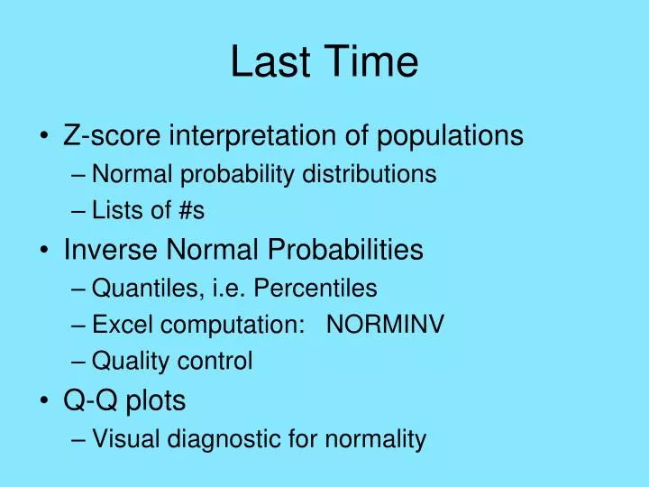
Last Time. Z-score interpretation of populations Normal probability distributions Lists of #s Inverse Normal Probabilities Quantiles, i.e. Percentiles Excel computation: NORMINV Quality control Q-Q plots Visual diagnostic for normality. Reading In Textbook.

E N D
Last Time • Z-score interpretation of populations • Normal probability distributions • Lists of #s • Inverse Normal Probabilities • Quantiles, i.e. Percentiles • Excel computation: NORMINV • Quality control • Q-Q plots • Visual diagnostic for normality
Reading In Textbook Approximate Reading for Today’s Material: Pages 61-62, 66-70, 59-61, 335-346 Approximate Reading for Next Class: Pages 322-326, 337-344, 488-498
Normal Density Fitting Idea: Choose μ and σ to fit normal density to histogram of data, Approach: IF the distribution is “mound shaped” & outliers are negligible THEN a “good” choice of normal model is:
Normal Density Fitting Melbourne Average Temperature Data
Checking Normality Idea: For which data sets, will the normal distribution be a good model?
Checking Normality Q-Q plot, e.g. Buffalo Snowfalls • Approximately linear • Suggests normal • But some wiggles? • Due to natural sampling variation? Study with smaller simulation
Checking Normality Q-Q plot, e.g. n = 100 from N(0,1) • Approximately linear • Some wiggliness • Suggests Buffalo variation is usual • Make this more precise?
Research Corner Melbourne Average Temperature Data • Mound shaped
Research Corner Melbourne Average Temperature Data • Mound shaped • But really Normal?
Research Corner Melbourne Average Temperature Data • Mound shaped • But really Normal? • Check with QQ – plot
Research Corner Melbourne Average Temperature Data • QQ-plot
Research Corner Melbourne Average Temperature Data • QQ-plot • For N(xbar,s)
Research Corner Melbourne Average Temperature Data • QQ-plot • For N(xbar,s) • Overlay 45o line
Research Corner Melbourne Average Temperature Data • QQ-plot • For N(xbar,s) • Overlay 45o line • Helps assess how linear
Research Corner Melbourne Average Temperature Data • Is this curved? (suggests non-Normal)
Research Corner Melbourne Average Temperature Data • Is this curved? • Or just result of natural sampling variation?
Research Corner Melbourne Average Temperature Data • Is this curved? • Or just result of natural sampling variation? Approach: simulate from Normal
Research Corner Melbourne Average Temperature Data • Is this curved? • Or just result of natural sampling variation? Approach: simulate from Normal
Research Corner Melbourne Average Temperature Data • Is this curved? • Or just result of natural sampling variation? Approach: simulate from Normal
Research Corner Melbourne Average Temperature Data • Is this curved? • Or just result of natural sampling variation? Approach: simulate from Normal
Research Corner Melbourne Average Temperature Data • Is this curved? • Or just result of natural sampling variation? Approach: simulate from Normal
Research Corner Melbourne Average Temperature Data • Is this curved? • Or just result of natural sampling variation? Approach: simulate from Normal (repeat 100 times)
Research Corner Melbourne Average Temperature Data QQ Envelope Plot
Research Corner Melbourne Average Temperature Data QQ Envelope Plot • Curvature not far from natural sampling variation
Research Corner Melbourne Average Temperature Data QQ Envelope Plot • Curvature not far from natural sampling variation • But does stick out
Research Corner Melbourne Average Temperature Data QQ Envelope Plot • Curvature not far from natural sampling variation • But does stick out • Conclude not Normal
Research Corner Recall Buffalo Snowfall Data
Research Corner Recall Buffalo Snowfall Data QQ Envelope Plot
Research Corner Recall Buffalo Snowfall Data QQ Envelope Plot • Always within band
Research Corner Recall Buffalo Snowfall Data QQ Envelope Plot • Always within band • Conclude: Normal distribution fits this data set
Research Corner Recall British Suicide Data
Research Corner Recall British Suicide Data QQ Envelope Plot
Research Corner Recall British Suicide Data QQ Envelope Plot • Way outside band
Research Corner Recall British Suicide Data QQ Envelope Plot • Way outside band • Normal does not fit this data set
Research Corner Recall British Suicide Data QQ Envelope Plot • Way outside band • Normal does not fit this data set (so transformation was a good approach)
Research Corner Recall log10 British Suicide Data Idea: log10 transforms to normality
Research Corner Recall log10 British Suicide Data QQ Envelope Plot
Research Corner Recall log10 British Suicide Data QQ Envelope Plot • Now much closer to normal
Research Corner Recall log10 British Suicide Data QQ Envelope Plot • Now much closer to normal • But three 0s, so not quite normal
Research Corner Recall log10 British Suicide Data QQ Envelope Plot • Now much closer to normal • But three 0s, so not quite normal Approach: Shifted log transformation
Research Corner log10 (10 + British Suicide Data) QQ Envelope Plot
Research Corner log10 (10 + British Suicide Data) QQ Envelope Plot • Shift reduces impact of 0s
Research Corner log10 (10 + British Suicide Data) QQ Envelope Plot • Shift reduces impact of 0s • Now conclude data are Normal
Research Corner log10 (10 + British Suicide Data) QQ Envelope Plot • Shift reduces impact of 0s • Now conclude data are Normal • Shift is good to know about
Research Corner QQ Envelope Plot Summary • Useful in close cases • Makes interpretation over different sample sizes much easier • Generally more quantitative approach
Applications of Normal Dist’n • Population Modeling
Applications of Normal Dist’n • Population Modeling Examples: • Heights of people • Scores on SAT ...
Applications of Normal Dist’n • Population Modeling Examples: • Heights of people • Scores on SAT ... (for almost anything measured)
Applications of Normal Dist’n • Population Modeling Often want to make statements about: • The population mean, μ • The population standard deviation, σ
Applications of Normal Dist’n • Population Modeling Often want to make statements about: • The population mean, μ • The population standard deviation, σ Based on a sample from the population