Download
1 / 20
210 likes | 226 Views
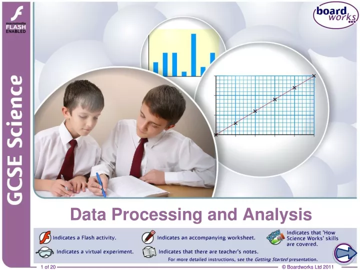
Data Processing and Analysis. Planning an investigation. As part of your GCSE Science course you will be assessed on your ability to plan, carry out, analyse the results of and evaluate investigations. You will be expected to present and analyse results in order to reach a clear conclusion.

E N D
Planning an investigation As part of your GCSE Science course you will be assessed on your ability to plan, carry out, analyse the results of and evaluate investigations. You will be expected to present and analyse results in order to reach a clear conclusion. What should you consider when analysing your results and coming to a conclusion?
Presenting results Results from most investigations should be presented in a table, which should be drawn up before the investigation is carried out. • the table should be simple and easy to read • the independent variable should be in the left-hand column • there must be a column for each measurement you plan to take, including any repeats, and a column for any value you will calculate, like an average • the table headings should give the name of the variable and its units – there should be no units next to your results • results must have an appropriate number of decimal points.
Presenting results: tables length(cm) V(V) average V(V) I(A) average I(A) R() 10.0 6.1, 6.1 6.1 0.81, 0.80 0.81 7.53 30.0 6.0, 6.1 6.1 0.28, 0.27 0.28 21.8 50.0 6.0, 6.0 6.0 0.16, 0.15 0.16 37.5 70.0 6.1, 6.0 6.1 0.12, 0.14 0.13 46.9 90.0 5.9, 6.0 6.0 0.09, 0.10 0.10 60.0 100.0 6.0, 5.9 6.0 0.08, 0.08 0.08 75.0 Oliver investigated the relationship between the length of nichrome wire and its resistance. a column for each variable and calculated value independentvariable and unit repeats consistency in number of decimal places
Presenting results: tables 2 Temperature Time taken for solutionto go cloudy Average 15 85s, 91s, 88s 88s 20.0 76s, 72s, 73s 73.66666s 25 68.3s, 69s, 67s 68.100s 30.00 62s, 63s, 62s 62.3333s 35 59s, 58s, 60s 59s James investigated the relationship between the temperature of sodium thiosulfate and the time it took to turn cloudy with hydrochloric acid. What mistakes has he made in his table? no unit no quantity units should be in column headings, not table body inconsistent decimal places inconsistent decimal places
Reliability: calculating averages sum of all data values average = total number of data values To ensure reliability, you should repeat your investigation several times and compare results. You then need to identify and discard any anomalous results or outliers. These are values that don’t appear to fall within the expected pattern or range of measurements. Finally, calculate the average of your results: add up all the individual data values then divide by the total number of values.
Presenting results: graphs Drawing a graph makes it easier to spot trends and patterns in results. However, it must be neat, clear and easy to interpret. • Label the axes with the names of the independent and dependent variables and any units. • Put the independent variable on the horizontal axis unless you are told otherwise. • Choose scales that let your graph fill the paper. You do not need to start at zero. • Don’t forget to add a title that shows what the graph is about.
Pie charts Eye colour Number Angle at centre brown blue green other A pie chart uses sectors of a circle to display categoric data. For example, a class survey of eye colour produced the following results: 11 (11/27) × 360° = 147° 9 (9/27) × 360° = 120° 4 (4/27) × 360° = 53° 3 (3/27) × 360° = 40°
Mistakes with graphs The graph shows the relationship between the acid concentration and the volume of CO2 produced in 1 minute with marble chips. What three mistakes can you spot? no units poor scale: wasted space points should be drawn by a line of best fit or smooth curve, whichever is most appropriate.
Evaluating investigations After finishing your investigation you need to carry out an evaluation to decide how certain you are of your conclusion. You need to consider the reliability and validity of your results and whether they were as you expected. Based on your evaluation you might decide that you have confidence in your results and conclusion or you may decide that further investigations are needed. You may even identify the reasons for the investigation not working as you expected.
Evaluation: an example Oliver investigated how the pulling force of a falling mass affected the acceleration of a trolley. His results lie close to a straight line, which suggests they are reliable. However, the graph suggests that the trolley would still accelerate if there was no mass. Are his results reliable?