Download
1 / 19
190 likes | 263 Views
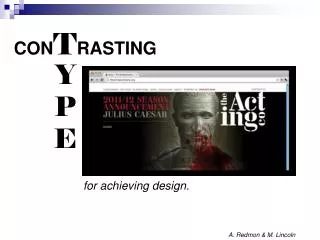
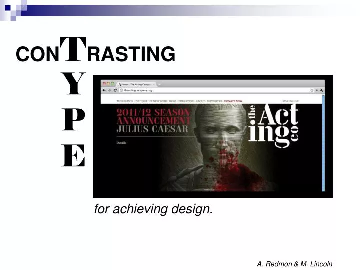
CON T RASTING. Y P E. for achieving design. A. Redmon & M. Lincoln. Using type for Design:. A process of grouping two typographical elements and using different methods to create contrast . . 6 Ways to Contrast Type. Size vary the size of the words Weight

E N D
CONTRASTING Y P E for achieving design. A. Redmon & M. Lincoln
Using typefor Design: A process of grouping two typographical elements and using different methods to createcontrast.
6 Ways to Contrast Type • Size • vary the size of the words • Weight • vary the thickness of strokes • Structure • use two fonts from different categories that look very different
6 Ways to Contrast Type • Form • vary the shapes of the words – - italics vs. normal, - lowercase vs. Upper And Lowercase 5. D i r e c t i o n • combine horizontal and vertical type or blocks of text Color
1. Size: • The eye is immediately drawn to the "super sized" G. • The word "Jiong" is the first thing you pay attention to on the page because of the G. • The key point here is that the font used for the lettering is the same.
3. Structure:Use two fonts from different categories that look very different.
4. Form:Vary the shapes of the words - italics vs. normal - lowercase vs. Upper And Lowercase or ALL CAPS arial narrow meetsArial Regular
5. Direction:Combine horizontal and vertical type or blocks of text.
6. Color: Notice how the most important word in the title is ‘FIRST” and how it contrasts rather nicely with the rest of the text.
Hmmm, how can you use to create if you are only printing in black and white ? color contrast
Assignment: Daily GradeContrasting Type Activity • On the next three slides are 14 proverbs. You will use these proverbs to illustrate six ways to contrast type. • This means you will be creating six different illustrations (graphics). • One illustration (graphic) for each of the six contrasting methods.
Birds of a feather flock together. • All's well that ends well. • Practice makes perfect. • Slow but sure wins the race. • Honesty is the best policy.
Time is money. • Health is wealth. • Look before you leap. • Waste not, want not. • Clothes do not make the man.
There’s no place like home. • Silence is golden. • Rats desert a sinking ship. • Success has many friends. On the next slide is a rubric on how you will be graded.
Rubric – Daily Grade WOW!
r n disserves another. -Gaius Petronius u 1. Direction = One good t Instructions… • You will choose six proverbs. • You will use the proverbs you chose to illustrate each of the six ways to contrast type. Example:
Save a copy of the Contrasting Type PowerPoint to your Desktop. • Open the PowerPoint from your Desktop and go to the slides with the proverbs. From here you will be able to copy and paste your favorite six proverb graphics into an InDesign document (8.5” x 11”). Your choice portrait or landscape. • Have fun!
Sources: 3st: The Acting Company. Web Page. 20 September 2011. <http://happenings.3st.com/>. Van Loon, T. & Valicenti, R. Loeb Fellowship Poster. 20 September 2011. <http://happenings.3st.com/>. Jiong. Image Six. 20 September 2011. <http://www.tomontheweb2.ca/CMX/D4FBD/>. Dair, C. Image Nine. 20 September 2011. <http://www.tomontheweb2.ca/CMX/D4FBD/>. Vorzie. Typography/Structure. 20 September 2011. http://www.vorzie.com/html/typography.html. Tomontheweb2. Image Ten. 20 September 2011. <http://www.tomontheweb2.ca/CMX/D4FBD/>. 3st: The Acting Company. The Acting company Logo. 20 September 2011. http://3st.com/#/clients/cultural_leaders/the_acting_company. Istuff. 50FirstDates. 20 September 2011. <http://istuff21.blogspot.com/2011/09/various-artists-50-first-dates-love.html>.