Download
1 / 8
80 likes | 188 Views
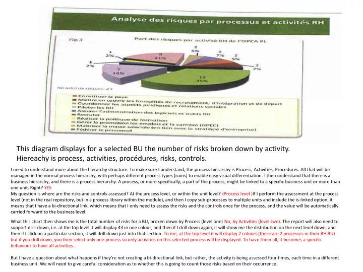
This diagram displays for a selected BU the number of risks broken down by activity. Hiereachy is process, activities, procédures, risks, controls.

E N D
This diagram displays for a selected BU the number of risks broken down by activity. Hiereachy is process, activities, procédures, risks, controls. I need to understand more about the hierarchy structure. To make sure I understand, the process hierarchy is Process, Activities, Procedures. All that will be managed in the normal process hierarchy, with perhaps different process types (icons) to enable easy visual differentiation. I then understand that there is a business hierarchy, and there is a process hierarchy. A process, or more specifically, a part of the process, might be linked to a specific business unit or more than one unit. Right? YES My question is where are the risks and controls assessed? At the process level, or within the unit level? (Process level )If I perform the assessment at the process level (not in the real repository, but in a process library within the module), and then I copy sub-processes to multiple units and include the is-linked option, it means that I have a bi-directional link, which means that I only need to assess the risks and the controls once for the process, and the value will be automatically carried forward to the business level. What this chart then shows me is the total number of risks for a BU, broken down by Process (level one) No, by Activities (level two). The report will also need to support drill-down, i.e. at the top level it will display 43 in one colour, and then if I drill down again, it will show me the distribution on the next level down, and then if I click on a particular section, it will drill down just into that section. To me, at the top level it will display 2 colours (there are 2 processes in their RH BU) but if you drill down, you then select only one process so only activities on this selected process will be displayed. To have them all, it becomes a specific behaviour to have all activities... But I have a question about what happens if they’re not creating a bi-directional link, but rather, the activity is being assessed four times, each time in a different business unit. We will need to give careful consideration as to whether this is going to count those risks based on their occurrence.
Assumingthatthere are 4 levels of risks (minor, medium, major and critical), thisdiagram displays for a selected BU the weight (converted in percentage) of the ‘major risks’ (i.e major + criticallevelsonly), distributed by procedure (all processes and activitiesincluded). Here, major risks (ie major + critical) in number are carried by the « Veiller aux conditions d’hygienne, de sante, … » procedure, 30% are located in thatprocedure; to find out whichactivity or whichprocessisimpacted, one refers to the processmapping), whileother proc eduresarecarryingsimilarnumber of major risk (i.e. concentration seems in the blueprocedure). Many questions for you! Firstly, if you want, you can create four levels within the Risk Square, and have the dashboard reports linked to those levels. In the risk square configuration, you type in the Label instead of the number. The number still gets calculated in the Risk Summary at the bottom, but the risk level is taken as the text label instead of the number. This way, you can group values such as 16 – 25 as Very High. The only problem with the chart (and it is annoying) is that it displays the dashboard according to ABC, so if you have High, Medium, Low, you need to write the label as 3 – High, 2 – Medium, 1 – Low, in order for it to display correctly. Our current dashboard shows all risk levels, not just the top two. This is clearly an example of something specific (I found similar reports at UMC... It seems that you must have and show action plans for the top 2 risk level in our regulation). I see what the report is doing – it’s going to a Business Unit, seeing the Processes connected to the BU, and seeing the included Risks. It’s then saying how many major and critical risks do I have per process, and showing me the relative distribution. I come back to my point on the previous slide – where are these risks assessed? Inside the business unit, or inside the process once, and then copied to all business units? (process level, all is process driven)
Assumingthatthere are 4 levels of risks (minor, medium, major and critical), thisdiagram displays for a selected BU the number of risks in eachlevel for eachprocess (eachcoloris a process). Here, there are 4 criticalrisks, 1 iscararied by the process « Developper les RH » and 3 by the process « Administrer les RH ». Here you are looking at the risk distribution (inherent or residual?) of all risks for a given business unit. Those risks are broken down by Process. This report is nice when there are two processes. What if the BU is linked to 10 processes? Do I see all 10 processes? Yes, but processes are actually macro processes, and activities / Procedures look like what you call processes.
Same as prévious but presented in a differentmanner. Here « Administrer les RH » has 15 minorrisks, 7 medium, 5 major and 3 critical, making a total of 26. This is more like our risk distribution report by organizational structure, which should be relabelled as it does show it also by process. So, each process within a BU is displayed, and the risk distribution is presented on a numeric basis. I guess that if i click on Administrer les RH, it will drill be down to the underlying activities, and then procedures. This chart is exactly as Risk – distribution by organizational unit, but instead of displaying quantitative (ie currency amount and damages) it counts risk by risk levels.
Same as chart N°1, Assumingthatthere are 4 levels of risks (minor, medium, major and critical), thisdiagram displays for a selected BU the weight (converted in percentage – y axis) of the ‘major risks’ (i.e major + criticallevelsonly), for eachprocedure (x axis). Here : The procedure « organiser les conditions de travail » iscarryingmost of the criticalrisks, while the procedure « Veiller aux conditions… only 30% of the riskscarried are critical. Warning, itis not because a procedure displays 100 of major riskthatthere are no minornor medium risks. It issupposed to highlightriskyprocedures … Here you are running a report on a BU which is linked to a number of processes. The report is taking the top two layers of risks, and is looking at the distribution of them across the processes. The percentage is showing the split between level 1 and level 2 risks. This is actually quite similar to the previous chart except that a) it is only showing the top two layers, and b) it is showing the percentage not the numeric split. Yes
Same as chart N°1 and prévious, Assumingthatthere are 4 levels of risks (minor, medium, major and critical), thisdiagram displays for a selected BU the proportion (converted in percentage – y axis) of the ‘major risks’ compared to all risks. Here : There are 43 risks in the consolidated RH processes, amongthem 12 are major or critical. I understand. Again, major is taken to include the top two categories of risks.
This is the distribution or risk by impact type (i.e. first level in ourrisk tiers table (displayed as percentage, number /total number). The number of risksdisplayediscountedwithout duplicate: a riskallocated in 2 subcategories of the same type will not becountedtwice. How is this chart different from chart 1? Chart 1 was by activities, this one is by risk type, level one of the tiers risk table
This is the distribution or risk by riskcategorie (i.e. second level in ourrisk tiers table (displayed as percentage, number /total number). No number as a riskmaybeattached to 2 categoriesso confusion mayrise to the readerfrom a greaternumber of risk. We can avoid this issue by having the risk distribution work according to percentage, and then I guess round up / down to whole numbers in the chart. And compared to the previous chart, this one is by “type of impact”, actually set in level two of the tiers risk table.