Download
1 / 1

E N D
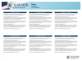
INTRODUCTION This PowerPoint document is set up to help you create a poster presentation for the IASDR2011 conference. We consider a conference poster to be a visual communications tool and set up this document accordingly. The banner at the bottom contains the conference’s logo plus descriptor, and a suggested area to put your name, contact information and the logo of your school, institute or company. Poster Guidelines Helpful hints for poster presentations at IASDR 2011 CONTENT Most people tend to put too much (textual) information on a poster. We urge you to choose carefully and to limit the amount of text, use strong visuals instead, while preserving the message of course. The margins and columns of this document are set to provide you with a good starting point. The 7 columns grid ‘forces’ you to leave some white space which will help you come up with a communicative, attractive and well balanced presentation. Hierarchy is important in providing ‘access’ to your findings. Use different font sizes, bold and/or italic and color to achieve that. Avoid the use of boxes or lines around text, structure should arise from the (proper) use of content and the grid, not from embellishments. COLUMNS AND SPACING This document comes equipped with guides in the Master slide to help you align elements on the plane. You can see them as very thin light blue lines in the background resulting in 7 columns of 9.5 cm each, and a spacing of 1.5 cm. The size of elements is related to this grid. This text box for instance, is 3 columns wide (3 x 9.5 cm) + (2 x 1.5 cm) = 31.5 cm. 2 columns = 20.5 cm; 4 columns = 42.5 cm. Try to align all items on the plane with these columns. For horizontal alignment use the Dynamic- and Static Guides of this application (View/Guides/…). TEXT Legibility diminishes when lines of text become too long. Rule of thumb is 60 to 70 characters (including spaces and punctuation) maximum for comfortable reading. The text in this document respects that. If you want to use a different font and/or size, adjust column width accordingly if necessary. The table below shows the specifications of the components used in this document. The font is Trebuchet MS. The line spacing is set to 48 pt. Of course you are free to use a different font and/or size, and lay out, this document is just to help you get started. The banner however, is strongly recommended. Visuals are important means to support your message. However, choose carefully. One or two clear, large pictures often work better than a lot of small ones. Variation in size can support hierarchy. Make sure the quality (pixels,) of your illustration is sufficient to be printed in large format. 200dpi at 100% is the minimal requirement to guarantee good quality. Captions also can carry part of the message. 1st presenter’s name affiliation affiliation (continued) e-mail address 2nd presenter’s name affiliation affiliation (continued) e-mail address put logo of school, institute or company in this area. (remove the border)