Download
1 / 8
80 likes | 201 Views
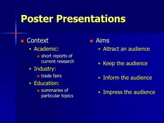
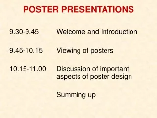
Guidelines for Poster Printing, Creation, and Presentations. Elements of your poster. Title Abstract Introduction Methods Data/Results Conclusions Acknowledgements References. Things to Remember. Your poster should be stand alone Font should be readable from 3’ away (feet)

E N D
Elements of your poster • Title • Abstract • Introduction • Methods • Data/Results • Conclusions • Acknowledgements • References
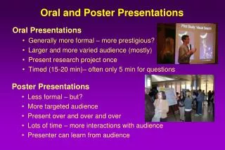
Things to Remember • Your poster should be stand alone • Font should be readable from 3’ away (feet) • Bullets keep people’s attention more than putting your whole paper on the poster • View menu – Grid and Guides allows you to align and space properly
Abstract Sample PosterBy John Doe Results Conclusion Introduction/ Background Information Table Or Chart Works Cited/ Acknowledgements
Guidelines - Font • Create in PowerPoint and set size of slide/poster (before adding content) • Design Tab > Page Setup • Average Poster Size – 28’’ x 40’’ (inches) • Orientation - Portrait • Text - No smaller than 20pt • Title - should be at least 60pt • Be careful of fancy, elaborate, script or any font that may be hard to read from a distance…remember that simpler is better
Guidelines - Color • Beware of dark backgrounds • Light backgrounds with dark text work best • Watch color combinations • Images on your screen reproduce differently on a poster
Guidelines - Graphics • Graphs – good • Clip art – if tasteful • Photos work – just don’t use too many • Make sure any extra picture or clipart you use is related to your specific topic and is not too general
Websites for Additional Info! • http://www.ncsu.edu/project/posters/ • http://www.ploscompbiol.org/article/info:doi/10.1371/journal.pcbi.0030102