Download
1 / 25
250 likes | 415 Views
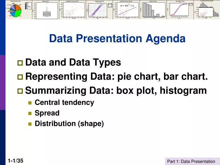
Data Presentation Agenda. Data and Data Types Representing Data: pie chart, bar chart. Summarizing Data: box plot, histogram Central tendency Spread Distribution (shape). Data = A Set of Facts A picture of some aspect of the world. Pizza Sales by Type. What do the data tell you?

E N D
Data Presentation Agenda • Data and Data Types • Representing Data: pie chart, bar chart. • Summarizing Data: box plot, histogram • Central tendency • Spread • Distribution (shape)
Data = A Set of FactsA picture of some aspect of the world Pizza Sales by Type What do the data tell you? How can you use the information? What additional information would make these data more informative?
Data Types and Measurement • Quantitative • Discrete = count: Number of car accidents by city by time • Continuous = measurement: Housing prices • Qualitative • Categorical: Shopping mall, car brand, trip mode • Ordinal: Survey data on attitudes; “How do you feel about…?” Strongly disagree Disagree Neutral Agree Strongly agree Moody’s bond ratings: Aaa, Aa, A, Bbb, Bb, B, and so on. • Frameworks • Cross section • Time series
Problem with Ordered Survey Response Data 61 Stern Students’ Ranking of Subway Safety (1994)* Very Unsatisfactory Unsatisfactory OK Satisfactory Very Satisfactory Is there an objective meaning to “3” on some standard scale?Does everyone’s “1” or “2” or “3” … mean the same thing? * Jeff Simonoff: Data Presentation and Summary, pp. 3-4
Representing Data • In raw form • Transformed to a visual form • Summarized graphically • Summarized statistically
Pie Chart Pizza Pies Sold, by Type
Data Representation BAR CHART PIE CHART Same data. Which is easier to understand?
A Box Plot Describes the Distributionof Values in a Set of Data Hawaii Box and Whisker Plot for House Price Listings
Making a Box Plot for Per Capita Income Maximum=31136 3rdQuartile = 24933 Interquartile Range = IQR= 24933-21677 = 3256 Median=22610 1stQuartile = 21677 Minimum=17043
Box and Whisker Plot What is an outlier?Why do we believe a particular point is an outlier? Outliers Smaller of (Maximum, Median + 1.5 IQR 75th Percentile Interquartile range=IQR Median 25th Percentile Larger of (Minimum, Median – 1.5 IQR HOG, pp. 39-43
Histogramfor House Price Listings A histogram describes the sample data and suggests the nature of the underlying data generating process. Note the “skewness” of the distribution of listings. HOG, pp. 16-18
Distribution of House Price Listings … shows up in the box and whisker plot. Note the long whisker at the top of the figure. Asymmetry (skewness) in the histogram of listing prices…
A Caution About Graphical Data Summaries Graphical tools can be very badly behaved when: (1) The data have only a few observations. (2) There are wild observations in the data set. The box and whisker plot is distorted (and dominated) by one wildly errant observation.
Summary • What story does the data presentation tell? • Data in raw form tell no story. • Visual representation of data tells something about the data • Data reduction and summary representation: What do we learn? • Location • Spread • Shape of the distribution • What tool is most informative? • Reduction to a small number of features • Visual displays of data • Pie chart • Box and whisker plots • Histograms • Time series plots “There are lies, damned lies and statistics.” (Benjamin Disraeli)
The Visual Data Do Tell the Story:Napoleon’s March to Moscow
Probability of Survival to Age 50, Female at BirthU.S. and 20 Other Wealthy Countries