Download
1 / 7
70 likes | 186 Views
As the web technology advance, the need to create an amazing user experience has increased dramatically. Following these guidelines you can design a better Checkout Experience as easy as possible.

E N D
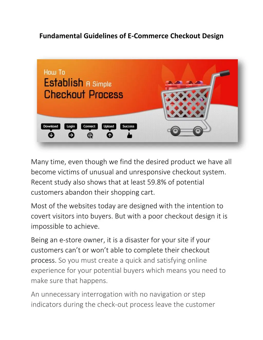
Fundamental Guidelines of E-Commerce Checkout Design Many time, even though we find the desired product we have all become victims of unusual and unresponsive checkout system. Recent study also shows that at least 59.8% of potential customers abandon their shopping cart. Most of the websites today are designed with the intention to covert visitors into buyers. But with a poor checkout design it is impossible to achieve. Being an e-store owner, it is a disaster for your site if your customers can’t or won’t able to complete their checkout process. So you must create a quick and satisfying online experience for your potential buyers which means you need to make sure that happens. An unnecessary interrogation with no navigation or step indicators during the check-out process leave the customer
confused and frustrated. You lose the sale and often lose the customer as well. So it is necessary to review not only your overall ecommerce website website design design but your e-store checkout flow. Creating the perfect checkout process is not an easy task, you must follow the design guidelines, customer preferences and mental models. ecommerce We have tested 15 ecommerce website and focusing only on the checkout user experience, from “Cart” to “Completed order”. And today we will share 11 guidelines from that report. 1. Your Checkout Process Should Be Completely Linear Such as creating an account should direct the customer to the next step of checkout process not to the previous one.
2. Add Descriptions to Form Field Labels Wrong method - Below are examples of how descriptions below form field labels can help customers understands what inputs are required of them:
3. Avoid Contextual Words like “Continue” 4. Visually Reinforce All Sensitive Fields on the Payment Page Customers might hesitate if credit card fields don’t appear secure. 5. Don’t Use an “Apply” Button in Your Form.
6. Format Field for Expiration Date Exactly As It Appears On Credit Card. 7. Use Only One Column for Form Fields Customers have an amazingly difficult time understanding the relationships between form fields in two columns. 8. Use Shipping Address as Billing Address by Default Most customers order products to their home, so requiring both a billing and shipping address doesn’t make sense.
9. Use Clear Error Indications Customers overlook error messages, making them less likely to resolve the errors. 10. Registration Should Be Optional. 11. Don’t Require Seemingly Unnecessary Information Customers feel that their privacy is being invaded when they are required to submit seemingly unnecessary personal information. As the web technology advance, the need to create an amazing user experience has increased dramatically. Following these guidelines you can design a better Checkout Experience as easy as possible. iMediadesigns provide cost effective web design and development solutions development solutions and offers custom web design services in Toronto effective web design and