Download
1 / 18
190 likes | 433 Views
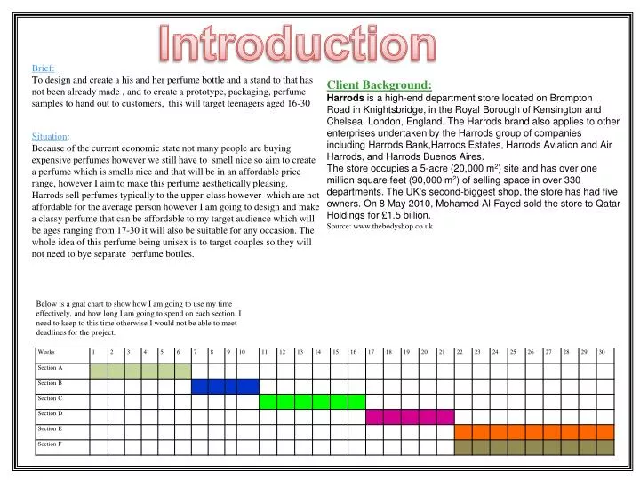
Introduction. Brief: To design and create a his and her perfume bottle and a stand to that has not been already made , and to create a prototype, packaging, perfume samples to hand out to customers , this will target teenagers aged 16-30 Situation :

E N D
Introduction Brief: To design and create a his and her perfume bottle and a stand to that has not been already made , and to create a prototype, packaging, perfume samples to hand out to customers, this will target teenagers aged 16-30 Situation: Because of the current economic state not many people are buying expensive perfumes however we still have to smell nice so aim to create a perfume which is smells nice and that will be in an affordable price range, however I aim to make this perfume aesthetically pleasing. Harrods sell perfumes typically to the upper-class however which are not affordable for the average person however I am going to design and make a classy perfume that can be affordable to my target audience which will be ages ranging from 17-30 it will also be suitable for any occasion. The whole idea of this perfume being unisex is to target couples so they will not need to bye separate perfume bottles. Client Background: Harrods is a high-end department store located on Brompton Road in Knightsbridge, in the Royal Borough of Kensington and Chelsea, London, England. The Harrods brand also applies to other enterprises undertaken by the Harrods group of companies including Harrods Bank,Harrods Estates, Harrods Aviation and Air Harrods, and Harrods Buenos Aires. The store occupies a 5-acre (20,000 m2) site and has over one million square feet (90,000 m2) of selling space in over 330 departments. The UK's second-biggest shop, the store has had five owners. On 8 May 2010, Mohamed Al-Fayed sold the store to Qatar Holdings for £1.5 billion. Source: www.thebodyshop.co.uk Below is a gnat chart to show how I am going to use my time effectively, and how long I am going to spend on each section. I need to keep to this time otherwise I would not be able to meet deadlines for the project.
I carried out a survey to ask my target market what they wanted in a new perfume bottle for both his and her. I asked 20 people at random of the public, ten female and ten male aged 20 and above to answer a questionnaire I produced to help me decide what sort of perfume to produce and the themes, size and so on. I chose to ask male and female because I want to create a his and her perfume for couples or husband and wife, where they can buy two perfume bottles together for a cheaper price rather than buying a perfume separately where is it more expensive to buy. Questionnaire When i asked how much would you pay for perfume bottle a surprising 6 people said they would pay £30 perhaps this suggests they expect the standards of perfume to be high However when i asked people what shape do they prefer 7 people preferred a square shaped perfume bottle, perhaps they are more use to this shape, this is good because a square shaped perfume bottle is easier to make than other shapes Finally when if my clients would like a unisex perfume bottle a surprising 19 answered “ yes” this shows they want something different In conclusion to the results I will include the followings things in my design, the colours blue, silver or two toned colour therefore it would not discriminate against either gender. The shape I will do for the perfume bottles are a unique design because people prefer it to be different and more eye catching and appealing. The theme I will do for the perfume bottle will be an elegant with icy white theme as it is what people would prefer. The size of the perfume bottle will be either 30ml or 50ml, as it what people would prefer to buy as it is cheaper and easy to store in places compared to big perfume bottles. The price would range between “£20 - £40”, depending on the size of the bottle and the value of perfume bottles that are out in the market now. The type of text for the perfume bottle would be Script because it makes the product seem handmade and also elegant, as well as showing the product is good quality.
Ergonomics Force/Strength Materials that i will be using have to be strong but small in terms of its ratio strength to wait . As perfumes bottles will be designed for the human hand the force will mainly be applied from the side of the product this is because customers hold the product here. The perfume bottle should not be damaged or broken in the packaging. This is the reasons why the material needs to be strong and the packaging needs to be done properly. Also the perfume bottle packaging must withstand the forces applied by customers without breaking and tearing. It has to stay the same shape and stay good quality through any forces. This material should be able to last for longer than a year, which means the material must be thick, strong, good quality, look and appeal to the customers making it aesthetically pleasing and scratch resistant. When designing and making the perfume bottle for both men and women, I have to take into account the hand dimensions, the hand grasp and so on, so when the customers use the product it needs to be ergonomic, (comfortable) to hold and use, and also not slip out of the hand either. It also needs to be easy to spray the perfume with out any problem of the bottle slipping or breaking. Using the diagrams above will enable me to design a perfume bottle for both men and women which is ergonomic and perfect for my target audience to use. The main force will be applied here The packaging will look something like this however it will be more complex in order for it to be aesthetically pleasing but still with stand force from an average male and female’s hand.
Colour Typography Warm Colours,- Red, Orange, Pink. Script MT Bold French Script MT Blackadder ITC Summer Colours This font when used looks handwritten and makes the product seem handmade. It is clear to read but sometimes people can’t read it due to the joined letters. This would be good to use for my product as it makes it looks elegant This font looks handwritten, however it is not very suitable for perfume bottles as you can not read what it says, it is not clear to the audience, and not understandable. This font is Script, and looks elegant as well as hand written. It could be suitable for my product because it shows a product to be good quality and handmade. Felix Titling Gigi This font is similar to Serif, as it has the Serif, the bar etc on it. This type of font suggests high quality which is what I want, however it does not appeal to me very much, and it is more likely to be aimed at older people, hence the reason why THE TIMES is Serif Typeface. This font is unique however it looks childish and not suitable for my product. It doesn’t give the impressions that the product is good quality, elegant and neither handmade. Contrasting Colours Palace Script MT Forte This font is Script, and looks like a handwritten font. It would show the product to be high quality and elegant. However it is very hard to read and it not understandable compared to the other fonts, hence the reason why it would not be suitable for my product. This font looks handwritten, and it is clear and understandable to read, however it may not be suitable for my product because it is too bold, doesn’t make the product seem good quality, and elegant. Also it doesn’t give the impression that the product is handmade. Cool, Winter Colours.- Blue, Green. Georgia Monotype Corsiva I have analysed some fonts, to help me decide which one is suitable for my product and what would appeal to the audience. I annotated a variety of fonts to help me in the process of choosing what is the best font to use in the product. Above is a Colour Theory. It would help me to choose the type of colours which is suitable for my product. The colours need to stand out and appeal to the audience, therefore I analysed the colours stating whether they are contrasting, dark, summer colours to help me choose the colours that would appeal to the customers. This font is understandable and easy to read. However it doesn’t show sophistication and elegance. It doesn’t show the product is good quality and neither the impression of it being handmade. This font is very clear to understand and read, and it gives the customers the impression that the product is good quality. Also it indicates elegance reflecting the product. Dark Colours, - Dark Blue, Dark Green.
Couples Script Eye Catchy Embossing Decorative Ink Jet Lithography Sans Serif CYMK Font Target Market British Standard Serif Toxic Screen Printing Easy to read Environmental Issues Age Range: 17and above CE Style Letter Press Printing FSC Stands out Safety Gravure Risk Assessments Bold Text Vinyl Cutter Vacuum Forming Machine Smart Reusable Recyclable Acrylic Biodegradable Blow Moulding Materials MDF Tools and Equipment Die Cutting Designing and Making the project Alloy Metal Plastic Corrugated Card CNC Laser Cutter Ferrous Card Non-Ferrous 2-D Design Thermosetting Plastic Thermoplastic CAD/CAM Spirit Varnish Pro - Desktop UV Varnish Colour Joining Method Varnish Super Glue Finishing Texture Acrylic Cement Screws Dip Coating Laminate Contrasting Colours Bright Colours Budget Rubber - Based Cement Glues, PVA, Tensol, Solvent Target Market Summer Colours Cost Time Materials Glue Gun Scale of Production Aerosols - Spray Mount Glue Pens Mass Batch
Task Analysis What type of finish will I use? The type of finish I could use on the material to make it look good is spray varnish to give a high quality finish look. This is to show the buyers that it is a high quality product and that they are not being mislead by what they buy. Also I could use wet and dry for plastics to give it a smooth and shinny finish. How will I ensure my product is environmentally friendly? To ensure my product is environmentally friendly, I will use recyclable materials and also biodegradable materials, the reason why I have chosen to use this material is because its cheap, Plastics are durable and degrade very slowly. The molecular bonds that make plastic so durable make it equally resistant to natural processes of degradation. However my plastics that I have chosen to use can cause environmental problems some resources are biodegradable but release toxic gases into the atmosphere to cause environmental problems. Finally I will make the bottle shatter resistant. Who is my product aimed at? My Product is aimed at Couples, and teenagers from 17 and above, however I have chosen to make it unisex because there isn’t many perfume bottles that exist as his and her together, also I have chosen to make it from 17 and onwards because teenagers gain money at this age therefore I have decided to make it cheaper to buy as it is together. However it can come in gift packages to give to people. Where will my product be most used? My product will be most used in the shop to gain more status but then, in people’s homes, it will be used on people’s clothes or skin. However I aim for this product to be sold in Harrods as it’s the second biggest store in England. When is the deadline for finishing the project? The deadline for finishing the project is the 26th of March 2011. Therefore I will need to use my time effectively in order for me to finish the project on time and complete everything I need to. What materials could I make my product out of? The type of materials I could use in my product is plastics and wood because they are easy to work with also I have decided to work with thermo plastics because when they are heated they can mould to any shape using various types of machines, such as the vacuum forming machine, you can not mould it again after heating it. I could use wood as I can carve into the wood and make designs and wood is easy to cut and shape, depending on the shape. However I have decided I cannot use glass as it is hard to shape and mould into any shape, and it would not be environmentally friendly and it is very expensive therefore I will not make a profit out of it. For Packaging I could use card and varnish it or laminating to make it strong and high quality. People would be interested in buying it as it doesn’t look poorly made or poor quality. How many units of the product do I need to make? The product will be batch produced because there are limited stores around the UK. There are not many body shops unlike the worldwide companies such as Dior and Gucci. However my product will be sold in shops such as Harrods to gain status however it will still be sold at an affordable price. It is better to batch produce than mass produce because if the product is not sold as often not a lot of money will be wasted, therefore there would not be hardly any loss in the money being made. How long will it take to finish the product? It will take about 30 weeks to finish the whole project, which includes the model making, research, designing, and evaluating things against the specification. How structurally strong might the product have to be? The product needs to be strong so the perfume bottle doesn’t break and can withstand the forces of human hands however it also needs to be light. therefore the perfume bottle will be strong in terms of its ratio to weight The packaging of the product needs to also be strong, to protect the perfume bottle from being damaged and breaking and the lid of the packaging needs to be strong so it doesn’t open and so the perfume doesn’t fall out and drop to pieces after being shattered. Finally the perfume bottle needs to be shatter resistant so it does not become a hazard What tools and machinery could I make my product out of? I could use a variety of machinery. The tools and machines I could use that I feel will help me make my product much faster as time is money. I have decided to use machinery such the laser cutter to cut the shapes of the product precisely, the vacuum forming machine to create the perfume bottle. I could also use the vinyl cutter to create the letter and place them on the product. For plastics I could use the blow moulding or injection moulder to create a unique shape. What would the colour scheme be for the product? The colour scheme I could use is the elegant theme together with red designs as see red to be a unisex colour. I will also use specs of blue, silver and two toned colours. This would make the perfume stand out because the metallic silver colour will be bold and stand out amongst other perfumes and metallic silver looks good with both sex’s
Task Analysis Where do I think I will find out what I need to know to design it well? To design the product well, I will need to gather research in order to help me with creating my product and carry out the form of research i will use will be primary research as i need first hand information therefore to do this i will use questionnaire /and survey, i will use these results from my target market , to help me create a product suitable for them and meet their requirements. I will also look at existing products. What is the purpose of the project? The purpose of the project is design and make a new perfume bottle for teenagers aged 17 and above and younger couples, i have chosen to target teens aged 17 and above because at this time they begin to make more money or some form of money. I have to attract the males and females to buy this product as it would be a value for money and it is combined for both men and women. What is the budget to make the product? The budget would be around £50 for the materials and other things needed to produce the product, this is fairly cheap compared to the amount I will be making in profit What are the safety considerations I will have to think about when designing and making my product? The safety considerations of the product are that it will have to pass the British Standards test. The product has to show allergy information and the safety marks such as the CE. Why am I designing and making this particular product? I am going to design and make this product in order for more perfumes to be sold at high profile shops such as the body shop and eventual Harrods as fragrances currently has a big gap in the market therefore I see this opportunity in making this product as a big gap in the market means people will be more anxious to buy my product making more revenue for. It will also be a value for customers as they get two perfumes at a cheaper price for both his and her together which is different to all the products they have ever sold. The design of the bottle will be unique in order to attract the customers attention and posters and adverts will be produced to promote the perfume to increase the sales when the perfume is out in shops. Where would my product be sold to its target market and what might I expect to sell it for? How would I find out what an appropriate price was? My perfume for his and her will be sold in The Body Shop stores, also in the near future it would be sold in Harrods this is simply to create more awareness of my product. To discover the most appropriate price to sell the perfumes at I will have to take into the account the amount I spent on producing the product and the results from carrying out my questionnaire which was that people would prefer to spend £30 on a perfume bottle therefore I could sell the product at around £50, and the customers will save a lot of money. However the price of my perfume will not stay at this price this is only a temporally price until when I start making a large profit.
Product analysis This product is also produced by the body shop, and it is also plain and simple, The product would gain the customers attention because of the use of the colours, which stand out as they are bright and of various colours. The use of the image on the bottles makes the bottle stand out otherwise it would be too plain, and not many people would buy it. This product is very simple from its shape however its colour suggests its for women. And its Brand “channel” is a women name therefore it must be for women This product is a Men’s Aftershave. It is very plan which enforces the idea that it belongs to men. However I don’t really like the design because it looks like a normal bottle, which would not stand out in stores. The use of texture is good on the bottle as it makes it look different, so I could consider using texture to make my design stand out. Unlike the other image this one is black which suggests its for males, “polo” is a well know brand therefore it will be sold at a high price This perfume is a sky blue colour which makes it attractive, from just looking at the colour you can almost tell what it would smell like which is a good thing as it catches my eye. Its also unique as it can fit in the human palm very well. If this perfume was to be left on shelf it would catch many peoples attention This is also a males perfume its very plain which makes it simple, however i would not go for this and idont think any other customer will unless its a very high prifileperfum
Product analysis This product is Homme Fresh by Kenzo. This product is a different shape and design, the bottle is plain however it would appeal to the customers because of its simplicity. However i would say this product is the type that you can either hate it or love it this brings more complication to it in a good and bad way. Its a sky blue/ sea colour which suggests it for women. This product is Tendre Poison, created by Christian Dior. The bottle is unique and reflects the name of the product, as stereotypically poison bottle will look like this. The colour green reflects, which suggests that the creators wanted people to think that when they wear the fragrance everyone will be jealous of them. The design of the bottle doesn’t really appeal as much because the colour green is very dull and looks very plain, however i wouldn't use this as my design because it looks very dull and most perfume shapes look like this. This is more of an upper class product its a gift set for Jean Paul Gaultier’s perfume Fragile. It is a unique gift box shape due to the shape being a dome. It reflects the dome on the lid of the perfume giving it an authentic look meaning it is not a copied design. The vacuum formed shape of the bottle is good to use for my product design the product will not fall out and become damaged.. The texture on the lid of the gift set makes it look realistic, which attracts the customers attention.
packaging analysis Below is a net of what I'm thinking of using I have labelled were my designs and text may go. Tabs are used to stick the net together and so it is secure, I'm thinking of adding patterns of a metallic silver colour to attract both sex’s top The packaging for the Kouros aftershave would appeal to men as they don’t like a lot of design on their packaging, they prefer simple and plain designs that look unique. The use of the colours blue shows masculine colours, and the different tones of colours, blue and dark blue appeals to the audience. The text stands out on top the blue as blue and white, however there is something different with this design compared to the other lacoste packaging perhaps its the colours that stand out more. The for Lacost e looks simplistic along with the colours used, its although the idea was to attract men and the perfume was created for casual wear but its still dull, iIwould not personally bye this perfume from the packaging Side Fold line is to fold the net into place to make a cube or another shape. Side Bottom Side Side The packaging for the Christina Aguilera perfume, is very appealing due to its unique and authentic design. However the packaging is still a “box”, but because of the patterns on it, it makes it stand out more. The packaging of Gucci by Gucci is very plain and simple. The writing stands out on top of the grey, but the colour grey looks very dull, and would not appeal to a wide range of audience, however Gucci is also a high profile fragrence so people will be willing to look past this. The colour grey reflects sad emotions and the weather of rain and cloud. I don’t like the packaging of this bottle because it wouldn’t appeal to the target audience very well.
Point Of Sale Analysis This display stand is good because of the way it is presented. Also the fact that four perfume bottles can fit on the stand is good because many customers can look at a perfume bottle at a time. The shape of the display stand is made in the shape of a egg and the egg can open and close this will attract many customers. Also the colours give an antique look to the stand, showing the perfume scent will be strong and classy.. The use of gold suggests this is for the upper class. However although it is very classy I will not buy it because it does not look environmentally friendly for example, what if it drops there can be sharp edges which are not safe for anybody This point of sale is a good idea as many people may not have com in contact with it. The name of the perfume reflects the stand due to the red door. Also the text on the top stands out on top of the white as gold is a metallic colour and will stand out on most colours. The colour red stands out due to the red overpowering all the colours on the stand. The edges on the stand however needs to be smoothed to prevent anything happening to the customers when they touch the stand. It is a good stand as it would instantly gain the audience’s attention due to the way it is made and shown, and also the door of a house creates a different stand compared to the other existing stands. The display stand is good because of the use of the shape of the circle but split into quarters. The levels are good because most display stands are on one level. The use of the mirrors are a good effect to use to attract the customers because when the perfume bottle sits on the stand it is reflected. However despite its good appearance I would not bye this perfume simply because its to big and it does not look environmentally friendly
Finishing techniques A finish is in simple terms a coating, layer or skin applied to the material. The finish will be applied for one or more of the following reasons: . 1) To protect the material from moisture, wear, abrasion, fungus, mould or insect attack. 2) To change the materials appearance, its colour or texture. 3) To enhance the materials durability, surface hardness or other properties. PLASTIC - Polish Plastics don’t really need a finish but it looks more appealing if it did. Polish makes the plastic more shiny on hard plastics, also it can be applied by hand or a machine. CARD - UV Varnishing UV varnishing consist of a synthetic resin dissolved in an organic solvent. The solvent evaporates to leave a thin protective layer of varnish. METAL - Protective Paint Paint on metal keeps the metal protected, durable and waterproof. It is available in a range of colours and does not cost a lot. Paints can be sprayed on from a can or brushed on.. Possibly suitable for a display stand. WOOD - Paint Paint on wood gives a good finish, and it can come in a range of colours. The wood, however needs to be smooth, sanded down, clean, undercoated and then paint can be applied. It would be good to use on a display stand to appeal to the audience and give a high quality finish. CARD - Laminating Laminating is a quick and effective way to finish a piece of work on paper or thin card. METAL - Dip Coating The metal is heated to about 150C and dipped into a box of fluidised powdered plastic which melts onto the surface of the metal sealing it. The correct temperature of the metal can be gauged by the colour of the heated metal. In school the metal is generally heated using a brazing hearth. Possibly suitable for a display stand. WOOD - Polish Polish gives wood a smooth finish and leaves it shiny which appeals to people. Wood finishing refers to the process of embellishing and/or protecting the surface of a wooden material. WOOD - Varnish Varnish gives wood a glossy, tough, high quality, waterproof, clear finish. Varnish prevents the wood from becoming wet and damp and weak. It protects the surface of the wood from becoming worn out. Varnish makes the product looks high quality, smart and classy. I could use it in the display stand as it is strong and makes the product look appealing.
Joining/Construction Methods Mortise and Tenon Joint On the right is a diagram of a Mortise and tenon joint. There are many other mortise and tenon joints. The one on the right is a through mortise and tenon joint. Through mortise and tenons are often used on doors and gates. This joint has the tenon passing right through the leg or stile. Wooden wedges are often used to lock the tenon in place in situations where the joint has to withstand more than normal amounts of leverage. Glues The types of glues that could possibly be used are, PVA Glue, epoxy resin, tensol cement, super glue, glue gun or a contact adhesive. These glues are good to use as they join the material together properly. Dovetail Joint Ideal for the corner joints on the backs of drawers, the tapered shape of the 'tails' resist the forces applied to the joints when the drawer is in use. Apart from being a strong joint in some situations dovetails are used primarily for their decorative qualities. The advantage of this method is the fact that its very strong Slotting Slotting is good to use as it is secure and stable. It allows the display stand or packaging to be folded when being delivered to save space and money. When the slots are on the display stand it makes it easier for the display to be put up, and also delivered and carried to places from other places. Slotting is mainly good for card and boards not wood, or other materials hence the reasons why there are different joints for wood and other materials. Metal Glue Metal glues are good to use with metals, as they join together properly. It would be good to use if I use metal for the product as it would not fall apart and give the metal strength so it would not fall apart.
Embossing Embossing is the raising of the surface of the paper or card in the shape of text or image so it stands in relief. Production Methods Mass Production Mass production is expensive and is not needed in making my perfume bottles because not a lot will need to made as it is only being sold in Body Shop and not a lot of people would buy a his and her perfume unless for a special occasion or something else. Therefore not a lot of money will be wasted. Vacuum Forming Vacuum forming is the process whereby a sheet of plastic is heated to a forming temperature, stretched onto or into a single-surface mold, and held against the mold by applying vacuum between the mold surface and the sheet. The vacuum forming process can be used to make most product packaging, speaker casings and even car dashboards. Screen Printing Screen printing is in common use today as it is relatively cheap and a variety of colours can be used. Screen printing can be printed on uneven surfaces, it can print onto surfaces that can not fit through a printing press Laser Cutter Laser cutting is a technology that uses a laser to cut materials, and is typically used for industrial manufacturing applications. Laser cutting works by directing the output of a high power laser, by computer, at the material to be cut. The material then either melts, burns, vaporizes away, or is blown away by a jet of gas, leaving an edge with a high quality surface finish. Die Cutting This is the method of cutting printed paper to shape. It works like a giant gingerbread man cutter, pressing the shape out of the paper or card cereal. Die cutting would be good to use on card, as it would be accurate every time and reduce the time needed unlike other processes. Lithography Lithography is a printing process. Lithography machines can print on both sides of paper/card and they rely on four basic colours; yellow, cyan (type of blue), magenta (type of red) and black. This is also known as the CYMK process. Batch Production Batch production is the manufacturing technique of creating a component at a workstation before moving to the next step in production. Batch production is good to use for the perfume bottle as it not going to be sold everywhere but the Body Shop stores only. There is not as many stores of body shop worldwide, therefore mass production is not needed but batch production instead. Blow Moulding Below is a diagram showing how blowing moulding process works. It can make any bottle shape, and therefore may be good to use for my product as it is a perfume bottle.
Quality assurance & quality control Safety The European Union has set up rules for selling certain types of products in the EU. The product has to pass certain tests in order for it to be sold anywhere in the EU. When my product goes on the market it needs to pass the tests of the CE otherwise it cannot be sold on the market. I will need to produce a production flow chart for quality assurance to help me through my project. The production flow chart helps me check and maintain the accuracy of the production process. quality assurance, or QA for short, refers to a program for the systematic monitoring and evaluation of the various aspects of a project, service, or facility to ensure that standards of quality are being met.The diagram on the left is a production flow chart which can be used in my project as it will help me check accuracy, finishing, quality etc, and if it goes wrong then the decision box will help to fix it and it will go back to the process stage above it, Quality Control is achieved by having production methods in place which minimise mistakes from happening, The European Union CE Mark During the making of my project I need to consider all the safety considerations and procedures to stop anyone from getting hurt, no harm has come to anyone. To prevent this from happening, wearing goggles, safety apron are worn to prevent damage to the eyes and body. When using equipment all the safety procedures need to be taken, and checking everything works correctly. The British standards kite mark is the British Standards Institute that has hand its own set of safety and quality guidelines for over 100 years. Products which display the BSI Kite mark have passed quality and safety checks. Customers see the Kitemark as a sign of quality. It can help sales of your product. The British Standards Kite Mark START PROCESS DECISION PROCESS
Specification Target Audience: My target audience will be aimed at teenagers aged 17+, this is so because at this age teenagers begin to get jobs or they gain some form of money, it will also bee aimed at couples because my perfume will be unisex . Materials: The materials I will be using to make my product should be lightweight and strong. In terms of its ration from strength to wiegt. For the packaging I will use card and then use UV varnish or laminate to make it appeal and give it a high quality finish and so the card doesn’t get damaged either. I could make it out of wood as it can be shaped into any shape and also it can be spray painted or coloured to make it look appealing. It can be carved and designed to a high quality standard. The wood can be varnished or polished to give a good quality finish. Safety:I will have to make sure the product passes all the safety regulations and tests for the CE and British Kitemark. I have to make sure it does not harm anyone and that everything is fitted correctly and properly. When using machinery I need to consider my own health and safety so I don’t harm myself and to this I would need to wear an apron and goggles. Final Product used mostly: My final product will be used everywhere as it is light and can be carried to places, but it will mostly be used in people’s homes as people mostly use perfumes when they get ready to go somewhere. Time: The project must be completed by around 30 weeks, because I need to research into how to solve the problem and survey the public into what they want in the new perfume bottle. I then need to design and make the product, Tools and Machinery: The tools and machinery I will use to make the perfume bottle are the laser cutter as it can cut wood, also use the hand tools such as, files and sandpaper to sand edges and also the sanding machine to create smooth edges so it is safe and no one gets hurt. Deadline: The deadline for completing the project is by march 2010Therefore I need to design and make the product prototype before the deadline so it is ready to be displayed and evaluated. Environmentally Friendly: I will make my product environmentally friendly by using as much recycled material, Finishing: The type of finish I will use on my final product is for the perfume bottle I would use, varnish or polish and paint to give the wood a high quality, appealing finish. For the display stand I could use a plastic polish to make it glossy and attract the customers. Best Sold: My product will be best sold in The Body Shop as the manufacturer of the product is The Body Shop. I can not sell it in another shop as it would not be right as The Body Shop merchandise is not sold anywhere else apart from their Shops. Joining Methods: The joining methods I could use for the display stand are epoxy resin glue which is strong to hold parts together in order for them not to fall apart. For the packaging I could use slots or super glue so the perfume bottle does not fall out of the packaging. Weight: The product needs to be lightweight but strong in terms of its ratio n order for the customer to pick it up and also carry it around. Therefore it would be easier to hold and not slip out of the hand. It has to also be lightweight because if people would like to take it with them when travelling it has to be easy to carry and place into bags without it taking up a lot of space.