Download

1 / 10
100 likes | 106 Views
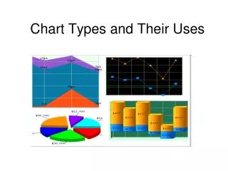
Chart Plus™ Web Part. Part of the Bamboo eLearning Series. Chart Plus™ Web Part: What does it do?. Charts can be created in minutes allowing you to visually present your data using several types of charts:. Bar. Pie. Line, Area, etc.

E N D
Chart Plus™ Web Part Part of the Bamboo eLearning Series
Chart Plus™ Web Part: What does it do? Charts can be created in minutes allowing you to visually present your data using several types of charts: Bar Pie Line, Area, etc. Present critical information such as sales per region, issues by categories, task status, or project milestones. Available in several languages including Spanish, French and German.
Case Study: Jane’s Coffee and Tea Jane sells coffees and teas around the world via her online store. She not only knows beans, but also knows that SharePoint can help her manage data associated with her global, online operations. Find out how Bamboo Web Parts are helping her “wake up” her business!
The Challenge Showcase Jane’s sales figures on her company’s corporate portal so that employees can see which products are selling in different regions each quarter. Jane would like to be able to show the revenue numbers for each individual region. Jane would like to showcase three statistics: her U.S. sales, International sales, and then total sales.
The Problem The revenue numbers are on a different scale from the unit sales. Jane needs to use a different Y-Axis to maintain the visibility, but display all the series in the same chart. Jane doesn’t have Excel Services or MOSS 2007 and cannot find an easy way to get this data into SharePoint.
The Solution - Chart Plus Web Part Jane can now easily: • Create a variety of charts (Area, Stacked Area, Bar, Stacked Bar, Bubble, Gantt, Line, or Pie) from SharePoint summary data • Display multiple sets of data on the same chart • Display columns of ungrouped data by Average, Count, Percent, or Sum • Use multiple data source types, including reading data from SharePoint List, SQL Server Table or View. • Access quick and easy pre-built templates for formatting.
Configure Chart Data in 3 Easy Steps 2. Select the Total Count and the Revenue using a different chart type to denote the difference. In this case Jane chooses to use the Line chart. 1. Select the same Chart Type for each column to be displayed in the series. In this example, Jane selects Bar as the Chart Type for both US Count and World Count columns. Chart Plus™ Web Part 3. Assign ONE of the series to use the Secondary Y-Axis. In this example, Jane selects the Revenue column to display on the Secondary Y-Axis.
The Results: Jane has created a chart using SharePoint sales data, allowing her staff to get a snapshot of product sales around the world.
Thank you! For more information about Chart Plus and to download a free, 15 day fully functional trial, visit our website at www.bamboosolutions.com We hope you enjoyed learning about our Chart Plus Web Part. Questions? Email us at sales@bamboosolutions.com