Download
1 / 27
290 likes | 903 Views
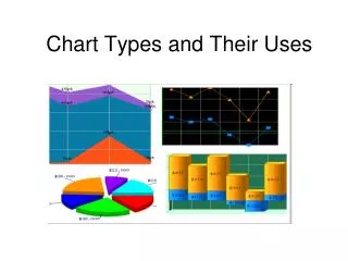
Chart Types and Their Uses. AREA CHARTS. Use it to…. Display over time (or any other dimension) How a set of data adds up to a whole (cumulated totals) Which part of the whole each element represents . Column/Bar Chart. Use it to…. Present few data; useful for comparisons of data .

E N D
Use it to… • Display over time (or any other dimension) • How a set of data adds up to a whole (cumulated totals) • Which part of the whole each element represents
Use it to… Present few data; useful for comparisons of data
DO NOT USE IT FOR… • Larger data sets: Use line charts
Selecting Bars or Columns • When in doubt, use columns • Use a horizontal bar chart if the labels are too long to fit under the columns
Use it to… • Present a part-whole relation over time (with accurate impression) • Show proportional relationships over time NOTE: Segmented column/bar charts are more accurate than pie chart, because distances can be more accurately estimated than areas.
Variants • Polygon: Connects data points through straight lines or higher order graphs • Histogram: Columns/bars touch; useful for larger sets of data points, typically used for frequency distributions • Staircase Chart: Displays only the silhouette of the histogram; useful for even larger sets of data points, typically used for frequency distributions • Step chart: Use it to illustrate trends among more than two members of nominal or ordinal scales; do not use it for two or more variables or levels of a single variable (hard to read) • Pyramid histogram: Two mirror histograms; use it for comparisons
Use it… • To display long data rows • To extrapolate beyond known data values (forecast) • To compare different graphs • To find and compare trends (changes over time) • To recognize correlations and covariations between variables
Use it to… • convey approximate proportional relationships (relative amounts) at a point in time • compare part of a whole at a given point in time • emphasize a small proportion of parts
Do NOT use it… • For exact comparisons of values, because estimating angles is difficult for people • For rank data: Use column/bar charts in this case; use multiple column/bar charts for grouped data • If proportions vary greatly; do not use multiple pies to compare corresponding parts
Caution! • Pie charts cannot represent values beyond 100% • Each pie chart is valid for one point in time only • Pie charts are only suited to presenting quite a few percentage values • Angles are harder to estimate for people than distances; perspective pie charts are even harder to interpret
Use it to… • Show measurements over time (one-dimensional scatterplot) • Convey an overall impression of the relation between two variables (Two-dimensional scatterplot)
Don’t Use it for… • Determining and comparing trends, recognition and comparison of change rates • More than one independent variable: Avoid illustrating more than one independent variable in a scatter plot
Source: • http://www.sapdesignguild.org/resources/diagram_guidelines/charts_bk.html