Download
1 / 58
610 likes | 1.31k Views
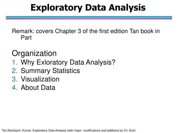
Exploratory Data Analysis. Remark: covers Chapter 3 of the first edition Tan book in Part Organization Why Exloratory Data Analysis? Summary Statistics Visualization About Data. 1. Why Data Exploration?. A preliminary exploration of the data to better understand its characteristics.

E N D
Exploratory Data Analysis Remark: covers Chapter 3 of the first edition Tan book in Part Organization Why Exloratory Data Analysis? Summary Statistics Visualization About Data
1. Why Data Exploration? A preliminary exploration of the data to better understand its characteristics. • Key motivations of data exploration include • Helping to select the right tool for preprocessing, data analysis and data mining • Making use of humans’ abilities to recognize patterns • People can recognize patterns not captured by data analysis tools • Related to the area of Exploratory Data Analysis (EDA) • Created by statistician John Tukey • Seminal book is Exploratory Data Analysis by Tukey • A nice online introduction can be found in Chapter 1 of the NIST Engineering Statistics Handbook http://www.itl.nist.gov/div898/handbook/index.htm
Exploratory Data Analysis Get Data Exploratory Data Analysis Preprocessing Data Mining
Techniques Used In Data Exploration • In EDA, as originally defined by Tukey • The focus was on visualization • Clustering and anomaly detection were viewed as exploratory techniques • In data mining, clustering and anomaly detection are major areas of interest, and not thought of as just exploratory • In our discussion of data exploration, we focus on • Summary statistics • Visualization
Iris Sample Data Set • Many of the exploratory data techniques are illustrated with the Iris Plant data set. • Can be obtained from the UCI Machine Learning Repository http://www.ics.uci.edu/~mlearn/MLRepository.html • From the statistician Douglas Fisher • Three flower types (classes): • Setosa • Virginica • Versicolour • Four (non-class) attributes • Sepal width and length • Petal width and length Virginica. Robert H. Mohlenbrock. USDA NRCS. 1995. Northeast wetland flora: Field office guide to plant species. Northeast National Technical Center, Chester, PA. Courtesy of USDA NRCS Wetland Science Institute.
2. Summary Statistics • Summary statistics are numbers that summarize properties of the data • Summarized properties include frequency, location and spread • Examples: location - mean spread - standard deviation • Most summary statistics can be calculated in a single pass through the data
Frequency and Mode • The frequency of an attribute value is the percentage of time the value occurs in the data set • For example, given the attribute ‘gender’ and a representative population of people, the gender ‘female’ occurs about 50% of the time. • The mode of a an attribute is the most frequent attribute value • The notions of frequency and mode are typically used with categorical data
Percentiles • For continuous data, the notion of a percentile is more useful. Given an ordinal or continuous attribute x and a number p between 0 and 100, the pth percentile is a value of x such that p% of the observed values of x are less than . • For instance, the 50th percentile is the value such that 50% of all values of x are less than . • Key Idea: associate attribute value with a rank!!
outlier 75th percentile 50th percentile 25th percentile Minimum (is at most 1.5 IQR off the 25th percentile) Maximum (is at most 1.5 IQR off the 75th percentile) R Box Plots (different from textbook) • R Box Plots • Invented by J. Tukey • displaying the distribution of data based on percentiles • Following figure shows the basic parts of a box plots http://chartsgraphs.wordpress.com/2008/11/18/boxplots-r-does-them-right/ IQR
Measures of Location: Mean and Median • The mean is the most common measure of the location of a set of points. • However, the mean is very sensitive to outliers. • Thus, the median or a trimmed mean is also commonly used.
Measures of Spread: Range and Variance • Range is the difference between the max and min • The variance or standard deviation • However, this is also sensitive to outliers, so that other measures are often used. 0, 2, 3, 7, 8 11.5 3.3 standard_deviation(x)= sx (Mean Absolute Deviation) [Han] (Absolute Average Deviation) [Tan] 2.8 (Median Absolute Deviation) 3 5
68-95-99.7 Rule For more details see: https://en.wikipedia.org/wiki/68%E2%80%9395%E2%80%9399.7_rule This rule assumes a Gaussian distribution! • Remark: • is mean value and • is standard deviation
Correlation • https://en.wikipedia.org/wiki/Correlation_and_dependence
Fitting Linear Models > x<-c(1,2,3) > y<-c(1,6,7) > dataset<-data.frame(x,y) > mod<-lm(y ~ x, data=dataset) > mod$coeff (Intercept) x -1.333333 3.000000 > plot(x,y) > abline(c(-1.3333,3)) > summary(mod)$r.squared [1] 0.8709677 More details: https://en.wikibooks.org/wiki/R_Programming/Linear_Models In statistics, the coefficient of determination, denoted R2 or r2 and pronounced "R squared", is the proportion of the variance in the dependent variable that is predictable from the independent variable; see: https://en.wikipedia.org/wiki/Coefficient_of_determination
3. Visualization Visualization is the conversion of data into a visual or tabular format so that the characteristics of the data and the relationships among data items or attributes can be analyzed or reported. • Visualization of data is one of the most powerful and appealing techniques for data exploration. • Humans have a well developed ability to analyze large amounts of information that is presented visually • Can detect general patterns and trends • Can detect outliers and unusual patterns
Example: Sea Surface Temperature • The following shows the Sea Surface Temperature (SST) for July 1982 • Tens of thousands of data points are summarized in a single figure
Representation (more on Vis. Sept. 9!) • Is the mapping of information to a visual format • Data objects, their attributes, and the relationships among data objects are translated into graphical elements such as points, lines, shapes, and colors. • Example: • Objects are often represented as points • Their attribute values can be represented as the position of the points or the characteristics of the points, e.g., color, size, and shape • If position is used, then the relationships of points, i.e., whether they form groups or a point is an outlier, is easily perceived.
Visualization Techniques: Histograms • Histogram • Usually shows the distribution of values of a single variable • Divide the values into bins and show a bar plot of the number of objects in each bin. • The height of each bar indicates the number of objects • Shape of histogram depends on the number of bins • Example: Petal Width (10 and 20 bins, respectively)
Two-Dimensional Histograms • Show the joint distribution of the values of two attributes • Example: petal width and petal length • What does this tell us?
Visualization Techniques: Histograms • Several variations of histograms exist: equi-bin(most popular), other approaches use variable bin sizes… • Choosing proper bin-sizes and bin-starting points is a non trivial problem!! • Example Problem from the midterm exam 2009: Assume you have an attribute A that has the attribute values that range between 0 and 6; its particular values are: 0.62 0.97 0.98 1.01. 1.02 1.07 2.96 2.97 2.99 3.02 3.03 3.06 4.96 4.97 4.98 5.02 5.03 5.04. Assume this attribute A is visualized as a equi-bin histogram with 6 bins: [0,1), [1,2), [2,3],[3,4), [4,5), [5,6]. Does the histogram provide a good approximation of the distribution/density function of attribute A? If not, provide a better histogram for attribute A. Give reasons for your answers! [7] • https://en.wikipedia.org/wiki/Histogram
outlier 75th percentile 50th percentile 25th percentile 10th percentile 90th percentile Visualization Techniques: Box Plots • Box Plots (we do not use the version depicted below!) • Invented by J. Tukey • Another way of displaying the distribution of data • Following figure shows the basic part of a box plot Also see: https://en.wikipedia.org/wiki/Box_plot
Boxplots in R (we use those!!) By default, boxplot() in R plots the maximum and the minimum non-outlying values instead of the 10th and 90th percentiles as the book describes. Outliers in BPs are values that are 1.5*IQR or more away from the box, where IQR is the height of the box! outlier • See: • > a<-c(11,12, 22, 33, 34, 100) • > boxplot(a) • > b<-c(11,12, 22, 33, 34, 65) • > boxplot(b) • a<-c(11,12,22, 33, 34, 50, 100) • boxplot(a) 75th percentile IQR (a proxy for standard deviation) 50th percentile 25th percentile 10th percentile 90th percentile Maximum non-outlier Minimum non-outlier
Example of R Box Plots (Mid1 Question) b) The following boxplot has been created using the following R-code for an attribute x: > x<-c(1,2,2,2,4,4,8,9,9,10,18,22) > boxplot(x) R version 3.4.3: Kite-Eating Tree What is the median for the attribute x? What is the IQR for the attribute x? The lower whisker of the boxplot as at 1; what does this tell you? According the boxplot 18 is not an outlier and 22 as an outlier; why do you believe this is the case? [5] Median is 6=(4+8)/2 [1] IQR=9.5-2=7.5 [1] 1 is the lowest value in the dataset that is not an outlier [1]Every value that is 1.5*IQR above the 75th percentile is an outlier; that is, for the particular boxplots values above 9.5+1.5*7.5=20.75 and below the 25th percentile -9.25 are outliers; consequently, 22 is an outlier and 1 and18 is not, and the whiskers are therefore at 1 and 18! [2]
Attibute Standardization: Z-scores • Attribute Standardization/Normalizationmakes attributes equally import, alleviates impact of attribute scale • Z-score standardization: • Calculate the mean mf, the standard deviation sf: • Calculate the standardized measurement (z-score) • Result of Z-score standardization is a dataset in which each attribute has a mean of 0 and a standard deviation of 1. • The obtained attribute values allow for statistical interpretation: e.g. if a person’s z-scored age is -1 her age is on standard deviation below the average age… • Z-scores can be interpreted based on the 68-95-99.7 Rule! http://en.wikipedia.org/wiki/Standard_score
[0,1] Attribute Standardization Approach: Normalize interval-scaled variables using where minf denotes the minimum value and maxfdenotes the maximum value of the f-th attribute in the data set; that is, all values of the normalized dataset are numbers in [0,1]. Question: if the normalized value of an attribute is 0; what does this mean?
Visualization Techniques: Scatter Plots • Scatter plots • Attributes values determine the position • Two-dimensional scatter plots most common, but can have three-dimensional scatter plots • Often additional attributes can be displayed by using the size, shape, and color of the markers that represent the objects • It is useful to have arrays of scatter plots can compactly summarize the relationships of several pairs of attributes • For prediction scatter plots see: http://en.wikipedia.org/wiki/Scatter_plot http://en.wikipedia.org/wiki/Correlation (Correlation) • See example for classification, also called supervised scatter plots, on the next slide
Scatter Plot Old Faithful Eruptions http://en.wikipedia.org/wiki/Old_Faithful
Visualization Techniques: Contour Plots • Contour plots • Useful when a continuous attribute is measured on a spatial grid • They partition the plane into regions of similar values • The contour lines that form the boundaries of these regions connect points with equal values • The most common example is contour maps of elevation • Can also display temperature, rainfall, air pressure, etc. • An example for Sea Surface Temperature (SST) is provided on the next slide https://plot.ly/r/contour-plots/
Celsius Contour Plot Example: SST Dec, 1998
Density Plots • https://en.wikipedia.org/wiki/Probability_density_function • http://ggplot2.tidyverse.org/reference/geom_density_2d.html • https://python-graph-gallery.com/2d-density-plot/ • Sept. 6/11: Discussion of underlying approaches to create density plots.
Visualization Techniques: Parallel Coordinates • Parallel Coordinates • Used to plot the attribute values of high-dimensional data • Instead of using perpendicular axes, use a set of parallel axes • The attribute values of each object are plotted as a point on each corresponding coordinate axis and the points are connected by a line • Thus, each object is represented as a line • Often, the lines representing a distinct class of objects group together, at least for some attributes • Ordering of attributes is important in seeing such groupings
Other Visualization Techniques • Star Coordinate Plots • Similar approach to parallel coordinates, but axes radiate from a central point • The line connecting the values of an object is a polygon • Chernoff Faces • Approach created by Herman Chernoff • This approach associates each attribute with a characteristic of a face • The values of each attribute determine the appearance of the corresponding facial characteristic • Each object becomes a separate face • Relies on human’s ability to distinguish faces • http://people.cs.uchicago.edu/~wiseman/chernoff/ • http://kspark.kaist.ac.kr/Human%20Engineering.files/Chernoff/Chernoff%20Faces.htm#
Star Plots for Iris Data Setosa Versicolour Virginica Pedal length Sepal Width Sepal length Pedal width
Chernoff Faces for Iris Data Translation: sepal lengthsize of face; sepal width forhead/jaw relative to arc-length; Pedal lengthshape of forhead; pedal width shape of jaw; width of mouth…; width between eyes… Setosa Versicolour Virginica
Useful Background “Engineering St. Handbook” • http://www.itl.nist.gov/div898/handbook/eda/section1/eda15.htm (graphical techniques) • http://www.itl.nist.gov/div898/handbook/eda/section3/eda35.htm (quantitative analysis) • http://www.itl.nist.gov/div898/handbook/eda/section2/eda23.htm (testing assumptions) • http://www.itl.nist.gov/div898/handbook/eda/section3/eda34.htm (survey graphical techniques) Remark: The material is very good if your focus is on prediction, hypothesis testing, clustering; however, providing good visualizations/statistics for classification problems is not discussed much…
4. About Data Remark: This subsection discusses “basics concerning data sets (first half of Chapter 2) but does not discuss preprocessing. Preprocessing will be discussed in late October.
What is Data? • Collection of data objects and their attributes • An attribute is a property or characteristic of an object • Examples: eye color of a person, temperature, etc. • Attribute is also known as variable, field, characteristic, or feature • A collection of attributes describe an object • Object is also known as record, point, case, sample, entity, or instance Attributes Objects
Attribute Values • Attribute values are numbers or symbols assigned to an attribute • Distinction between attributes and attribute values • Same attribute can be mapped to different attribute values • Example: height can be measured in feet or meters • Different attributes can be mapped to the same set of values • Example: Attribute values for ID and age are integers • But properties of attribute values can be different • ID has no limit but age has a maximum and minimum value
Types of Attributes • There are different types of attributes • Nominal • Examples: ID numbers, eye color, zip codes • Ordinal • Examples: rankings (e.g., taste of potato chips on a scale from 1-10), grades, height in {tall, medium, short} • Interval • Examples: calendar dates, temperatures in Celsius or Fahrenheit. • Ratio • Examples: temperature in Kelvin, length, time, counts
Properties of Attribute Values • The type of an attribute depends on which of the following properties it possesses: • Distinctness: = • Order: < > • Addition: + - • Multiplication: * / • Nominal attribute: distinctness • Ordinal attribute: distinctness & order • Interval attribute: distinctness, order & addition • Ratio attribute: all 4 properties
Attribute Type Description Examples Operations Nominal The values of a nominal attribute are just different names, i.e., nominal attributes provide only enough information to distinguish one object from another. (=, ) zip codes, employee ID numbers, eye color, sex: {male, female} mode, entropy, contingency correlation, 2 test Ordinal The values of an ordinal attribute provide enough information to order objects. (<, >) hardness of minerals, {good, better, best}, grades, street numbers median, percentiles, rank correlation, run tests, sign tests Interval For interval attributes, the differences between values are meaningful, i.e., a unit of measurement exists. (+, - ) calendar dates, temperature in Celsius or Fahrenheit mean, standard deviation, Pearson's correlation, t and F tests Ratio For ratio variables, both differences and ratios are meaningful. (*, /) temperature in Kelvin, monetary quantities, counts, age, mass, length, electrical current geometric mean, harmonic mean, percent variation
Attribute Level Transformation Comments Nominal Any permutation of values If all employee ID numbers were reassigned, would it make any difference? Ordinal An order preserving change of values, i.e., new_value = f(old_value) where f is a monotonic function. An attribute encompassing the notion of good, better best can be represented equally well by the values {1, 2, 3} or by { 0.5, 1, 10}. Interval new_value =a * old_value + b where a and b are constants Thus, the Fahrenheit and Celsius temperature scales differ in terms of where their zero value is and the size of a unit (degree). Ratio new_value = a * old_value Length can be measured in meters or feet.
Discrete and Continuous Attributes • Discrete Attribute • Has only a finite or countably infinite set of values • Examples: zip codes, counts, or the set of words in a collection of documents • Often represented as integer variables. • Note: binary attributes are a special case of discrete attributes • Continuous Attribute • Has real numbers as attribute values • Examples: temperature, height, or weight. • Practically, real values can only be measured and represented using a finite number of digits. • Continuous attributes are typically represented as floating-point variables. • Different evaluation measures are used in conjunction with continuous attributes
The remainder of the slides in this file will not be discussed in Fall 2019! Types of data sets • Record • Data Matrix • Document Data • Transaction Data • Graph • World Wide Web • Molecular Structures • Ordered • Spatial Data • Temporal Data • Sequential Data • Genetic Sequence Data
Important Characteristics of Structured Data • Dimensionality • Curse of Dimensionality • Sparsity • Only presence counts • Resolution • Patterns depend on the scale
Record Data • Data that consists of a collection of records, each of which consists of a fixed set of attributes