Download
1 / 27
270 likes | 400 Views
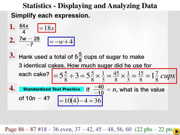
Statistics - Displaying and Analyzing Data. Math Pacing. 1. 2. 3. 4. Page 86 – 87 #18 – 36 even, 37 – 42, 45 – 48, 56, 60 (22 pbs – 22 pts). Statistics - Displaying and Analyzing Data. How many people do you know with the same first name?

E N D
Statistics - Displaying and Analyzing Data Math Pacing 1. 2. 3. 4. Page 86 – 87 #18 – 36 even, 37 – 42, 45 – 48, 56, 60 (22 pbs – 22 pts)
Statistics - Displaying and Analyzing Data How many people do you know with the same first name? Some names are more popular than others. The table lists the top five most popular names for boys and girls born in each decade from 1950 to 1999. Statistics
Statistics - Displaying and Analyzing Data To help determine which names appear most frequently, these data could be displayed graphically. In some cases, data can be presented using a line plot. Most line plots have a number line labeled with a scale to include all the data. Then an × is placed above a data point each time it occurs to represent the frequency of the data. Statistics
Create a Line Plot Example 5-1a Draw a line plot for the data. 11 –2 10 –2 7 2 7 4 9 0 6 9 7 2 0 4 10 7 6 9 Step 1 The values of the data range from –2 to 11, so construct a number line containing these values. Step 2 Then place an a number for each time it occurs.
Answer: Create a Line Plot Example 5-1b Draw a line plot for the data. 3 5 7 6 0 –4 6 4 7 0 0 –2 3 7 Line plots are a convenient way to organize data for comparison.
Use a Line Plot to Solve a Problem Example 5-2a Traffic The highway patrol did a radar survey of the speeds of cars along a stretch of highway for 1 minute. The speeds (in miles per hour) of the 20 cars that passed are listed below. 72 70 72 74 68 69 70 72 74 75 79 75 74 72 70 64 69 66 68 67 Make a line plot of the data. The lowest value is 64 and the highest value is 79, so use a scale that includes those values. Place an above each value for each occurrence.
Answer: Use a Line Plot to Solve a Problem Example 5-2b
Use a Line Plot to Solve a Problem Example 5-2c Which speed occurs the most frequently? Answer: Looking at the line plot, we can easily see that 72 miles per hour occurs most frequently.
Answer: Use a Line Plot to Solve a Problem Example 5-2d Family Size Students in Mrs. Barrett’s class listed the number of family members in their households below. 6 4 8 3 3 5 4 4 3 5 5 2 5 6 3 5 6 2 4 4 4 a. Make a line plot of the data. b. Which family size occurs the most frequently? Answer: 4
Statistics - Displaying and Analyzing Data greatest common place value is used for the stems. The numbers in the next greatest place value are used to form the leaves. Statistics Another way to organize data is by using a stem-and-leaf plot. In a stem-and-leaf plot, the
Create a Stem-and-Leaf Plot Example 5-3a Use the data below to make a stem-and-leaf plot. 85 115 126 92 104 107 78 131 114 9285 116 100 121 123 131 88 97 99 11679 90 110 129 108 93 84 75 70 132 The greatest common place value is tens, so the digits in the tens place are the stems.
Stem 7 8 9 10 11 12 13 Leaf 0 5 8 9 4 5 5 8 0 2 2 3 7 9 0 4 7 8 0 4 5 6 6 1 3 6 9 1 1 2 Answer: Create a Stem-and-Leaf Plot Example 5-3b The leaves are in numerical order. A key is included to indicate what the stems and leaves represent when read
Stem 0 1 2 3 Leaf 3 5 7 0 0 1 1 2 3 5 1 1 5 2 7 Answer: Create a Stem-and-Leaf Plot Example 5-3c Use the data below to make a stem-and-leaf plot. 3 5 7 11 10 15 21 11 13 25 32 37 21 10 12 A back-to-back stem-and-leaf plot can be used to compare two related sets of data.
Back-to-Back Stem-and-Leaf Plot Example 5-4a Weather Monique wants to compare the monthly average high temperatures of Dallas and Atlanta before she decides to which city she wants to move. The table shows the monthly high temperatures (F) for both cities.
Dallas Stem Atlanta 9 7 4 5 0 4 5 8 6 6 3 4 8 7 7 2 2 5 7 3 8 1 5 7 8 5 5 1 9 Answer: Back-to-Back Stem-and-Leaf Plot Example 5-4b Make a stem-and-leaf plot to compare the data. To compare the data we can use a back-to-back stem-and-leaf plot. Since the data represent similar measurements, the plot will share a common stem.
Dallas Stem Atlanta 9 7 4 5 0 4 5 8 6 6 3 4 8 7 7 2 2 5 7 3 8 1 5 7 8 5 5 1 9 Back-to-Back Stem-and-Leaf Plot Example 5-4c What is the difference between the highest average temperatures in each city? Answer: 95 – 88 or 7°
Dallas Stem Atlanta 9 7 4 5 0 4 5 8 6 6 3 4 8 7 7 2 2 5 7 3 8 1 5 7 8 5 5 1 9 Back-to-Back Stem-and-Leaf Plot Example 5-4d Which city has higher average temperatures? Answer: Looking at the temperatures of 80 and above, we can see that Dallas has a higher number of average temperatures above 80°.
Back-to-Back Stem-and-Leaf Plot Example 5-4e Ms. Smith wants to compare the final grades for two of her classes. The table shows the scores for both classes.
Class A Stem Class B 1 5 7 4 6 2 9 6 5 1 7 2 6 7 7 1 8 3 5 8 6 2 9 1 9 Answer: Back-to-Back Stem-and-Leaf Plot Example 5-4f a. Make a back-to-back stem-and-leaf plot to compare the data.
b. What is the difference between the highest score in each class? c. Which class scored higher overall for the grading period? Class A Stem Class B 1 5 7 4 6 2 9 6 5 1 7 2 6 7 7 1 8 3 5 8 6 2 9 1 9 Back-to-Back Stem-and-Leaf Plot Example 5-4g Answer: 1 point Answer: Class A
Statistics - Displaying and Analyzing Data When analyzing data, it is helpful to have one number that describes the set of data. Numbers known as measures of central tendency are often used to describe sets of data because they represent a centralized, or middle value. Three of the most commonly used measures of central tendency are the mean, median and mode. Statistics
Statistics - Displaying and Analyzing Data When you use a measure of central tendency to describe a set of data, it is important that the measure you use best represents all of the data. Extremely high or low values can affect the mean, while not affecting the median or mode. A value with a high frequency can cause the mode to be misleading. Data that is clustered with a few values separate from the cluster can cause the median to be too low or too high. Statistics
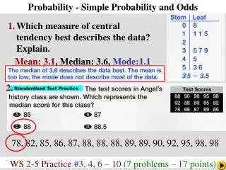
Stem 4 5 6 7 8 Leaf 1 1 2 4 4 4 5 8 0 2 5 7 3 9 1 Analyze Data Example 5-5a Which measure of central tendency best represents the data? Determine the mean, median, and mode. The mean is about 5.5. Add the data and divide by 15. The median is 4.8. The middle value is 4.8 The mode is 4.4. The most frequent value is 4.4.
Stem 4 5 6 7 8 Leaf 1 1 2 4 4 4 5 8 0 2 5 7 3 9 1 Analyze Data Example 5-5b The mean is about 5.5. The median is 4.8. The mode is 4.4. Answer: Either the median or the mode best represent the set of data since both measures are located in the center of the majority of the data. In this instance, the mean is too high.
Stem 1 2 3 4 5 Leaf 0 1 1 5 6 8 3 7 8 2 6 4 5 9 Analyze Data Example 5-5c Which measure of central tendency best represents the data? Answer: The mean is about 2.9. The median is 2.5. The mode is 1.1. Either the mean or median can be used to represent the data. The mode is too low.
Example 5-6a Determine the Best Measures of Central Tendency Politics The number of electoral college votes for the 12 most populous states in the 2000 Presidential election are listed below. Which measure of central tendency best represents the data? 21 22 18 23 15 2514 32 13 33 13 54 The mean is about 23.6. Add the data and divide by 12. The median is 21.5. The middle value is 21.5. The mode is 13. The most frequent value is 13. Answer: Either the mean or median can be used to best represent the data. The mode is too low.
Example 5-6b Determine the Best Measures of Central Tendency The number of points scored by the basketball team during each game in the season is listed below. Which measure of central tendency best represents the data? 48 45 52 63 59 64 67 72 5851 81 62 73 68 82 73 70 65 Answer: Either the mean or the median can be used to best represent the data. The mode is too high.