Download
1 / 17
170 likes | 307 Views
COMP 3503 Deductive Modeling and Visualization. with Daniel L. Silver. Agenda. Deductive and Inductive Modeling Visualization and Graphical Exploratory Methods. The KDD Process. Interpretation and Evaluation. Data Mining . Knowledge. Selection and Preprocessing. p(x)=0.02. Data

E N D
COMP 3503Deductive Modeling and Visualization with Daniel L. Silver
Agenda • Deductive and Inductive Modeling • Visualization and Graphical Exploratory Methods
The KDD Process Interpretation and Evaluation Data Mining Knowledge Selection and Preprocessing p(x)=0.02 Data Consolidation Warehouse
Selection and Preprocessing • Part of TL functions of ETL • Generate/Sample a set of examples • Explore the data • Reduce attribute dimensionality • Reduce attribute value ranges • Transform data • Encode data OLAP and visualization tools play key role
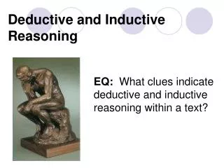
Induction versus Deduction Top-down verification of hypothesis Deduction Model or General Rule Example A Example B Example C Induction Bottom-up construction of hypothesis
Deductive Modeling • Top-down (toward the data) verification of an hypothesis • The hypothesis is generated within the mind of the data miner (limited by human preconceptions) • Exploratory tools: • Query and response/report (SQL-like) software • Data visualization software • OLAP – On-Line Analytical Processing • Models are used for description
Inductive Modeling • Bottom-up (from the data) development of an hypothesis • The hypothesis is generated by the technology directly from the data • Statistical and machine learning tools such as regression, decision trees and artificial neural networks are used • Models can be used for prediction
Deductive Exploratory Methods Interactive Visualization Tools • Graphs and statistics from data • Histograms of value distribution • 2D, 3D, plus colors and shapes for nD • Time-series plots and animations • Can require training and practice Response MS Excel,IBM Cognos Temp Velocity
Which type of graph do I use? • Depends on • The type of data • The type of analysis • The availability of statistical software • What you want to illustrate/explore • When creating graphs for others to interpret: • Keep in mind what you are trying to communicate • Be clear, concise, and consistent • Label all your documents! This slide courtesy Anders Stjarne
Bar Charts • Summarizes categorical data • Horizontal axis represents categories, while vertical axis represents either counts (“frequencies”) or percentages (“relative frequencies”) • Used to illustrate the differences in percentages (or counts) between categories. This slide courtesy Anders Stjarne
Histograms • Divide measurement up into equal-sized categories. • Each bar’s height represents number (or percent) falling into a category This slide courtesy Anders Stjarne
Box Plots upper quartile whiskers outliers • “Whiskers” are drawn to not more than 1.5 times the length of the box beyond either quartile • “Outliers,” or observations outside of this statistic (shown as asterix). • For details see - http://davidmlane.com/hyperstat/A37797.html lower quartile median This slide courtesy Anders Stjarne
Scatter Plots • Summarizes the relationship between two measurement variables. • Horizontal axis represents one variable and vertical axis represents second variable. • Plot one point for each pair of measurements. This slide courtesy Anders Stjarne
Brushplots • One of the most common, and historically first widely used visualization technique explicitly identified as exploratory data analysis, is known as brushing. Weka provides a brushings view. This slide courtesy Anders Stjarne
Deductive Exploratory Methods DEMO Excel and WEKA Capabilities