Download
1 / 36
400 likes | 1.6k Views
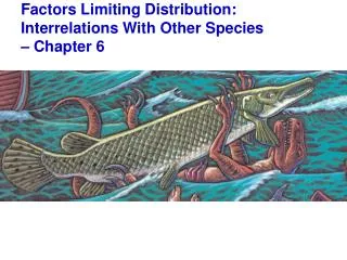
Figure 50.5 Flowchart of factors limiting geographic distribution. Figure 50.9 Predator-removal experiments. Figure 50.10 A climograph for some major kinds of ecosystems (biomes) in North America. Figure 50.18 Zonation in a lake.

E N D
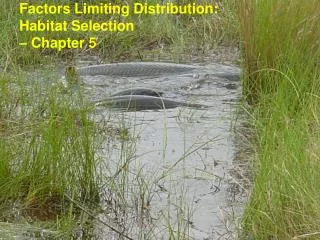
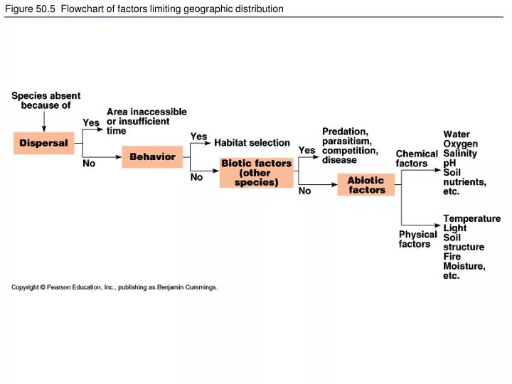
Figure 50.5 Flowchart of factors limiting geographic distribution
Figure 50.10 A climograph for some major kinds of ecosystems (biomes) in North America
Figure 50.19 Freshwater biomes: Oligotrophic lake (left), eutrophic lake (top right), stream flowing into a river (bottom right)
Figure 52.8 Population growth predicted by the exponential model
Figure 52.9 Example of exponential population growth in nature
Figure 52.10 Reduction of population growth rate with increasing population size (N)
Figure 52.11 Population growth predicted by the logistic model
Figure 52.12 How well do these populations fit the logistic population growth model?
Figure 52.13 Graphic model showing how equilibrium may be determined for population density
Figure 53.2 Testing a competitive exclusion hypothesis in the field
Figure 53.6 Aposematic (warning) coloration in a poisonous blue frog
Figure 53.8 Müllerian mimicry: Cuckoo bee (left), yellow jacket (right)
Figure 53.x2 Parasitic behavior: A female Nasonia vitripennis laying a clutch of eggs into the pupa of a blowfly (Phormia regina)
Figure 54.14 Food energy available to the human population at different trophic levels