Download
1 / 205
2.05k likes | 2.07k Views
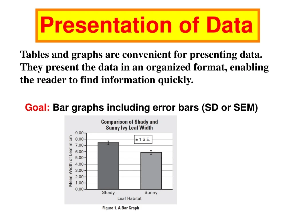
Presentation of Data. Tables and graphs are convenient for presenting data. They present the data in an organized format, enabling the reader to find information quickly. Goal: Bar graphs including error bars (SD or SEM). Data Tables. Table 1.

E N D
Presentation of Data Tables and graphs are convenient for presenting data. They present the data in an organized format, enabling the reader to find information quickly. Goal: Bar graphs including error bars (SD or SEM)
Data Tables Table 1 Tables are most easily constructed using your word processor's table function or a spread sheet such as Excel.
Tables should be numbered sequentially beginning with Table 1. Include a descriptive title. The title should enable the reader to understand the table without reading the rest of the document. When creating tables, be sure to state the units of all measurements. Example: Table 1. Number of bird species observed in 10 different woodlots in Clinton County, NY on January 18, 2006. Each bird count was done by two observers over a 1-hour period beginning at 8:00 AM.
Graphs There are four common types of graphs used in biology: bar graph, frequency histogram, XY scatterplot, XY line graph.
Bar Graphs Bar graphs are best when the data are in groups or categories.
The data in the example below come from population counts of several different kinds of mammals in a woodlot in Clinton County, NY in July 2006. Grey squirrel – 8 Red squirrels – 4 Chipmunks - 17 White-footed mice – 26 White-tailed deer – 2 A bar graph is best for these data because they are categories; it is not possible to have a data point that is between grey squirrels and red squirrels.
Parts of a Graph: This is an example of a typical bar graph with the various component parts labeled in red. Figure 1: Mean germination (%) (+SD) of gourd seeds following various pregermination treatments
Frequency Histogram Frequency histograms (also called frequency distributions) are bar-type graphs that show how the measured individuals are distributed along an axis of the measured variable. Frequency (the Y axis) can be absolute (i.e. number of counts) or relative (i.e. percent or proportion of the sample.)
A familiar example would be a histogram of exam scores, showing the number of students who achieved each possible score. UC Davis
When an investigation involves measurement data, one of the first steps is to construct a histogram to represent the data’s distribution to see if it approximates a normal distribution Creating this kind of graph requires setting up bins—uniform range intervals that cover the entire range of the data. Then the number of measurements that fit in each bin (range of units) are counted and graphed on a frequency diagram, or histogram.
Bar charts are very like histograms except that the columns are not usually adjacent to one another. This is to emphasize the point that these data are notdirectly related to one another. They could be placed in any order.
Error bars are a graphical representation of the variability of data and are used on graphs to indicate the error, or uncertainty in a reported measurement. They give a general idea of how accurate a measurement is, or conversely, how far from the reported value the true (error free) value might be. Error bars often represent one standard deviation of uncertainty or one standard error. These quantities are not the same and so the measure selected should be stated explicitly in the graph or supporting text.
Many questions and investigations in biology call for a comparison of populations. For example, Are the spines on fish in one lake without predators shorter than the spines on fish in another lake with predators? or Are the leaves of ivy grown in the sun different from the leaves of ivy grown in the shade? If the variables are measured variables, then the best graph to represent the data is probably a bar graph of the means of the two samples with standard error indicated (Figure 1).
In Figure 1, the sample standard error bar (also known as the sample error of the sample mean) is a notation at the top of each shaded bar that shows the sample standard error (SE, in this case, ±1).
Sample standard error bars are not particularly easy to plot on a graph, however. In Excel, for example, the user needs to choose the “custom error bar” option. An Internet search will yield links to video instructions on “how to plot error bars in Excel.” http://www.youtube.com/watch?v=G10_qGcuELA Most of the time, bar graphs should include standard error rather than standard deviation. The standard error bars provide more information about how different the two means may be from each other.
For some labs, students should include standard error (or standard deviation) in their analysis and use standard error bars on their graphical displays when appropriate. Error bars or not?Always include error bars (SD or SEM) when plotting means. In some courses you may be asked to plot other measures associated with the mean, such as confidence intervals.
Error bars can be used to compare visually two quantities if various other conditions hold. This can determine whether differences are statistically significant
The graph show an overlap of the error bar. If two SE error bars overlap you can conclude that the difference is not statistically significant. Sample A and Sample B are not significantly different.
If the two error bars do not overlap then we CANNOT conclude that they are statistically different. At this stage the student should proceed to a t-test to determine any statistically significant difference.
Making a Bar Graph with Error Bars with EXCEL
Example: Some students grow tomato plants with and without fertilizer. (1) Create a data table using EXCEL. (2) Calculate the mean, standard deviation, and standard error (SEM) of their data (3) Make a bar graph comparing their means including SEM error bars.
Highlight the two average cells and the column titles (so they show up on graph) Insert | Chart | Column Add title, axes labels
4. Click on left axis Change minimum to 0 Maximum to 50 5. Click on series 1… delete
Youtube that explains how to do error bars: http://www.youtube.com/watch?v=G10_qGcuELA Click chart |Choose Chart on menu bar | Source data | columns This will allow you to add error bars separately
Make the overlap negative This will separate the columns
Now click on one column and then add Y error bars… the value is on your data table
+/- SEM control fertilizer Add with text box
PROBLEM 6: do these and print out your bar graph http://www.youtube.com/watch?v=G10_qGcuELA Example: Some students grow tomato plants with and without fertilizer. (1) Create a data table using EXCEL. (2) Calculate the mean, standard deviation, and standard error (SEM) of their data (3) Make a bar graph comparing their means including SEM error bars.
X,Y scatterplot These are plots of X,Y coordinates showing each individual's or sample's score on two variables. When plotting data this way we are usually interested in knowing whether the two variables show a "relationship", i.e. do they change in value together in a consistent way? When comparing one measured variable against another—looking for trends or associations— it is appropriate to plot the individual data points on an x-y plot, creating a scatterplot.
A scatter plot is a type of graph that shows how two sets of data might be connected. When you plot a series of points on a graph, you’ll have a visual idea of whether your data might have a linear, exponential or some other kind of connection. Creating scatter plots by hand can be cumbersome, especially if you have a large number of plot points. Microsoft Excel has a built in graphing utility that can instantly create a scatter plot from your data. This enables you to look at your data and perform further tests without having to re-enter your data. For example, if your scatter plot looks like it might be a linear relationship, you can perform linear regression in one or two clicks of your mouse.
If the relationship is thought to be linear, a linear regression line can be calculated and plotted to help filter out the pattern that is not always apparent in a sea of dots (Figure 3).
In this example, the value of r (square root of R2) can be used to help determine if there is a statistical correlation between the x and y variables to infer the possibility of causal mechanisms. Such correlations point to further questions where variables are manipulated to test hypotheses about how the variables are correlated.
Students can also use scatterplots to plot a manipulated independent x-variable against the dependent y-variable. Students should become familiar with the shapes they’ll find in such scatterplots and the biological implications of these shapes.
A concave upward curve is associated with exponentially increasing functions (for example, in the early stages of bacterial growth).
In ecology, a species-area curve is a relationship between the area of a habitat, or of part of a habitat, and the number of species found within that area.
A sine wave–like curve is associated with a biological rhythm.
A sine wave–like curve is associated with a biological rhythm. Figure 1: Predator-Prey Curve
Elements of effective graphing Students will usually use computer software to create their graphs. In so doing, they should keep in mind the following elements of effective graphing: • A graph must have a title that informs the reader about the experiment and tells the reader exactly what is being measured. • The reader should be able to easily identify each line or bar on the graph.
Big or little? For course-related papers, a good rule of thumb is to size your figures to fill about one-half of a page. Readers should not have to reach for a magnifying glass to make out the details. Compound figures may require a full page
• Axes must be clearly labeled with units as follows: ––The x-axis shows the independent variable. Time is an example of an independent variable. Other possibilities for an independent variable might be light intensity or the concentration of a hormone or nutrient. ––The y-axis denotes the dependent variable— the variable that is being affected by the condition (independent variable) shown on the x-axis.