Download
1 / 108
1.09k likes | 1.13k Views
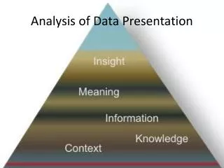
Presentation of Data. http://udel.edu/~mcdonald/statspreadsheet.html. Tables and graphs are convenient for presenting data. They present the data in an organized format, enabling the reader to find information quickly. Data Tables. Table 1.

E N D
Presentation of Data http://udel.edu/~mcdonald/statspreadsheet.html
Tables and graphs are convenient for presenting data. They present the data in an organized format, enabling the reader to find information quickly.
Data Tables Table 1
Tables should be numbered sequentially beginning with Table 1. Include a descriptive title. The title should enable the reader to understand the table without reading the rest of the document. When creating tables, be sure to state the units of all measurements. Example: Table 1. Number of bird species observed in 10 different woodlots in Clinton County, NY on January 18, 2006. Each bird count was done by two observers over a 1-hour period beginning at 8:00 AM.
The Anatomy of a Table Table 4 below shows the typical layout of a table in three sections demarcated by lines. Tables are most easily constructed using your word processor's table function or a spread sheet such as Excel. Gridlines or boxes, commonly invoked by word processors, are helpful for setting cell and column alignments, but should be eliminated from the printed version (for published papers). Tables formatted with cell boundaries showing are unlikely to be permitted in a journal.
Where do you place the legend? Table legends go above the body of the Table and are left justified; Tables are read from the top down.
In these examples notice several things: 1. the presence of a period after "Table #"; 2. the legend (sometimes called the caption) goes above the Table; 3. units are specified in column headings wherever appropriate; 4. lines of demarcation are used to set legend, headers, data, and footnotes apart from one another. 5. footnotes are used to clarify points in the table, or to convey repetitive information about entries; 6. footnotes may also be used to denote statistical differences among groups.
The Anatomy of a Figure The four most common Figure types (bar graph, frequency histogram, XY scatterplot, XY line graph.) Title or no title? Never use a title for Figures included in a paper; the legend conveys all the necessary information and the title just takes up extra space. However, for posters or projected images, where people may have a harder time reading the small print of a legend, a larger font title is very helpful. Where do you place the legend? Figure legends go below the graph; graphs and other types of Figures are usually read from the bottom up.
Parts of a Graph: This is an example of a typical line graph with the various component parts labeled in red.
Bar Graphs Bar graphs are best when the data are in groups or categories.
The data in the example below come from population counts of several different kinds of mammals in a woodlot in Clinton County, NY in July 2006. Grey squirrel – 8 Red squirrels – 4 Chipmunks - 17 White-footed mice – 26 White-tailed deer – 2 A bar graph is best for these data because they are categories; it is not possible to have a data point that is between grey squirrels and red squirrels.
Parts of a Graph: This is an example of a typical bar graph with the various component parts labeled in red. Figure 1: Mean germination (%) (+SD) of gourd seeds following various pregermination treatments
Many questions and investigations in biology call for a comparison of populations. For example, Are the spines on fish in one lake without predators shorter than the spines on fish in another lake with predators? or Are the leaves of ivy grown in the sun different from the leaves of ivy grown in the shade? If the variables are measured variables, then the best graph to represent the data is probably a bar graph of the means of the two samples with standard error indicated (Figure 1).
In Figure 1, the sample standard error bar (also known as the sample error of the sample mean) is a notation at the top of each shaded bar that shows the sample standard error (SE, in this case, ±1).
Most of the time, bar graphs should include standard error rather than standard deviation. The standard error bars provide more information about how different the two means may be from each other.
Sample standard error bars are not particularly easy to plot on a graph, however. In Excel, for example, the user needs to choose the “custom error bar” option. An Internet search will yield links to video instructions on “how to plot error bars in Excel.”
Frequency Histogram Frequency histograms (also called frequency distributions) are bar-type graphs that show how the measured individuals are distributed along an axis of the measured variable. Frequency (the Y axis) can be absolute (i.e. number of counts) or relative (i.e. percent or proportion of the sample.)
Frequency histograms are important in describing populations, e.g. size and age distributions.
A familiar example would be a histogram of exam scores, showing the number of students who achieved each possible score. Physics 2 CSU
A familiar example would be a histogram of exam scores, showing the number of students who achieved each possible score. UC Davis
Bar charts are very like histograms except that the columns are not usually adjacent to one another. This is to emphasize the point that these data are notdirectly related to one another. They could be placed in any order.
When an investigation involves measurement data, one of the first steps is to construct a histogram to represent the data’s distribution to see if it approximates a normal distribution Creating this kind of graph requires setting up bins—uniform range intervals that cover the entire range of the data. Then the number of measurements that fit in each bin (range of units) are counted and graphed on a frequency diagram, or histogram.
If enough measurements are made, the data can show an approximate normal distribution, or bell-shaped distribution, on a histogram. These constitute parametric data. The normal distribution is very common in biology and is a basis for the predictive power of statistical analysis.
Left: The theoretical normal distribution. Right: Frequencies of 5,000 numbers randomly generated to fit the normal distribution. The proportions of this data within 1, 2, or 3 standard deviations of the mean fit quite nicely to that expected from the theoretical normal distribution.
If the data do not approximate a normal distribution (that is, they are nonparametric data), then other descriptive statistics and tests need to be applied to those data. Figure 5 shows a histogram with nonparametric data.
The proportions of the data that are within 1, 2, or 3 standard deviations of the mean are different if the data do not fit the normal distribution, as shown for these two very non-normal data sets:
Keep in mind, though, that even though a distribution does not reflect a perfect bell curve, it doesn’t mean that the actual population is not normally distributed.
Notice several things about this example: 1. the Y axis includes a clear indication ("%") that relative frequencies are used. (Some examples of an absolute frequencies: "Number of stems", "Number of birds observed") 2. the measured variable (X axis) has been divided into categories ("bins") of appropriate width to visualize the population distribution. In this case, bins of 0.2 cm broke the population into 7 columns of varying heights. Setting the bin size at 0.5 cm would have yielded only 3 columns, not enough to visualize a pattern. Conversely, setting the bin size too small (0.05 cm) would have yielded very short columns scattered along a long axis, again obscuring the pattern.
3. the values labeled on the X axis are the bin centers; 4. sample size is clearly indicated, either in the legend or (in this case) the graph itself; 5. the Y axis includes numbered and minor ticks to allow easy determination of bar values.
X,Y scatterplot These are plots of X,Y coordinates showing each individual's or sample's score on two variables. When plotting data this way we are usually interested in knowing whether the two variables show a "relationship", i.e. do they change in value together in a consistent way?
When comparing one measured variable against another—looking for trends or associations—it is appropriate to plot the individual data points on an x-y plot, creating a scatterplot.
A scatter plot is a type of graph that shows how two sets of data might be connected. When you plot a series of points on a graph, you’ll have a visual idea of whether your data might have a linear, exponential or some other kind of connection. Creating scatter plots by hand can be cumbersome, especially if you have a large number of plot points. Microsoft Excel has a built in graphing utility that can instantly create a scatter plot from your data. This enables you to look at your data and perform further tests without having to re-enter your data. For example, if your scatter plot looks like it might be a linear relationship, you can perform linear regression in one or two clicks of your mouse.