Download
1 / 61
630 likes | 797 Views
Based on a Microsoft presentation. Introduction to WPF. .NET At The Core. Topics. Windows Presentation Foundation Overview 2D Controls and Layout Styles, Templates & Resources Data Binding Animation. Overview. Now. GDI (20 years), GDI+, WinForms DirectX (11 years), Direct3D

E N D
Based on a Microsoft presentation Introduction to WPF
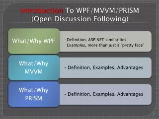
Topics • Windows Presentation Foundation • Overview • 2D • Controls and Layout • Styles, Templates & Resources • Data Binding • Animation
Now • GDI (20 years), GDI+, WinForms • DirectX (11 years), Direct3D • Quartz, DirectShow (8 years) • Problems • Showing their age • Each API is different • Mixing APIs is challenging
Next Gen • WPF – replaces GDI • Direct3D – large games, used by WPF • Media Foundation – ultimately will replace DirectShow • MCML –markup language for Media Center Edition applications • XNA – small games
WPF • Compositing • UI, Documents, Media, 3D, Browser, … • Declarative programming with XAML markup • For Designers and Developers • Rewritten from scratch • Built on top of Direct3D • Hardware accelerated • Vector based • Resolution independent • Retained graphics
WPF Vision • Integrated, vector-based composition engine • Utilizing the power of the PC throughout the graphics stack • Unified approach to UI, Documents, and Media • Integration as part of development and experience • Declarative programming • Bringing designers directly into application development • Ease of deployment • Allowing administrators to deploy and manage applications securely
Designer Developer Developer Designer Collaboration
XAML • XML for Applications Markup Language <Button Name="button1"> Click Me! </Button> Button button1 = new Button(); button1.Content = "Click Me!";
Properties as Attributes or Elements <Button Content="Click Me!" Background="LightGreen" /> <Button> <Button.Background> LightGreen </Button.Background> Click Me! </Button>
Attached Properties <Canvas> <Button Canvas.Top="30" Canvas.Left="40"> Click Me! </Button> </Canvas>
Shapes • Elements of UI tree • Just like controls and other elements
Shapes Example <Canvas Width="100" Height="100"> <Ellipse Fill="Yellow" Stroke="Black" StrokeThickness="7" Width="100" Height="100" /> <Ellipse Fill="Black" Width="10" Height="15" Canvas.Left="28" Canvas.Top="28" /> <Ellipse Fill="Black" Width="10" Height="15" Canvas.Left="62" Canvas.Top="28" /> <Path Stroke="Black" StrokeThickness="6" Data="M 30,60 Q 50,90 70,60" /> </Canvas>
Shapes and Code • Shapes accessible from code behind • Just like any element • Change appearance by setting properties • Screen is automatically updated <Ellipse Fill="Yellow" x:Name="myEllipse" StrokeThickness="7" Stroke="Black" Width="100" Height="100" /> // ...in code behind myEllipse.Width = 200;
Transforms • Any element can be transformed • Scaling, rotation, shearing • Optionally affects layout
Hit Testing • Built in for all drawing elements • Takes transformations into account • Bubbling event model
Brushes • Specifies how shape is filled • Used for properties throughout WPF • Polymorphic • Composable <RectangleFill="Red" Width="200" Height="100" />
Linear/RadialGradientBrush • Fills across a range of colors • Enables interesting visual effects
ImageBrush <TextBlock FontSize="72" FontFamily="Arial Black"> <TextBlock.Foreground> <ImageBrush ImageSource="c:\Windows\Blue Lace 16.bmp" /> </TextBlock.Foreground> Hello, World! </TextBlock>
Composability: DrawingBrush • Fill with vector image • Scalable
Composability: VisualBrush • Fill with any UI element • Makes certain design tricks easy • Reflection of UI • Use as 3D surface texture
OpacityMask • Apply opacity to any visual using any Brush
Imaging and Video • Elements • Image • MediaElement • Integrate images and video into a brush • Paint shapes • Use as a 3D surface texture • Extensive image handling support • System.Windows.Media.Imaging
Future Proofing the Platform and Your Applications • Resolution independent graphics • Double precision floating point coordinates and transformations • Hardware capabilities are abstracted to better map to future hardware advances
Summary • Modern integrated content platform • Consistency across UI and development • Higher quality through hardware advances
Layout Controls • StackPanel • WrapPanel • Canvas • DockPanel • Grid • ...
Simple Controls • PasswordBox • ScrollBar • ProgressBar • Slider • TextBox • RichTextBox • ...
Content Controls • Button • RepeatButton • ToggleButton • CheckBox • RadioButton • Label • Frame • ListBoxItem • StatusBarItem • ScollBarViewer • ToolTip • UserControl • Window • NavigationWindow • ...
Headered Content Controls • Expander • GroupBoxItem • TabItem • ...
Items Controls • Menu • ContextMenu • StatusBar • TreeView • ListBox • ComboBox • TabControl • ...
Summary • Controls • Containers • Events • Commands
Designer Developer
Prototype & Experiment Feedback from Customers Design Skeleton Final Product Styling & Templates Development Process
Setting Properties Styles Trigger Animations Template
Lookless Controls and Templates • Control implies behaviour • Probably supplies default look • Designer free to supply new look
Styling and Resources • Style rarely defined inline • Tend to be reused for consistency • Usually defined as resources
Resource Dictionaries • Simple Key, Value collection • FrameworkElement.Resources <Grid> <Grid.Resources> <Style x:Key="dapper"> <Setter Property="Background" Value="LimeGreen" /> </Style> </Grid.Resources> ... <Button Style="{StaticResource dapper}">Click</Button>
Window/Page Resources Window/Page Resources Element Resources Resource Hierarchy <Window> <Window.Resources> ... </Window.Resources> <Grid> <Grid.Resources> ... </Grid.Resources> <ListBox> <ListBox.Resources> ... </ListBox.Resources> </ListBox> </Grid> </Window> System Resources Application Resources Application Resources Element Resources Element Resources Element Resources
Agenda Element data binding Object and XML data binding Data templates Master / child relationships Debugging
Data Binding Overview Target Any property, any element Source CLR Object WPF Element ADO.NET XML Dynamic INotifyPropertyChanged, DependencyProperty or PropertyDescriptor Multiple models One Time One Way Two Way Value Converter Control Property Binding “Data Item” Property
Binding in Markup <Image Source="truck.png" Canvas.Left= "{Binding Path=Value, ElementID=horzPos}" /> <Slider Orientation= "Horizontal" Name="horzPos" Value="40"/> {Binding Path=Value, ElementName=horzPos}
Object Data Providers Add to resource dictionary Named source objects Use with resource binding {StaticResource theCars} <Window> <Window.Resources> <ObjectDataProvider x:Key="myData" ObjectType=" {x:Type Foo}" /> </Window.Resources> ... <TextBlock TextContent="{Binding Path=Bar, Source={StaticResource myData} }" />