Download
1 / 8
80 likes | 203 Views
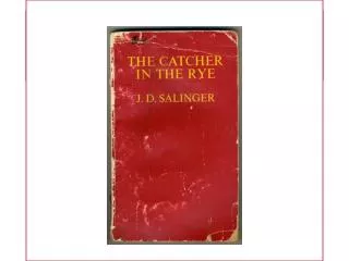
HOW A BOOK IS MADE: THE COVER. Meet Paul Manning, graphic designer. Paul designed the covers for all the book in the ‘Read On’ series of books, including Lone Wolf , of course. Paul’s going to tell you about his creative process as he put together this dark and exciting cover.

E N D
HOW A BOOK IS MADE: THE COVER
Meet Paul Manning, graphic designer. Paul designed the covers for all the book in the ‘Read On’ series of books, including Lone Wolf, of course. Paul’s going to tell you about his creative process as he put together this dark and exciting cover.
Designing the cover of Lone Wolf Paul says: When you’re designing a book cover, your main job is to make people want to read the book. That’s especially true if it’s a story or a novel. Lone Wolf is a dark, scary story about a boy who gets attacked one night and starts turning into … Whoops, I had better not tell you too much in case you haven’t read it yet. I don’t want to spoil it for you.
Designing the cover of Lone Wolf This is my trusty graphics tablet. You use the ‘pen’ like a mouse, but it’s much easier to draw with than a mouse, and great for doing cutouts of complicated shapes. This is where I work, in a studio in my house. When I bought my screen I chose the biggest and best I could find. It’s 32 inches from corner to corner – as big as a flat-screen TV.
Designing the cover of Lone Wolf When I started thinking about the cover design, I knew it was going to have a black background, maybe with a horrible face looming out of it. I also knew it would probably have splashes of blood-red on it. Red and black always look good together. When I saw the pictures the artist had done for inside the book, I was really excited. They were brilliant. That made my job much easier. Early sketches by Lone Wolf illustrator, Matt Timson.
Designing the cover of Lone Wolf I chose the picture on the front because it’s really two images in one: first you see the shadowy wolf figure towering over you with its claws outstretched. Then you realise you are looking at a reflection in somebody’s eye – someone who is very scared, because their eyes are wide open in terror ... Suddenly they’re the victim, and you’re the wolf. It’s a great image. This is what the cover looks like when I’m designing it on my screen. I see the back, the front and the bit in the middle called the ‘spine’ all at the same time. The coloured guide-lines don’t show up when the cover is printed; they are just there to help me line things up.
Designing the cover of Lone Wolf Choosing which font to use is often the hardest part of designing a cover. If you get the font wrong, everything else looks wrong too. For Lone Wolf, I used a font with jagged edges and pointy corners that reminded me of old films about vampires and werewolves. Lone Wolf Lone Wolf Lone Wolf Lone Wolf Lone Wolf
Designing the cover of Lone Wolf I like the way the pictures and the type work together; in fact, it’s one of my favourites of all the ‘Read On’ covers. I hope you like it too! – Paul Manning