Download
1 / 15
150 likes | 267 Views
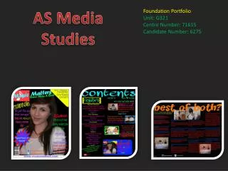
AS media studies. Magazine evaluation. I have created a music magazine called “Bars” aimed at fans of RnB and Grime genres of music. Forms and Conventions.

E N D
AS media studies Magazine evaluation
I have created a music magazine called “Bars” aimed at fans of RnB and Grime genres of music
Forms and Conventions • One way in which my magazine follows the forms and conventions of other magazines like this is the use of a one word title with one font used for it such as vibe. • Another way in which it follows some of the forms and conventions of vibe is firstly the image of just one person on the front and the facial expression of the person in the picture. • However it uses a sell line going along the bottom which is different to the forms and conventions of the magazine I am comparing mine to, Vibe • Another way I feel that mine differs is the use of the same font for the title of the contents page and the double page spread I think that other magazines tend to differ it but I have gone for continuity
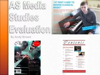
Front cover • The font I have used I feel fits in with the name of the magazine due to the bar running through it. It also looks like the lines that musical notes are displayed on which fits in with the music magazine • I have used two base colours of yellow and black this is as I felt to many colours would complicate the page. The use of two colours gives it structure and makes everything easy to read and easy to see • The image I have used is a single image to again simplify the page and not confuse the reader with to much action on the page. I have just used a plain background which I keeps in the context of the magazine the facial expressions of the person in the picture fits the gritty grime style of the magazine due to the degree of aggression shown. • The font is also a main part of the page I have chosen a large font for the title and a different and smaller font for the sub titles down the page this guides the reader around the page as their eyes will be drawn to the larger writing then around the page to the smaller font. • The language style is also in fitting with the genre as it is the type of vocab and simplistic language the readers are used to.
Contents page • The structure of the contents page is very similar to that of other magazines with a few headings, sub headings and descriptions of these sub headings. It is also in a simple list format which keeps with the simplistic way that i have created the whole magazine • The font sizes are similar to that of the front page with a big title slightly smaller headings and then smaller sub headings with a small description or preview underneath that this is because as i have already mentioned the readers eyes will be drawn from big to small so he gets the important bigger information before he gets the less important smaller information. • I have again used the same font as the front cover but have not included a brand image as i think the font shows the brand without having to use the actual symbol.
Double Page Spread • On this page unlike the contents page i have used my brand image by using the logo in each corner in the same font. This font is also used for the title. • I think i have used the space quite well by using a picture on one page which slightly overlaps onto the next. On the opposite page i have used the interview to take up most of the space. To use up more space but not make the page look to crowded i have used a pull out from the text which is quoted and enlarged. This takes up space and also draws the readers eyes to it and may cause them to read on. • I have used stock colours again in order not to complicate the page and the picture is a good size to draw the eyes of the reader so it is not to small that it does not draw the eyes, but also not to big that it makes the page look crowded and not inviting to read. • On the page hierachy as i have already said i have used a call out in order to draw the readers eyes and try to persuade them to read the article. I have also used a drop capital at the start of the article which is used in most articles in magazines. This also helps to draw the eyes. I have also put the sub headings in a different colour which separates it from the rest of the article. • The content of the page is an interview and the language used is quite simplistic with some jargon that is relevant to the audience.
Representation • My magazine represents teenagers as the lanugage used is simplistic and more jargon that teenagers will understand and older people may not. It is not as much shown in the clothes they wear but more in the facial expressions which on the front cover is slightly aggresive and relates to the type of music and represents the teenage audience. I have also removed the background of all photos as i felt that the expressions where what i wanted to represent however the setting was not in keeping with the theme.
Institution • A magazine similar to mine is vibe this also focuses on the same sort of audience and music as mine and will use the same sort of language and expressions as i do • Distributing my magazine for free in places such as music shops and McDonalds could work as many of my audience are likely to be in places like this and could be a good way to distribute it. However I think that the audience will also be in shops that a lot of other magazines are sold and are not free and i think that although giving it away in places like that for free could work that mainline sale in shops would be the best way for me to get my magazine to my audience
Audience • My audience is most likely to be teenagers and male as they are mostly the people who enjoy the music in the magazine. I also feel that they will live in urban areas as this type of music is street music and is unlikely to be heard in the countryside. This will also have an effect on where i would distribute my magazine as there would be no point distributing it to a place where no one likes the genre so no one would buy it.
Attraction • I attracted the reader by using a big title a simple page layout, simple colours to make the page good to look at, photos which were relevant to the style and of course the content of what is in the magazine is the main attraction to the audience.
Technology • The amount of technology used in creating my magazine is massively important. • Firstly the research done via the use of the internet this helped me gain ideas for my magazine and look at the forms and conventions of other magazines. This meant i could see how magazines were made and what i could change to make my idea unique and sellable. • Also the use of the camera to take all my pictures for my magazine. This technology is vital for my magazine to work and with a camera with a poor picture it would have meant my piece would suffer because of it. • The main technology used is Photoshop and Indesign to formulate my different pages of the piece. Photoshop helped me develop my front cover by allowing me to cut out the image and place it on a background i could then layer the various effects and text into the page. I also used it to make my contents page in which i also cut out a picture and entered it into the page and used the black and white effects to make it look unique. Again i used it to add the text. • For my double page spread i used a mixture of both i used photoshop to cut out the picture i then entered it into the indesign file and then built the page around it using the tools to add the green effects at the top and bottom of the page. I also used word to create my article and then entered the file into in design and i had my double page spread.
Looking back • Looking back over the improvments from my first piece to my final piece i am very pleased as it took me a while to get used to photoshop but i feel i can now use it very well and my piece looks a lot more professional than my first attempt.