Download
1 / 13
130 likes | 288 Views
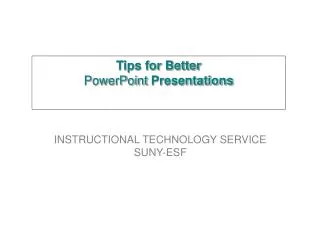
Tips for Better PowerPoint Presentations. INSTRUCTIONAL TECHNOLOGY SERVICE SUNY-ESF. Introduction.

E N D
Tips for Better PowerPoint Presentations INSTRUCTIONAL TECHNOLOGY SERVICE SUNY-ESF
Introduction • PowerPoint is an excellent tool for presenting ideas in an electronic format. Frequently these types of presentations can be difficult for an audience to view because of basic style failures on the part of the presentations creator. By using the following tips you’ll create a visually cleaner and more effective presentation.
Avoid Complex Backgrounds • Use solid colors, so the text stands out. The presentation should still look good printed or displayed in Black and White. Avoid using red font.
Use a San-Serif font vs. a Serif Font • Use Arial, Verdana or Helvetica rather than Times New Roman. 28 pt or larger font size for body text. • Never smaller that 24 pt for body text. Times New Roman Arial,Verdana,Helvetica
Design with High Contrast in Mind • Dark backgrounds require very bright foreground font colors and vice versa. Foreground text Foreground text Avoid Good
Maintain a “Safe Area” • Use an imaginary border around your presentation screen and avoid placement of objects and text in that area. Consider only 80% of the area of your slide will survive display to your audience. Safe Area Title • Be, been, is, am, are, was, were, may, might, must, can, could, well, would, shall, should Be, been, is, am, are, was, were, may, might, must, can, could, well, would, shall, should
Stay Consistent • Maintain the same font and relative size for text objects in each slide. Title, Title, Title, Title….. 32pt Arial Body text, body text, body text… 28 pt Arial
Keep it Simple • Avoid overloading your slides with too much information. Break up complex slides into a series of slides. Title Title con’t Title con’t Third Point First Point Second Point
Enhance your Presentation • Use combinations of Bold or Shadow to emphasis text or objects. A A A Bolded text Shadowed text Plain text
Using Images • When using images, limit image dpi (dots per inch) to 72. Consider using a shadow, outline or additional background to enhance visibility.
Have a Backup • Always backup your presentation on a disk or CD. Print out the presentation on overhead slide material and have it available in case your computer or projection unit fails.
Review your presentation • Get someone to proof your slides, run spell check, rehearse in front of an audience.
For More Information • Get more information about PowerPoint including, plug ins, free graphics, or viewer upgrades on the web at www.microsoft.com. Or from the Instructional Technology Service - 8 Moon Library SUNY ESF.