Download
1 / 6
60 likes | 209 Views
Designing a Poster. Lynnette Young Overby, University of Delaware and Susan Koff, New York University. I sure wish I’d presented my theory with a poster before I wrote my book. Title that hints at the underlying issue or question.

E N D
Designing a Poster Lynnette Young Overby, University of Delaware and Susan Koff, New York University
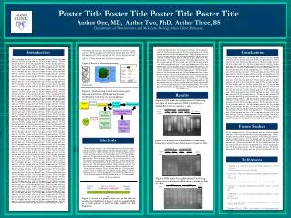
I sure wish I’d presented my theory with a poster before I wrote my book. Title that hints at the underlying issue or question Format in“sentence case.” This means only the “t” in “title” gets capitalized. Maintain a good amount of space between your columns. Although you could squeeze them right up against each other, the poster’s aesthetics would suffer. So when your mentor says to do it, just nod your head as if you’re listening, but roll your eyes as soon as she’s not looking. Your name(s) hereDepartment of Biology, Swarthmore College, Swarthmore, Pennsylvania 19081 Make sure the edges of your columns are aligned with adjacent columns. Don’t trust your eyes: select the columns, then “Align” with the proper tool This is a header. If you make the font size large, and then add bolding…there is no need to also apply underlining or italicization. Adding multiple kinds of styles, needlessly, just marks you as a poster novice. • Results • The overall layout for this section should be modified from this template to best show off your graphs and other result-related illustrations. You might want a single, large column to accommodate a big map, or perhaps you could arrange 6 figures in a circle in the center of the poster: do whatever it takes to make your results graphically clear. And, for the love of God (or whoever), make your graphs big enough to read from 6’ away. • Paragraph format is fine, but sometimes a simple list of “bullet” points can communicate results more effectively: • data were so non-normal, they were bizarre • 9 out of 12 brainectomized rats survived • 1 brainectomized rat escaped, killing 12 undergraduates • Control rats completed maze faster, on average, than rats without brains (Fig. 3b) (t = 9.84, df = 21, p = 0.032) Conclusions You can, of course, start your conclusions in column #3 if your results section is “data light.” Conclusions should not be mere reminders of your results. Instead, you want to guide the reader through what you have concluded from the results. What is the broader significance? Would anyone be mildly surprised? Why should anyone care? This section should refer back, explicitly, to the “burning issue” mentioned in the introduction. If you didn’t mention a burning issue in the introduction, go back and fix that -- your poster should have made a good case for why this experiment was worthwhile. A good conclusion will always refer to the literature on the topic -- how does your research add to what is already published on the topic? Blah, blah, blah. Blah, blah, blah. Blah, blah, blah. Blah, blah, blah. Blah, blah, blah. Blah, blah, blah. Blah, blah, blah. Blah, blah, blah. Blah, blah, blah. Blah, blah, blah. Blah, blah, blah. Blah, blah, blah. Blah, blah, blah. Blah, blah, blah. Blah, blah, blah. Blah, blah, blah. Blah, blah, blah. Blah, blah, blah. Blah, blah, blah. Blah, blah, blah. Blah, blah, blah. Blah, blah, blah. Blah, blah, blah. Blah, blah, blah. Blah, blah, blah. Blah, blah, blah. Blah, blah, blah. Blah, blah, blah. Introduction This is a Microsoft Powerpoint template that has column widths and font sizes optimized for printing a 36 x 56” poster—just replace the “tips” and “blah, blah, blah” repeat motifs with actual content, if you have it. Try to keep your total word count under 500 (yea, this suggestion applies to everyone, even you). More tips (18 pages!) can be found at “Advice on designing scientific posters” at my web site (www.swarthmore.edu/natsci/cpurrin1). To see examples of how others have abused this template to fit their presentation needs, perform a Google search for “powerpoint template for scientific posters.” This paragraph has “justified” margins, but be aware that simple left-justification (other paragraphs) is infinitely better if your font doesn’t “space” nicely when fully justified. Sometimes spacing difficulties can be fixed by manually inserting hyphens into longer words. Powerpoint doesn’t automatically hyphenate, by the way. Your main text is easier to read if you use a “serif” font such as Palatino or Times (i.e., people have done experiments and found this to be the case). Use a non-serif font for your title and section headings. If you can orient your label horizontally, do it – viewers with fused neck musculature are more likely to read it. Rats with brains navigated mazes faster Brainectomized Time (s) The first sentence of the first paragraph does not need to be indented. Control (brain intact) Maze difficulty index Figure 4. Avoid keys that force readers to labor through complicated graphs: just label all the lines (as above) and then delete the silly key provided by your charting software altogether. The above figure would also be greatly improved if I had the ability to draw mini rats with and without brains. I would then put these really cute little illustrations next to the lines they represent. Be sure to separate figures from other figures by generous use of white space. When figures are too cramped, viewers get confused about which figures to read first and which legend goes with which figure. Figures are preferred but tables are sometimes unavoidable. A table looks best when it is first composed within Microsoft Word, then “Inserted” as an “Object.” If you can add small drawings or icons to your tables, do so! (b) (c) (a) Figure 1. Photograph or drawing of organism, chemical structure, or whatever. Don’t use graphics from the web (they usually look terrible when printed). Remember: no period after journal name. Ever (unless you use abbreviation). Literature cited Bender, D.J., E.M Bayne, and R.M. Brigham. 1996. Lunar condition influences coyote (Canislatrans) howling. American Midland Naturalist 136:413-417. Brooks, L.D. 1988. The evolution of recombination rates. Pages 87-105 in The Evolution of Sex, edited by R.E. Michod and B.R. Levin. Sinauer, Sunderland, MA. Scott, E.C. 2005. Evolution vs. Creationism: an Introduction. University of California Press, Berkeley. Society for the Study of Evolution. 2005. Statement on teaching evolution. < http://www.evolutionsociety.org/statements.html >. Accessed 2005 Aug 9. Figure 3. Make sure legends have enough detail to explain to the viewer what the results are, but don’t go on and on. Note that for posters it is good to put some “Materials and methods” information within the figure legends or onto the figures themselves—it allows the M&m section to be shorter, and gives viewer a sense of the experiment(s) even if they have skipped directly to figures. Don’t be tempted to reduce font size in figure legends, axes labels, etc.—your viewers are probably most interested in reading your figures and legends! Materials and methods Be brief, and opt for photographs or drawings whenever possible to illustrate organism, protocol, or experimental design. Viewers don’t actually want to read about the gruesome details, however fascinating you might find them. Blah, blah, blah. Blah, blah, blah. Blah, blah, blah. Blah, blah, blah. Blah, blah, blah. Blah, blah, blah. Blah, blah, blah. Blah, blah, blah. Blah, blah, blah. Blah, blah, blah. Blah, blah, blah. Blah, blah, blah. Blah, blah, blah. Blah, blah, blah. Blah, blah, blah. Blah, blah, blah. Often you will have some more text-based results between your figures. This text should explicitly guide the reader through the figures. Blah, blah, blah (Figs. 3a,b). Blah, blah, blah. Blah, blah, blah. Blah, blah, blah. Blah, blah, blah. Blah, blah, blah. Blah, blah, blah. Blah, blah, blah. Blah, blah, blah. Blah, blah, blah. Blah, blah, blah. Blah, blah, blah. Blah, blah, blah. Blah, blah, blah. Blah, blah, blah. Blah, blah, blah (Fig. 3c). Blah, blah, blah. Blah, blah, blah. Blah, blah, blah. Blah, blah, blah. Blah, blah, blah. Blah, blah, blah (data not shown). Blah, blah, blah. Blah, blah, blah. Blah, blah, blah. Blah, blah, blah. Blah, blah, blah. Blah, blah, blah. Blah, blah, blah. Blah, blah, blah. Blah, blah, blah. Blah, blah, blah (God, personal communication). Acknowledgments We thank I. Güor for laboratory assistance, Mary Juana for seeds, Herb Isside for greenhouse care, and M.I. Menter for questionable statistical advice. Funding for this project was provided by the Swarthmore College Department of Biology, a Merck summer stipend, and my mom. [Note that people’s titles are omitted.] Abutting these last sections can save you a little space, and subtly indicates to viewers that the contents are not as important to read. Put a figure here that explores a statistical result This is the gene of interest! For further information Please contact email@blahcollege.edu. More information on this and related projects can be obtained at www.swarthmore… (give the URL for general laboratory web site). A link to an online, PDF-version of the poster is nice, too. If you just must include a pretentious logo, hide it down here rather than up near where it would compete with your title. Figure 5. You can use connector lines and arrows to visually guide viewers through your results. Adding emphasis this way is much, much better than making the point with words in the text section. These lines can help viewers read your poster even when you’re not present. Blah, blah, blah. Blah, blah, blah. However, blah, blah, blah. Figure 2. Illustration of important piece of equipment, or perhaps a flow chart summarizing experimental design. Scanned, hand-drawn illustrations are usually preferable to computer-generated ones. Just bribe (cookies, whatever) an artist to help you out. Hi. If you’ve found this poster helpful, please consider sending me a postcard from wherever you are presenting your poster. It makes me feel like a have friends. Colin Purrington, Dept of Biology, Swarthmore College, Swarthmore, PA 19081, USA.
Creating Landscapes: Geography through Dance Julie Luzier, Heather Silva, SarahKim Vennard ArtsBridge America at University of Delaware • Results • By the end of the 2008-09 school year, the scholars worked with the students for approximately 20 days. With the teaching of these lessons, the scholars were able to improve their skills, specifically in the areas of time management and effective teacher-student interaction. Currently, the pre- and post-test data is being analyzed, and later this summer, the video footage and qualitative data will be reviewed. The Creating Landscapes lesson plans are also currently being revised by the scholars and their advisors: while many parts of the lessons have proved successful, there are certainly areas for improvement. • In each of the lessons taught, the student subjects have proved successful in the three areas of assessment: • Cognitive • Student understanding of the curricular content is evident through content-assessments and • student feedback. • Affective • Student understanding of how to interact and behave effectively is evident through peer/self-assessments, participation, and observation. • Artistic • Student understanding of how to express ideas accurately and creatively through movement is evident through peer/self-assessments, participation, • and observation • Sample Journal Entry (by Student) • “My favorite part of this game was that now I can see and draw Delaware really well…I will teach all my friends to learn how to do this. Today was a really fun day. I learned a lot about how Delaware looks.” Creation of Creating Landscapes Curriculum: Summer 2008 Dr. Overby and the three ArtsBridge Scholars, Brittany Carson, Heather Silva, and SarahKim Vennard, began the summer by exploring the elements of creative movement. The concept of interdisciplinary education was studied through a number of published works, as well as research of the educational standards, both national and state. The scholars focused mainly on the Delaware standards for fourth grade geography and dance, which would be the two disciplines fused in the Creating Landscapes curriculum. A summer institute at Thurgood Marshall Elementary school introduced teachers to the concept of interdisciplinary learning through dance. This also allowed the scholars to meet the teachers and establish topics for the lessons. The lessons created would correspond to The Delaware Adventure textbook used by many of the fourth grade classes in Delaware. By the close of the summer, six lessons were developed for the 2008-09 school year. Topics covered include map reading skills, region identification, local indigenous people, and the transportation revolution. • Introduction Dr. Lynnette Overby founded the ArtsBridge Scholars program at the University of Delaware in 2008. ArtsBridge America, originally developed in 1994, is an organization that aims to address the problem of decreasing arts programs within schools by bring arts directly into the classroom. • Dr. Overby advised three scholars in the creation of Creating Landscapes, an interdisciplinary curriculum which incorporates creative dance and fourth grade geography. This past year, the lessons were taught to a fourth grade class at Thurgood Marshall Elementary School in Newark, Delaware. • Implementing the Curriculum The Creating Landscapes lesson plans were taught in Mrs. Karen Frederick’s fourth grade classroom at Thurgood Marshall Elementary School in Newark, Delaware. Julie Luzier came in to replace Brittany Carson on the project, and a new mentor, Mimi Nelson, also became part of the process. • In the Fall semester, the scholars and Dr. Overby gave the experimental class a pre-test to assess their knowledge of the curricular content. This pre-test was also given to a control group: another fourth grade class at the same school. This pre-test was followed by three days in which the elements of creative movement were introduced to the students through a variety of fun and educational activities. • The scholars then took turns preparing and teaching the Creating Landscapes lessons two to three times a week. After the lessons were taught, the students were asked to fill out assessments, both in the form of content-based and self assessments. The lessons were also videotaped for evaluation purposes, allowing the scholars to improve and develop better teaching methodologies. • Research Goals • Scholars create interdisciplinary lessons using creative and artistic strategies • Scholars gain knowledge and skills in creating, teaching, and assessing interdisciplinary lessons • Teachers who do not have arts-related expertise learn to incorporate the arts in their classroom lessons • Fourth grade students score significantly better than control group in knowledge of geography and dance concepts Next Steps… Complete Data Analysis
Advice on designing a Poster • Include a one sentence overview of poster content • Choosing software – Download Powerpoint template • Include Sections • Title • Introduction • Materials and methods • Results • Conclusions • Literature Cited • Acknowledgements
Avoiding Common Mistakes • Do not make the poster too long • Avoid blocks of text longer than 10 sentences • Use lists of sentences rather than blocks of text • Use italics instead of underlining • Use figures, graphs and pictures • Include white space
Presenting Your Poster • Choose clothes to match your poster • Wear a name tag • Do not refer to notes when explaining your poster • Speak to your viewers as you explain your poster – give a 1 sentence overview of why your research/project is interesting and relevant. • Thank your viewers for visiting