Download
1 / 53
530 likes | 534 Views
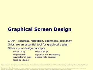
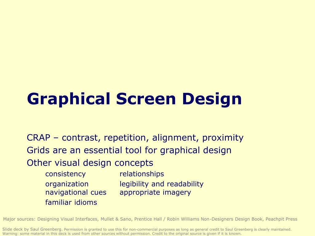
Graphical Screen Design. CRAP – contrast, repetition, alignment, proximity Grids are an essential tool for graphical design Other visual design concepts consistency relationships organization legibility and readability navigational cues appropriate imagery familiar idioms.

E N D
Graphical Screen Design CRAP – contrast, repetition, alignment, proximity Grids are an essential tool for graphical design Other visual design concepts consistency relationships organization legibility and readability navigational cues appropriate imagery familiar idioms • Major sources: Designing Visual Interfaces, Mullet & Sano, Prentice Hall / Robin Williams Non-Designers Design Book, Peachpit Press • Slide deck by Saul Greenberg. Permission is granted to use this for non-commercial purposes as long as general credit to Saul Greenberg is clearly maintained. Warning: some material in this deck is used from other sources without permission. Credit to the original source is given if it is known.
CRAP • Contrast • make different things different • brings out dominant elements • mutes lesser elements • creates dynamism • Repetition • repeat design throughout the interface • consistency • creates unity • Alignment • visually connects elements • creates a visual flow • Proximity • groups related elements • separates unrelated ones • Robin Williams Non-Designers Design Book, Peachpit Press
Grids • Horizontal and vertical lines to locate window components • aligns related components • Organization • contrast for dominant elements • element groupings by proximity • organizational structure • alignment • Consistency • location • format • element repetition • organization • Format of variable contents • Message text in Arial 14, left adjusted • Standard icon set • Widget to widget spacing • No • Ok • window to widget spacing • Fixed components
Message text in Arial 14, left adjusted • Standard icon set • No • Ok • Cannot move the file “myfile.doc” to the folder “junk” because the disc is full. • ! • Ok • Do you really want to delete the file “myfile.doc” from the folder “junk”? • ? • No • Ok • Apply • The file was destroyed • Cancel
Two-level Hierarchy • indentation • contrast • Logic of organizationalflow • Alignment connects visual elements in a sequence • Grouping by white space
Warning • Tip of the day: Monday, Mar 12 • mmmm mmm • mmm • ! • mmmm mmm • mmm • Help • Dismiss • Okay • mmmm mmm • mmm mmm • ? • Okay Visual consistency (repetition) • internal consistency • elements follow same conventions and rules • set of application-specific grids enforce this • external consistency • follow platform and interface style conventions • use platform and widget-specific grids • deviate only when it provides a clear benefit to user
Mmmm: • Mmmm: • Mmmm: • Mmmm: • Mmmm: • Mmmm: • Mmmm: • Mmmm: • Mmmm: • Mmmm: • Mmmm: • Mmmm: • Mmmm: • Mmmm: • Mmmm: Relating screen elements • proximal clusters • alignment • white (negative) space • explicit structure
Terrible alignment • no flow • Poor contrast • cannot distinguish colored labels from editable fields • Poor repetition • buttons do not look like buttons • Poor explicit structure • blocks compete with alignment • Webforms
No regard for order andorganization • IBM's Aptiva Communication Center
Haphazard layout • Mullet & Sano
Repairing the layout • Mullet & Sano
Spatial Tension • Mullet & Sano
Using explicit structure as a crutch • Mullet & Sano
Overuse of 3-d effects makes the window unnecessarily cluttered • WebForms
Imagery • Signs, icons, symbols • right choice within spectrum from concrete to abstract • Icon design very hard • except for most familiar, always label them • Image position and type should be related • image “family” • Consistent and relevant image use • identifies situations, offerings... • Partial icon family
Refined vs excessive literal metaphors • Mullet & Sano
Choosing levels of abstraction • Mullet & Sano
What do these images mean? • no tooltips included • one of the tabs is a glossary explaining these images! which one? • Novell GroupWise 5.1
Text orientation difficult to read • Microsoft Word
Idioms • Familiar ways of using GUI components • appropriate for casual to expert users • builds upon computer literacy • must be applied carefully in walk up and use systems • Files • Window manipulation • Standardtypographic controls • Toolbars and tooltips • What you see is what you get displays • Pulldown menus • Cascading menu • Dialog box item • Microsoft Powerpoint
How to choose between widgets • What components must be in the display? • necessary visual affordances • frequent actions • direct manipulation for core activities • buttons/forms/toolbar/special tools for frequent/immediate actions • menus/property window for less frequent actions • secondary windows for rare actions • How are components related? • organize related items as “chunks” • What are familiar and expected idioms? • cross application look and feel
Displaying core functionality • Apple MacPaint & Macwrite, from mullet & Sano
Widgets and complexity • how can window navigation be reduced? • avoid long paths • avoid deep hierarchies
Exercise • Graphical redesign • Create a grid emphasising: • visual consistency • relationships between screen elements • navigational cues • economy • legibility and readability • imagery
Constructing a grid Maintain consistency with GUI style locate standard components - title bar, window controls, … Decide navigational layout + white space + legibility + typography annotated grid shows location of generic components these generic components may have their own grids.
Using the grid Determine relationships, navigational structure map navigational structure onto the grid Economize collapse two windows into one trim sound dialog
Using the grid • Evaluate by displaying actual examples • Economize further • decide which we prefer • vs
What you now know • CRAP • Grids are an essential tool for graphical design • Other visual concepts include • visual consistency • repetition • visual organization • contrast, alignment and navigational cues • visual relationships • proximity and white space • familiar idioms • legibility and readability • typography • appropriate imagery
Interface Design and Usability Engineering • Articulate: • who users are • their key tasks • Brainstorm designs • Refined designs • Completed designs • Goals: • Task centered system design • Participatory design • User-centered design • Graphical screen design • Interface guidelines • Style guides • Psychology of everyday things • User involvement • Representation & metaphors • Participatory interaction • Task scenario walk-through • Evaluatetasks • Usability testing • Heuristic evaluation • Field testing • Methods: • high fidelity prototyping methods • low fidelity prototyping methods • Throw-away paper prototypes • Products: • User and task descriptions • Testable prototypes • Alpha/beta systems or complete specification
How do you chose when you cannot discriminate screen elements from each other? • GIF Construction Set • Microsoft Access 2.0
Navigational cues • provide initial focus • direct attention as appropriate to important 2ndary, or peripheral items as appropriate • order should follow a user’s conceptual model of sequences
Redesigning a layout using alignment and factoring • Mullet & Sano
The importance of negative space and alignment • Mullet & Sano
NNNN • MMMM • xxx: ____ • xxx: ____ • MMMM • xxx: ____ • xxx: ____ • xxx: ____ • xxx: ____ • xxx: ____ • xxx: ____ • xxx: ____ • xxx: ____ • xxx: ____ • NNNN • xxx: ____ • xxx: ____ • xxx: ____ • xxx: ____ Economy of visual elements • minimize number of controls • include only those that are necessary • eliminate, or relegate others to secondary windows • minimize clutter • so information is not hidden
Repairing excessive display density • Mullet & Sano
Tabs excellent means for factoring related items but can be overdone
Legibility and readability • Characters, symbols, graphical elements should be easily noticable and distinguishable • Text set in Helvetica • TEXT SET INCAPITOLS • Text set in Braggadocio • Text set in Times Roman • Text set in Courier
Readable • Unreadable • Design components to be • inviting and attractive • Design components to be • inviting and attractive • Design components to be • inviting and attractive • Design components to be • inviting and attractive Legibility and readability • Proper use of typography • 1-2 typefaces (3 max) • normal, italics, bold • 1-3 sizes max • Large • Medium • Small • Large • Medium • Small
Readable • Design components to be • inviting and attractive • Design components to be • inviting and attractive Legibility and readability • typesetting • point size • word and line spacing • line length • Indentation • color • Unreadable: Design components • to be easy to interpret and • understand. Design components to • be inviting and attractive