Download
1 / 20
200 likes | 319 Views
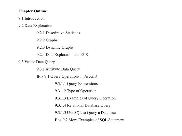
Chapter Outline 9.1 Introduction 9.2 Data Exploration 9.2.1 Descriptive Statistics 9.2.2 Graphs 9.2.3 Dynamic Graphs 9.2.4 Data Exploration and GIS 9.3 Vector Data Query 9.3.1 Attribute Data Query Box 9.1 Query Operations in ArcGIS 9.3.1.1 Query Expressions

E N D
Chapter Outline 9.1 Introduction 9.2 Data Exploration 9.2.1 Descriptive Statistics 9.2.2 Graphs 9.2.3 Dynamic Graphs 9.2.4 Data Exploration and GIS 9.3 Vector Data Query 9.3.1 Attribute Data Query Box 9.1 Query Operations in ArcGIS 9.3.1.1 Query Expressions 9.3.1.2 Type of Operation 9.3.1.3 Examples of Query Operation 9.3.1.4 Relational Database Query 9.3.1.5 Use SQL to Query a Database Box 9.2 More Examples of SQL Statement
9.3.2 Spatial Data Query 9.3.2.1 Feature Selection by Cursor 9.3.2.2 Feature Selection by Graphic 9.3.2.3 Feature Selection by Spatial Relationship Box 9.3 Expressions of Spatial Relationship in ArcMap 9.3.2.4 Combination of Attribute and Spatial Data Queries 9.4 Raster Data Query 9.4.1 Query by Cell Value 9.4.2 Query Using Graphic Method 9.5 Charts 9.6 Geographic Visualization 9.6.1 Data Classification 9.6.1.1 Data Classification for Visualization Box 9.4 Data Classification Methods 9.6.1.2 Data Classification for Creating New Data 9.6.2 Data Aggregation 9.6.3 Map Comparison
Applications: Data Exploration Task 1: Select Feature by Location Task 2: Select Feature by Graphic Task 3: Query Attribute Data from a Joint Table Task 4: Query Attribute Data from a Relational Database Task 5: Combine Spatial and Attribute Data Queries Task 6: Query Raster Data
Graphs for data exploration: a line graph (top), a bar chart (middle), and a scatterplot (bottom)
This cumulative distribution graph plots % population change, 1990-2000, by state in the United States. The y-axis shows the cumulative frequencies from 0.0 to 1.0.
This bubbleplot shows % population change, 1990-2000 along the x-axis and % persons under 18 years old along the y-axis, and 2000 population by the bubble size.
Boxplot (a) suggests that the data values follow a normal distribution. Boxplot (b) shows a positively skewed distribution with a higher concentration of data values near the high end. The x’s in (b) may represent outliers, which are more than 1.5 box lengths from the end of the box. Boxplot (c) shows a negatively skewed distribution with a higher concentration of data values near the low end.
This plot shows annual precipitation at 105 weather stations in Idaho. A north to south (along the y-dimension) decreasing trend is apparent in the plot. There is also an increasing trend from east to west (along the x-dimension).
This variogram cloud is based on annual precipitation data at 105 weather stations in Idaho. Distances are measured in 10,000 meters, and semivariances are measured in 10 square inches.
The scatterplot on the left is dynamically linked to the map on the right. The “brushing” of two points in the scatterplot highlights the corresponding states (Washington and New Mexico) on the map.
The shaded portion represents the complement of data subset A (top), the union of data subsets A and B (middle), and the intersection of A and B (bottom).
Three types of operation may be performed on the subset of 40 records: add more records to the subset (+2), remove records from the subset (-5), or select a smaller subset (20).
musym musym muid muid plantsym plantsym comname Soil Attribute Table Comp.dbf Forest.dbf Plantnm.dbf The keys relating three dBASE files in the MUIR database and the soilattribute table.
Relation 1: Parcel The key PIN relates the parcel and owner tables and allows use of SQL with both tables. Relation 2: Owner
A circle with a specified radius is drawn around Sun Valley. The circle is then used as a graphic object to select point features within the circular area.
The top map shows rate of unemployment in 1997 as either above or below the national average of 4.9%. The bottom map uses the mean and standard deviation (SD) for data classification.
Population Density (persons per sq. m.) Value after reclassification 0 – 25 1 26 – 50 2 51 – 75 3 >= 76 4 Reclassification assigns a new value to a range of cell values in the input grid such as 1 for 0-25, 2 for 26-50, and so on.
The top map shows percent population change by state, 1990–2000. The darker the symbol, the higher the percent increase. The bottom map shows percent population change by region.
An example of using multiple maps in data exploration. In this view of deer relocations in SE Alaska, the focus is on the distribution of deer relocations along the clearcut/old forest edge.
A bivariate map showing the combinations of (1) rate of unemployment in 1997, either > or <= the national average, and (2) rate of income change 1996–98, either > or <= the national average.