Download

1 / 20
200 likes | 208 Views
Graphs in Science. Graphs in Science. What type of data can line graphs display? How do you determine a line of best fit or the slope of a graph? Why are line graphs powerful tools in science?. The Uses of Graphs. Circle graphs show percentages of the whole. Coconut. The Uses of Graphs.

E N D
Graphs in Science • What type of data can line graphs display? • How do you determine a line of best fit or the slope of a graph? • Why are line graphs powerful tools in science?
The Uses of Graphs Circle graphs show percentages of the whole Coconut
The Uses of Graphs Bar graphs show comparisons.
The Uses of Graphs Line graphs show changes over time or the change of one variable (responding variable) due to the change of another variable (manipulated variable).
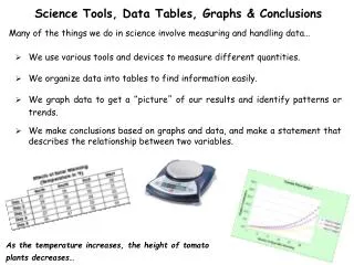
The Importance of Graphs Line graphs are used to display data to show how one variable changes in response to another variable. In this experiment, the responding variable is the time it takes for the water to boil. The manipulated variable is the volume of water in the pot.
Plotting a Line Graph • Draw axes • Label axes • Draw Scale • Plot points • Line of best fit • Title
Why Draw a Line of Best Fit? A line of best fit emphasizes the overall trend shown by all the data taken as a whole.
Slope (Rate of Change) The slope (rate of change) of a graph line tells you how much y changes for every change in x.
Car Travel The graph shows the distance a car travels in a one-hour period. Use the graph to answer the questions that follow.
Time (min), the manipulated variable, is plotted on the horizontal axis. Distance (km), the responding variable, is plotted on the vertical axis. Reading Graphs: What variable is plotted on the horizontal axis? The vertical axis? Car Travel
The car travels 10 km in10 minutes and 40 km in40 minutes. Interpreting Data: How far does the car travel in the first 10 minutes? In 40 minutes? Car Travel
The car is traveling 1 km per minute. It would travel 120 km in 120 minutes. Predicting: Use the graph to predict how far the car would travel in 120 minutes. Assume the car continues to travel at the same speed. Car Travel
The slope (rate of change) is 1 km/min. The slope (rate of change) provides information about the car’s average speed. Calculating: Calculate the slope (rate of change) of the graph. What information does the slope provide? Car Travel
Using Graphs to Identify Trends Line graphs are powerful tools in science because they allow you to identify trends and make predictions.
Using Graphs to Identify Trends Line graphs are powerful tools in science because they allow you to identify trends and make predictions.
Using Graphs to Identify Trends Line graphs are powerful tools in science because they allow you to identify trends and make predictions.
Using Graphs to Identify Trends Line graphs are powerful tools in science because they allow you to identify trends and make predictions.
Using Graphs to Identify Trends Line graphs are powerful tools in science because they allow you to identify trends and make predictions.