Download
1 / 39
400 likes | 505 Views
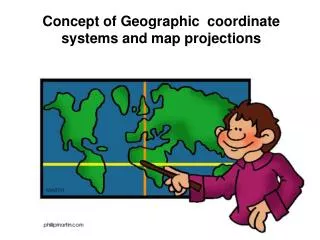
Lesson 2 Geographic Context and Map Fundamentals. MEASURE Evaluation PHFI Training of Trainers May 2011. Everything happens somewhere. Knowing where things happen can help us u nderstand why things happen. Location and Health. There is a close link between geography and health.

E N D
Lesson 2 Geographic Context and Map Fundamentals MEASURE Evaluation PHFI Training of Trainers May 2011
Knowing where things happen can help us understand why things happen.
Location and Health • There is a close link between geography and health.
Question • What are some ways that people’s health can be affected by geography? Geography can affect health through landscape, location of services, location of population in need, human interaction with landscape
Medical geography • A branch of geography that looks at the relation between location and people’s health • Concepts are useful beyond medical geography • Long history of use of geography to understand health and disease patterns.
John Snow cholera map • 1854 London • Used map to illustrate cholera outbreak was centered around a pump on Broad St • Locking pump led to decrease in disease
Maps • Valuable tool for displaying data and helping people understand data and direct action
Important Properties of Maps When creating maps there are four factors that are important Scale Legend Title Source All affect the context of data displayed and how the data is and can be INTERPRETED
Scale of a Map What is scale? It is the ‘representative fraction’ and states the relationship between the distance on the map and the distance on the ground Why is scale so IMPORTANT? The scale affects the level of detail a map shows
Map Scale Large-scale maps cover small areas, but can include a higher level of detail than small-scale maps which depict larger areas at lower detail. There are no precise definitions of large- or small-scale, but for most map users, the following general scale categories apply: • Large-scale: 1:250 to 1:1,000 • Medium-scale: 1:1,000 to 1:10,000 • Small-scale: 1:10,000 to 1:100,000 • Very Small-scale: 1: 100,000 to above Source: ICIMOD, 2000
Large Scale Small Scale 1:50,000 1:500,000
Scale What are the general rules with scale? Do not zoom below the scale as stated for the dataset (that is scale at which the data was collected) Only integrate GIS dataset that have been collected at the same or at a similar scale The maximum scale a dataset should be viewed is approximately 100 times the Scale that is stated in the Metadata. For Example: Data collected at 1:5,000 should not be viewed above 1:500,000
North Arrow Title Scale Bar Legend Data Source
Graduated Circle Map Size of symbol corresponds to data. Advantages: Easily see extreme ends of the data distribution Geographic patterns emerge Disadvantages Can be challenging to differentiate the middle of the distribution since the eye can’t easily detect small differences in size
Choropleth Polygons are shaded to match data distribution Advantages: Easy to see geographic distribution Easy for most people to interpret Disadvantages Polygons can hide uneven distributions within boundaries If patterns/colors aren’t chosen wisely the map can be difficult to interpret
Continuous surface maps Data is distributed continuously across space Advantages: Very easy to see hot spots or areas that deviate from other areas Disadvantages Not all data can be distributed continuously
Other types With advanced software it’s possible to produce diagram maps that display data using charts. Advantages Effectively displays complex information Lots of information on each map Disadvantages Can have too much information Can be difficult to structure data to produce such maps Requires an advanced GIS
Which map style should you use? • Depends on type of data you have • What purpose you want the map to serve • Sometimes a matter of experimentation to find the map style that best fits the data and purpose of the map It’s important to pick the type of map that makes the data most useful
Basic cartographic concepts Map Design Cartographic standards Generalization Graphic Variables Use of Color Classification of Data Methods of Mapping
Map Design Map making is both science and art. Maps influence people’s perception of space. This influence is partly because of convention and partly because of the graphics used. People understand the world differently, express this understanding differently in maps, and gain different understanding from the maps.
Cartographic standards There are cartographic standards that have emerged that make it easier to interpret and read maps. These standards do not have to be followed, but if they aren’t your map may be less readable.
Administrative Boundaries Most often black or gray. The higher the administrative unit the thicker the line
Roads Color and line styles to represent road type with major roads being thicker or more distinctively colored than minor roads.
Rivers and Lakes Blue Streams dashed lines light blue
Map Design Generalization • Maps contain a certain level of detail depending upon its scale and purpose. • Sometimes the map maker will need to simplify features to make them more readable.
Hue Saturation Intensity Use of Color Colorperception has psychological, physiological and conventional aspects. It has been noted that it is difficult to perceive colorin small areas, and more contrast is perceived between some colorsthan between others. In addition to distinguishing nominal categories, colordifferences are also used to show deviations or gradation. Source: ICIMOD 2000
Use of Color • Color blindness • 5-8% of men • 0.5% of women
Classification of Data The representation of data for mapping will depend on the measurement scale of the data. Nominal scale: The differences in data are only of qualitative nature, e.g., differences in facility type, land use or geology. Ordinal scale: Only the order of the attribute values is known, such as more than or less than, “small - medium – large” or “cool - tepid - hot”. Interval scale: Both the hierarchy and the exact distance is known, but it will not be possible to know the ratios, e.g., the temperature or the altitude values. Ratio scale: Data can be measured on a ratio measurement scale, e.g., the number of children in a family or income. Source: ICIMOD 2000
Making an effective map is a matter of finding the right balance between the limitations of the data, the needs of the map reader and the message you, as the map maker, want to convey.
Issues to Remember Maps can LIE!! Maps are just one person’s representation of the “real world” Like any source of information they can be misleading especially when used out of context How maps can be deceiving Inappropriate Legend Inappropriate Scale Source: ICIMOD, 2000
Key points • Everything happens somewhere • Geography is a common denominator across human activity • There are different types of maps, picking the right style is balancing the needs of the reader, the data and the message you as mapmaker want to convey.
Key points • The mapmaker can use colors, symbology among other techniques to make maps readable to the audience.