Download
1 / 3
30 likes | 34 Views
Companies have become mindful of their website design and development with the changing requirement. Most get confused between an adaptive and responsive web design. Let's understand the difference between the two and the concepts that make them unique to organizational needs.

E N D
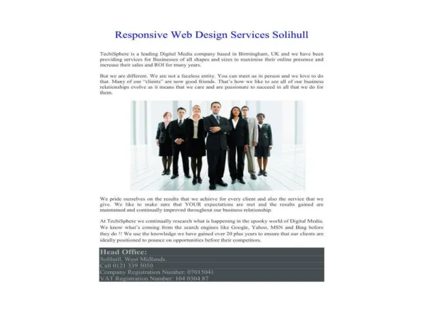
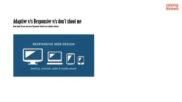
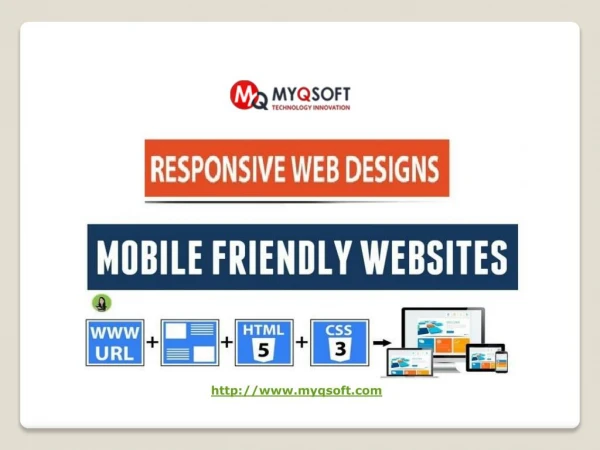
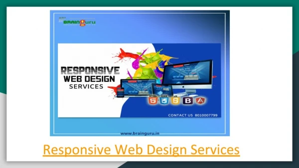
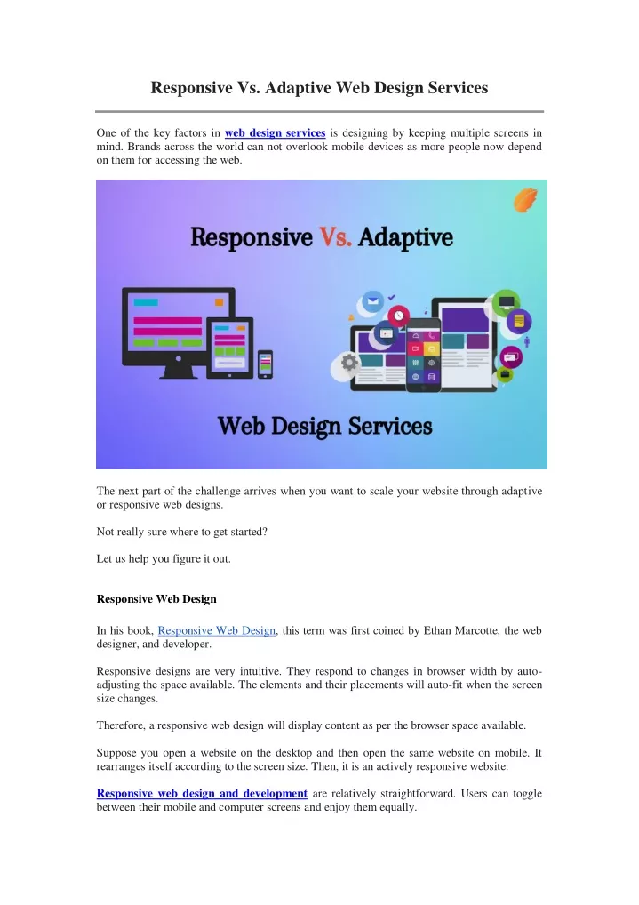
Responsive Vs. Adaptive Web Design Services One of the key factors in web design services is designing by keeping multiple screens in mind. Brands across the world can not overlook mobile devices as more people now depend on them for accessing the web. The next part of the challenge arrives when you want to scale your website through adaptive or responsive web designs. Not really sure where to get started? Let us help you figure it out. Responsive Web Design In his book, Responsive Web Design, this term was first coined by Ethan Marcotte, the web designer, and developer. Responsive designs are very intuitive. They respond to changes in browser width by auto- adjusting the space available. The elements and their placements will auto-fit when the screen size changes. Therefore, a responsive web design will display content as per the browser space available. Suppose you open a website on the desktop and then open the same website on mobile. It rearranges itself according to the screen size. Then, it is an actively responsive website. Responsive web design and development are relatively straightforward. Users can toggle between their mobile and computer screens and enjoy them equally.
The user experience is not compromised regardless of the device used. But it needs excellent developers to understand the concepts and user needs behind successful, responsive web design services. However, while the designers may have thousands of options to choose from in terms of screens, responsive web designstake longer to load than adaptive designs. Adaptive Web Design Aaron Gustafson introduced the concept in 2011 in his book Adaptive Web Design: Crafting Rich Experiences With Progressive Enhancement. Also known as a natural or advanced enhancement of a website. Adaptive designs give the options to choose from the best screen template sizes that are fixed. The website detects the screen size and chooses the best layout for that desktop screen. A web design company has to go to extra lengths to design screens for each of these screens. The most common screen sizes are- 1. 320 pixels 2. 480 pixels 3. 760 pixels 4. 960 pixels 5. 1200 pixels 6. 1600 pixels Therefore, choosing from these six-screen designs has requires zero resizing as each screen is built separately to appear on the screen. There is no resizing, and resizing has no effect on the browser here. The layouts can also differ for adaptive designs since there is the freedom to design a new screen from scratch. It is because the designers can pick a different screen as they want rather than leaving it for the website to rearrange. Many giants use adaptive designs to add unique elements to each screen and customize it as per their will. Apple, About.com, USA Today are some of them. For these companies, adaptive designs have helped increase the load time of screens without changing the content and functionality. Naturally, it's feasible for them to invest in more screens. Even if search engine bots are experts in sorting websites to identify .com and m.com websites, they can't rank similar content for multiple URLs equally. Therefore, adaptive designs will not help you rank better for SEO. Responsive designs work better there.
Closing Words- Need help choosing between responsive and adaptive design for your website? Consagous Technologies delivers world-class web design and development services with value-added functionality, faster load time, and exceptional graphics. Reach us to take advantage of our custom mobile app development services in USA. Original Source: bit.ly/3LLxwoY Contact Us: Consagous Technologies Phone: +1 (512) 488-3568 Email: projects@consagous.com