Download
1 / 11
110 likes | 118 Views
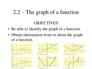
Graph of the Week. How to read, understand, and analyze real world data. Describe in your own words what you think is happening in the graph below. What information do you think we need to understand this graph better?. Does this help?. What could the y-axis represent?. Will this help…?.

E N D
Graph of the Week How to read, understand, and analyze real world data
Describe in your own words what you think is happening in the graph below. What information do you think we need to understand this graph better?
Do we have enough information now to figure out what this graph is about? We need a TITLE or HEADING for the graph What the numbers along the y-axis mean A time frame along the x-axis
What do you think the teen birth rate might be in 2025? Do you think there will be an upward or downward trend? Why? Discuss in your groups for 2-3 minutes.
What is the topic of the graph? What do the x- and y-axis represent? What observations can you make about the graph? What do you predict will be the average age of marriage in 10 years?
Let’s Write! Write a few complete sentences that describe what the graph is telling you.
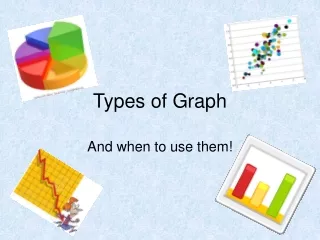
HW assignment (5 pts) Due MONDAY, August 12, 2019: • Think of something that interests you (i.e. music, movies, Angels baseball, skateboarding, gaming, law enforcement, cats, art, reading, soccer, etc.) • In a newspaper, magazine, or website, find a graph that shows a statistical graph on your interest. (it can be a line graph, pie chart, bar graph, etc) • Be sure to choose a graph that is detailed and easy to understand and read. • Print out your graph (do not write about it just yet!) and turn it in with your name and period on it.