Download

1 / 21
240 likes | 411 Views
TYPOGRAPHY in Graphic Design. Graphic Comm. Tech I Mr . Huang Semester 1, 2011-12. OBJECTIVES. Define “ typography ” Determine the relationship between a “ point ” and a “ pica ” Define a “ typeface ” Define a “ font ” Differentiate between “ text type ” and “ display type ”

E N D
TYPOGRAPHY inGraphic Design Graphic Comm. Tech I Mr. Huang Semester 1, 2011-12
OBJECTIVES • Define “typography” • Determine the relationship between a “point” and a “pica” • Define a “typeface” • Define a “font” • Differentiate between “text type” and “display type” • List and describe different typefaces
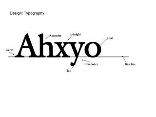
TYPOGRAPHY • Typography is the style, arrangement, and appearance of text. • The following properties can be applied to text to make it look different: • size, color, font/type, style, and alignment
PICAS and POINTS • A pica is the standard unitin printer’s measure (special measurement system for printers). • A pica is 1/6” in size (approx. 4 mm). • How many picas are in 1”?
PICAS and POINTS • A point is the most common unit of measurement for type. • What is the defaultfont sizein any word processing software? • 12 pointsmake up 1 pica(12 points = 1 pica). How many points make up 1”?
TYPEFACES and FONTS • A typeface is a particular style of type. • A font is a set or assortment of letters, numbers, and other symbols that share a consistent style. • Ex. Magneto font • ABCDEFGabcdefg123456!@#$%^&*()
TEXT TYPE vs. DISPLAY TYPE • Text typeis any typeface that measures 12 points or smaller. • Used for general reading materials such as books, magazines, and newspapers. • Display typeis any typeface that is larger than 12 points. • Where would you find examples of display type? • Used for headings/headlines, chapter titles, signs
THE DIFFERENT TYPEFACES • A typeface is a particular style of type. • These are the following typefaces that we will go over: • Oldstyle • Modern • Square Serif • Sans Serif • Script or Cursive • Decorative or Occasional
OLDSTYLE • PURPOSE • Used for easy legibility and readability in designs • Commonly used for text composition • FORMAT • Typeface contains serifs (little tails at the ends of letters) • Thick and thin strokes for the letters • EXAMPLES • Garamond, Century Schoolbook, and Goudy
MODERN • PURPOSE • Used to draw your attention (emphasis); used for modern publications/designs • Used in advertising, book composition, and commercial printing • FORMAT • Typeface has thin, horizontal serifs (tails) • Radical contrast between thick and thin strokes • EXAMPLES • Bodoni MT Black andModern No. 20
MODERN fonts: a close-up O Thick stroke Thin stroke
SLAB or SQUARE SERIF • PURPOSE • Used for headlines and short pieces of text material • FORMAT • Typeface has serifs that are square-shaped • Very little variation between thin and thickstrokes of the letters • EXAMPLES • Rockwell and Playbill
SLAB SERIFS: a close-up R Square-shaped serif
SANS SERIF • PURPOSE • Headlines, text composition, display advertising, and captions • FORMAT • No serifs anywhere on the letters (sans = without) • No variation in the thickness of the letter strokes • EXAMPLES • Arial, Microsoft Sans Serif, and Tahoma
SANS SERIFS: a close-up K No serifs or tails at the ends of letters Same line weight/thickness
SCRIPT or CURSIVE • PURPOSE • Resembles handwriting • Used for invitations, announcements • Should never be used in all capital letters • Ex. CAN YOU READ THIS??? • FORMAT • Uniform line weight • EXAMPLES • Vladimir Script, Palace Script MT, and French Script MT
DECORATIVE or OCCASIONAL • PURPOSE • Used for special effects or themes • Also known as NOVELTY typefaces • FORMAT • Variations or combinations of other typefaces • Style that does not resemble the other typefaces • EXAMPLES • Jokerman, Broadway, freshbot, and Ravie
Decorative/Occasional Typefaces Happy Halloween! Or Happy Halloween!