Download
1 / 20
200 likes | 205 Views
Ice shelf retreat on the Antarctic Peninsula. An investigation of the collapse of ice shelves in relation to climatic variables. Introduction.

E N D
Ice shelf retreat on the Antarctic Peninsula An investigation of the collapse of ice shelves in relation to climatic variables
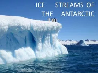
Introduction • The example uses ArcMap to investigate the retreat of ice shelves on the Antarctic Peninsula in relation to climate variables. Ice shelves are the floating extensions of a grounded ice sheet where the glacier flow transports ice from the interior of Antarctica to the sea. • They may be up to 200m high above the sea and sometimes are a kilometer thick, with a considerable amount of ice below sea level. • In the last few years ice shelves on the Antarctic Peninsula have broken up linked to climate change (pdf). • In this exercise we will investigate this phenomenon.
Step 1:Adding polygon data of the land and ice shelves • Open a new project in ArcMap • Using the Add layers icon along the top row, navigate to your data and add the “Land” file. This will add data to your ArcMap project. • This layer shows all the land, both rock and ice, that is above sea-level and on solid ground. • Next use the same button to add one of the ice-shelf layers (see next slide)
Default view of the land and ice shelf layers. Land is shown as blue.
Step 2:Investigating the attributes of the data • First let us look at the attributes of the ice shelves. • Attributes are information associated with the geographic data in a GIS. • Our ice shelves have two attributes, their name and the year the ice shelf was recorded in its location. • To access the attributes right click on the layer you want to look at in the table of contents (the pane on the right hand side). • This brings up a drop-down box with several alternatives; choose the “open attribute table” option (third from the top). • This brings up a tabular view of the data like this:
Each line on this table represents a separate polygon on the map, and associated with each polygon is the name of the particular ice shelf and the year it was like that. the attribute table of the “ice shelf” layer
Selecting from the attribute table. Left click on one of the lines – it will highlight in blue and the corresponding polygon on the map will show in the same colour.
All of the data for the Larsen B ice shelf. Some of the data overlaps. Hold down the shift button and highlight all of the line of a particular ice-shelf to look at this.
Step 3:Visualizing the ice shelf data to show how the shelves have retreated with time • Go into the symbology menu by right clicking the layer you wish to symbolize in the table of contents; in this case right click on the “ice shelf” layer. • From the drop-down menu chose “properties” (at the bottom) and make sure the symbology tab is clicked. • An example is shown on the next slide
In the left hand pane of this box choose “Categories”. Make sure the Category field is set to “Year”, then click “Add all values” at the bottom of the box.
Organise the colour scheme to make the map more understandable by clicking on the “color ramp” and choose a suitable colour scheme. • This symbology shows dark blue where the ice shelves were present recently and other colours where they have retreated in previous years. • The warmer the colour the longer ago the retreat occurred. The data symbolized by year
Step 4:Excluding some of the data from the visualization to see which ice shelves are intact • Display the most up to date data; that from 2010 by using the visualization tools. • In the symbology tools choose the left hand pane, change from “Quantities” to “Categories”. • Click on “ Add values...” . • Now scroll down until you find 2010, select it and click OK. • One last thing before you click the final OK – un-tick the box that says “all other values...“, then click OK to get back to the main screen.
Step 4:Excluding some of the data from the visualization to see which ice shelves are intact • See if you can now re-set the symbology. Go back into the symbology menu and tick the box that says “all other values“ on rather than off. Now you can see where the ice shelves have disappeared.
Step 5:Investigating the ice shelf retreat pattern • The retreat pattern can be investigated in conjunction with an environmental variable. • Isotherms, lines of equal mean temperature are used to see if the pattern of ice shelf retreat is linked to temperature.
Using the Add layers icon along the top row, navigate to your data and add the “Isotherm” file. • Next we need to label the isotherm data so that we can read it. • Right click on the layer and click on the properties option. • Change the tab from symbology to the “label” tab. This should open a dialogue box like the one to the left. The label dialogue box
Choose the attribute to label: • In the box called Text string Label field choose the temp field. • The rest of the defaults should be fine, but make sure you click the tick box in the top left of the menu to turn the labels on, then click OK. • This will label your lines with the mean annual temperature. The label dialogue box In the next slide can you see any pattern between the temperature and where ice shelves have been lost? Why do you think that there are no ice shelves on the north-west side of the Peninsula?
Isotherms in conjunction with present ice shelves (in green) and lost ice shelves (in yellow).
The link between temperature and ice shelf loss. • Scientists believe that one of the controls on where ice shelves are located is mean annual temperature. • They suggest that ice shelves in areas where the mean temperature is higher than -9°C are vulnerable to collapse. • On the Antarctic Peninsula, no ice shelves exist in the warmest areas to the north-west (top left of the map). • Over the last 50 years the region has warmed significantly by around 3 – 4°C. this means that areas which were colder than -9°C are now -5vC or -6°C; too warm to support ice shelves.
The link between temperature and ice shelf loss. • The first shelves to collapse were in the warmer areas in the north and west of the region, first the Wordie and Prince Gustav Ice Shelf, then the Larsen A, and more recently the Larsen B and part of the Wilkins ice shelves. • It is expected that as the area warms further and the -9°C isotherm retreats southward more ice shelves will collapse.