Download
1 / 8
0 likes | 2 Views
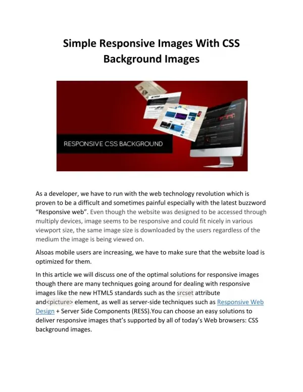
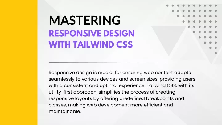
Responsive design is crucial for ensuring web content adapts seamlessly to various devices and screen sizes, providing users<br>with a consistent and optimal experience. Tailwind CSS, with its utility-first approach, simplifies the process of creating<br>responsive layouts by offering predefined breakpoints and classes, making web development more efficient and<br>maintainable.<br><br>For more details, read our blog at https://purecode.ai/blogs/tailwind-breakpoints/

E N D
MASTERING RESPONSIVE DESIGN WITH TAILWIND CSS Responsive design is crucial for ensuring web content adapts seamlessly to various devices and screen sizes, providing users with a consistent and optimal experience. Tailwind CSS, with its utility-first approach, simplifies the process of creating responsive layouts by offering predefined breakpoints and classes, making web development more efficient and maintainable.
THE SIGNIGICANCE OF RESPONSIVE DESIGN Responsive design is significant as it ensures web interfaces adapt seamlessly to various devices and screen sizes, providing a consistent and optimal user experience. With the prevalence of smartphones, tablets, and desktops, responsive design is essential for websites to look and function well across the diverse range of devices in use today.
TAILWIND CSS BREAKPOINTS Tailwind CSS provides default breakpoints, namely sm, md, lg, xl, and 2xl, inspired by common device resolutions. These breakpoints simplify the creation of responsive layouts by allowing developers to conditionally apply styles based on device resolution directly in HTML, eliminating the need for extensive custom CSS and streamlining the process of building adaptive and visually appealing interfaces.
DYNAMIC BREAKPOINTS IN TAILWIND CSS Dynamic breakpoints in Tailwind CSS refer to the use of arbitrary values for adapting webpage layouts. Two variants, ‘max-* and min-*’, allow developers to create custom breakpoints based on maximum and minimum screen widths, respectively. Visual representation of dynamic breakpoints involves illustrating how elements on a webpage adapt based on arbitrary screen values using Tailwind CSS. For example, employing the max-* and min-* variants enables developers to create custom breakpoints, visually showcasing how layouts dynamically respond to specific screen widths for an optimal user experience.
TAILWIND VS. TRADITIONAL MEDIA QUERIES Tailwind CSS breakpoints offer a utility- first approach, generating responsive classes for predefined breakpoints, reducing the need for writing custom CSS media queries. This streamlined approach in Tailwind enhances code readability, maintainability, and overall efficiency compared to traditional media queries, providing a more accessible and developer-friendly way to create responsive designs.
ADVANTAGES OF BREAKPOINTS IN TAILWIND Tailwind CSS streamlines web development with speedier development by providing predefined classes and breakpoints, reducing the need for extensive custom CSS coding. Its utility-first approach enhances maintainability, offering clean and organized code structures, and custom breakpoints become essential when specific layout adjustments are required outside the default breakpoints, allowing for precise control over responsive design tailored to unique project requirements. Infographic highlighting the advantages.
EMPOWERING YOUR WEB PROJECTS In summary, Tailwind CSS breakpoints empower developers by offering predefined classes and dynamic breakpoints, ensuring speedier development and enhanced maintainability in responsive design. Explore the full article at https://purecode.ai/blogs/tailwind- breakpoints/