Download
1 / 4
40 likes | 227 Views
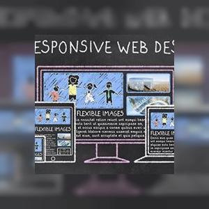
In this article we will discuss one of the optimal solutions for responsive images though there are many techniques going around for dealing with responsive images like the new HTML5 standards such as the srcset attribute and<picture> element, as well as server-side techniques such as Responsive Web Design Server Side Components (RESS).

E N D
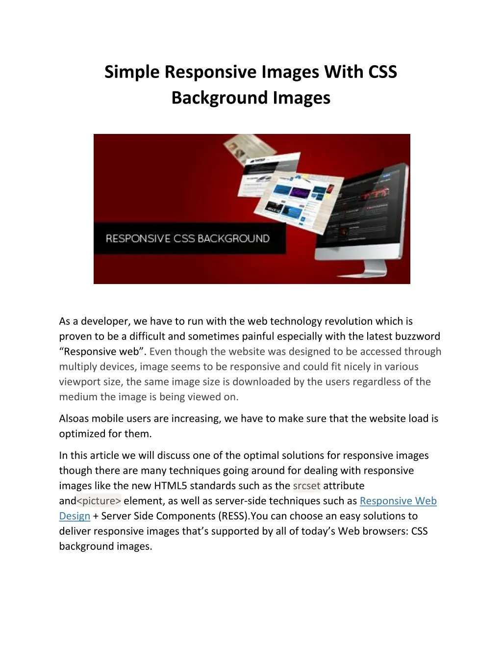
Simple Responsive Images With CSS Background Images As a developer, we have to run with the web technology revolution which is proven to be a difficult and sometimes painful especially with the latest buzzword “Responsive web”. Even though the website was designed to be accessed through multiply devices, image seems to be responsive and could fit nicely in various viewport size, the same image size is downloaded by the users regardless of the medium the image is being viewed on. Alsoas mobile users are increasing, we have to make sure that the website load is optimized for them. In this article we will discuss one of the optimal solutions for responsive images though there are many techniques going around for dealing with responsive images like the new HTML5 standards such as the srcset attribute and<picture> element, as well as server-side techniques such as Responsive Web Design + Server Side Components (RESS).You can choose an easy solutions to deliver responsive images that’s supported by all of today’s Web browsers: CSS background images.
Before anything you must look at the CSS background approach in several steps: First, the goals and requirements for responsive images. Then how CSS media queries can help identify important characteristics of our users’ devices. CSS background-image property that lets us respond to those characteristics. A strategy for optimizing the individual images that make up a responsive set. Examine the limitations of this approach in many cases there are simple techniques to overcome them. Let’s discuss some of the aspects of the website– The Need for Responsive Images To cope up with the popularity of mobile devices viewing the web we recognized the best practices to make our website compatible for different screen sizes. Website content should spread evenly on desktop or on smartphone. Identifying The User’s Context CSS offers the most effective way to distinguish different devices and can give answers to the critical questions like what is the size of the user’s display? And does it support Retina-style images? The CSS Background-Image Property !DOCTYPE html> <html lang="en"> <head> <metacharset="utf-8"> <title></title> <style> img.smallscreen{display: none;}
@media only screen and (max-width: 320px) { img{ display: none; } img.smallscreen{ display: inline; } } </style> </head> <body> <imgsrc="largeimage.jpg"> <img class="smallscreen" src="smallimage.jpg> </body> </html> Creating the Responsive Images <!DOCTYPE html> <html lang="en"> <head> <metacharset="utf-8"> <title></title> </head> <body> <imgsrc="test.jpg"width="100%">
<p>Window size: <span id="size"></span> pixels</p> <script> window.onresize=function(){ document.getElementById("size").innerHTML=window.innerWidth; }; </script> </body> </html> Conclusion At the end of the day, it is the developers mind to decide which responsive web design image approach can do the justice to their workflow. iMediadesigns provide cost effective web design and development solutions and offers custom web design services in Toronto