Download
1 / 1
0 likes | 9 Views
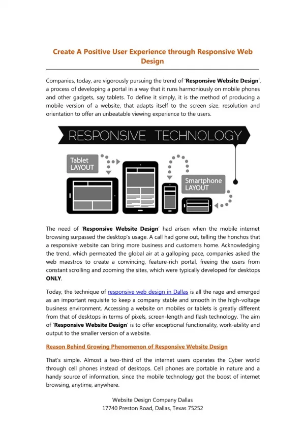
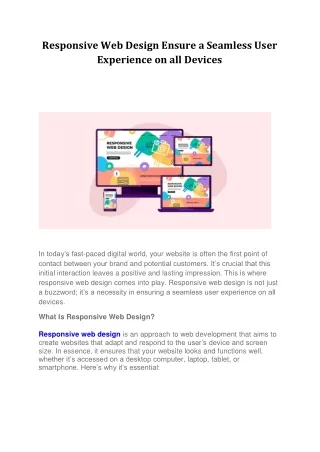
Learn the technical aspects of website development, ensuring mobile-friendly design and an optimal user experience on all devices. This guide teaches you the skills and details needed to create flexible and user-friendly web designs that look good on multi-sized devices without hindering browsing experiences. Read here for more details on crafting a responsive website.

E N D
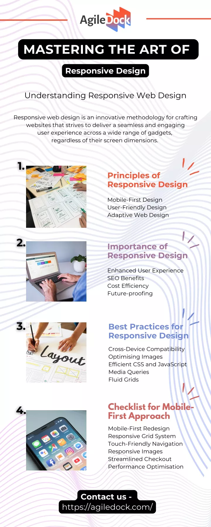
MASTERING THE ART OF Responsive Design Understanding Responsive Web Design Responsive web design is an innovative methodology for crafting websites that strives to deliver a seamless and engaging user experience across a wide range of gadgets, regardless of their screen dimensions. Principles of Responsive Design Mobile-First Design User-Friendly Design Adaptive Web Design Importance of Responsive Design Enhanced User Experience SEO Benefits Cost Efficiency Future-proofing Best Practices for Responsive Design Cross-Device Compatibility Optimising Images Efficient CSS and JavaScript Media Queries Fluid Grids Checklist for Mobile- First Approach Mobile-First Redesign Responsive Grid System Touch-Friendly Navigation Responsive Images Streamlined Checkout Performance Optimisation Contact us - https://agiledock.com/