Download
1 / 2
20 likes | 33 Views
Responsive Web Design provides a great user experience, exceptional functionality, workability and output to the smaller version of a website. Do you want to design a brand new website for your business or redesign the existing website, Contact us at - http://www.websitedesigncompanydallas.com/website-design

E N D
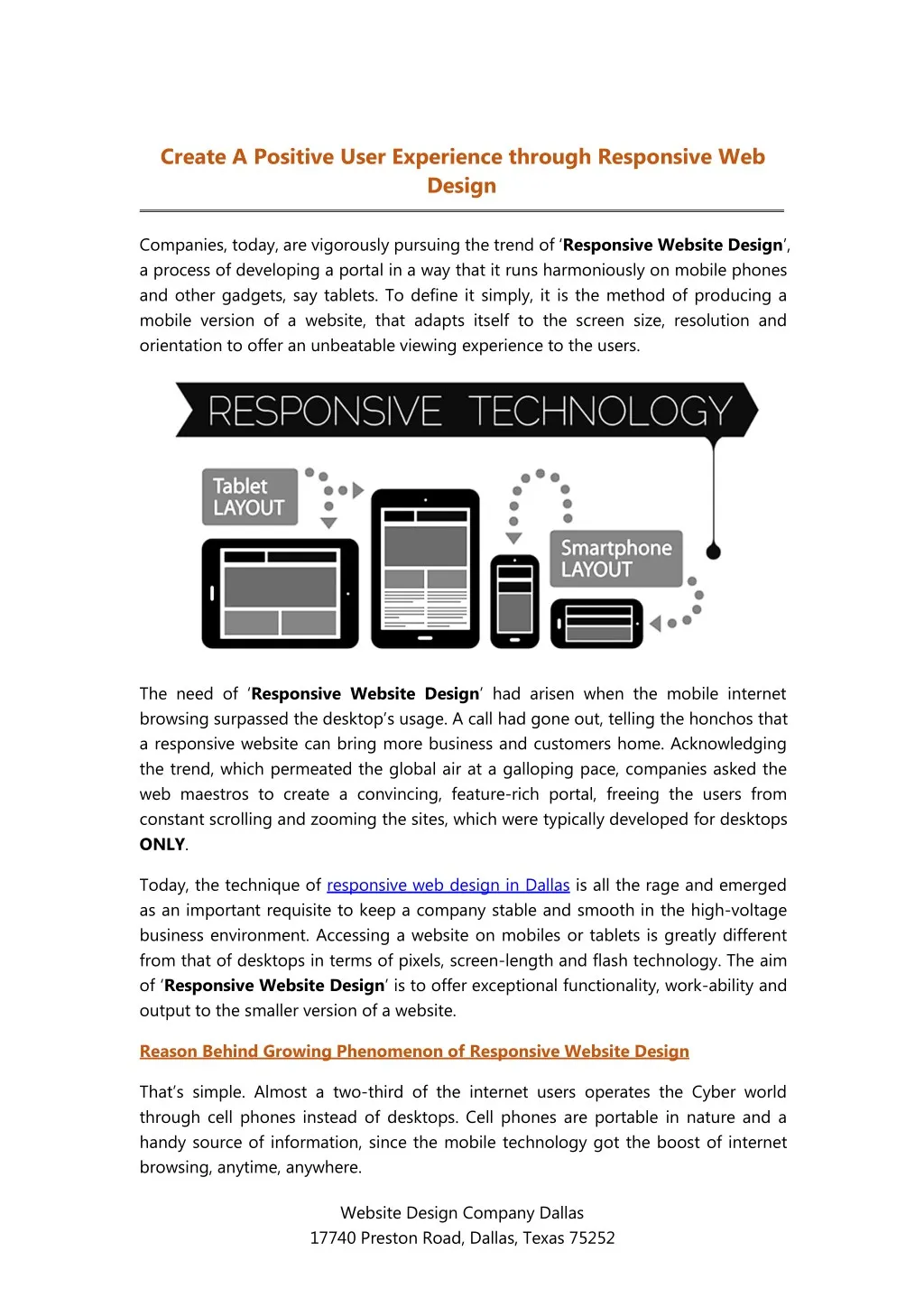
Create A Positive User Experience through Responsive Web Design Companies, today, are vigorously pursuing the trend of ‘Responsive Website Design’, a process of developing a portal in a way that it runs harmoniously on mobile phones and other gadgets, say tablets. To define it simply, it is the method of producing a mobile version of a website, that adapts itself to the screen size, resolution and orientation to offer an unbeatable viewing experience to the users. The need of ‘Responsive Website Design’ had arisen when the mobile internet browsing surpassed the desktop’s usage. A call had gone out, telling the honchos that a responsive website can bring more business and customers home. Acknowledging the trend, which permeated the global air at a galloping pace, companies asked the web maestros to create a convincing, feature-rich portal, freeing the users from constant scrolling and zooming the sites, which were typically developed for desktops ONLY. Today, the technique of responsive web design in Dallas is all the rage and emerged as an important requisite to keep a company stable and smooth in the high-voltage business environment. Accessing a website on mobiles or tablets is greatly different from that of desktops in terms of pixels, screen-length and flash technology. The aim of ‘Responsive Website Design’ is to offer exceptional functionality, work-ability and output to the smaller version of a website. Reason Behind Growing Phenomenon of Responsive Website Design That’s simple. Almost a two-third of the internet users operates the Cyber world through cell phones instead of desktops. Cell phones are portable in nature and a handy source of information, since the mobile technology got the boost of internet browsing, anytime, anywhere. Website Design Company Dallas 17740 Preston Road, Dallas, Texas 75252
To keep one’s business in the limelight and remain in the eye of netizens, it became important to bolster your visibility on minute screens. Benefits of Responsive Website Designing Responsive Website Design has turned the tide. It has become a marketing imperative, a bustling trend credited for drawing unprecedented gains to a business organization in terms of traffic, click-through, revenue and opportunities. Flexibility: Responsive web design aims at re-adjusting the various elements in a way that a website can be accessed on all devices hassle-free. The content moves smoothly, the images and videos sail around without jerks and the customer is at extreme ease. The sight of the website gets an upward revision in terms of viewing, scalability, navigation and functionality. Unrivaled User Experience: Customers have a poor patience threshold. Forget the content, the looks of the website is what prompts a user to stay or leave the page. With the presence of responsive web design around, a website offers an improved and brilliant user experience, regardless of the device used by the respective customer and ensures no irksome jerks in terms of re-sizing the content again and again by a visitor. Pocket-friendly: Responsive web design is cost-effective. The modification takes a little investment, but brings huge profit. There is no different expenditure incurred on the desktop-version and mobile-version. As there is a uniform code for all devices, a company is not compelled to cough up big money. As a result, the savings are incredibly increased. It empowers SEO to create a single website and sends traffic on a single platform. Google Loves Responsive: Google is the tech-god. His command is the last and thus, whatever Google does, it is accepted on a large-scale. Interestingly, a responsive web design is well-responded by the search giant too, placing it on the first page of search engine and wisely indexing associated web pages. This makes visibility grow profusely. The technique boosts sales, generates more leads and enhances conversion rates. Easily Manageable: A company couldn’t think operational the business without responsive web design in today’s time because it doesn’t just saves money, but also weed out the need of deploying extra staff for managing the different sites. A single site stamp out the urgency of having two SEO supports. Both the sites have a uniform URL, and therefore, manageability becomes a trouble-free task. Seeing the benefits, no one would waste a single moment in saying that this is the idea to rally around in the cynical international business community. Website Design Company Dallas 17740 Preston Road, Dallas, Texas 75252