Download
1 / 8
100 likes | 327 Views
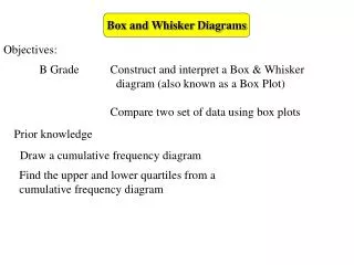
Box and Whisker Diagrams. Objectives:. B Grade Construct and interpret a Box & Whisker diagram (also known as a Box Plot) Compare two set of data using box plots. Prior knowledge. Draw a cumulative frequency diagram.

E N D
Box and Whisker Diagrams Objectives: B Grade Construct and interpret a Box & Whisker diagram (also known as a Box Plot) Compare two set of data using box plots Prior knowledge Draw a cumulative frequency diagram Find the upper and lower quartiles from a cumulative frequency diagram
Box and Whisker Diagrams Averages use one number to describe a set of data, this can be misleading, depending upon which average you use. • Box and whisker diagrams use the • median, • upper and lower quartiles and • range • to draw a picture that can be used to interpret data • Box plots can be drawn in two ways, from • cumulative frequency diagrams, or • the raw data
Box and Whisker Diagrams x Box plots from cumulative frequency diagrams 80 70 60 50 40 30 20 10 0 x x We have already seen how to find the median, LQ and UQ from a cumulative frequency diagram x Extend the the working out lines below the x axis x x x Median UQ Cumulative frequency x x LQ Maximum value x Minimum value 0 10 20 30 40 50 60 70 80 90 100 Draw the box plot like this Weight (g)
Box and Whisker Diagrams Looking at the box plot on its own: Median UQ LQ Maximum value Minimum value whisker whisker
Box and Whisker Diagrams Box plots from raw data First put them in order of size Fred keeps a record of his journey times to school each morning These are his time to the nearest minute for 25 days: 29, 21, 16, 25, 21, 19, 18, 30, 21, 21, 12, 26, 19, 21, 20, 19, 30, 29, 16, 21, 18, 18, 27, 18, 20 18 12, 16, 16, 18, 18, 18, 18, 19, 19, 19, 20, 20, 21, 21, 21, 21, 21, 21, 25, 26, 27, 29, 29, 30, 30 12 21 25 30 Minimum value Maximum value Median number of pieces of data, n Lower Quartile Median position n + 1 = 25 +1 = 13 2 2 Lower Quartile position n + 1 = 25 +1 = 6.25 4 4 Upper Quartile Upper Quartile position 3(n + 1) = 3(25 +1) = 18.75 4 4
Box and Whisker Diagrams 12 Minimum value Maximum value 30 21 Median 18 Lower Quartile 25 Upper Quartile Draw a sensible scale: • 14 16 18 20 22 24 26 28 30 • Time (minutes)
Box and Whisker Diagrams Now do this: Draw a box plot for this data: 18, 8, 19, 15, 27, 13, 10, 4, 8, 31, 26, 11, 29, 28, 23 Solution: Arrange the data in order of size: 4, 8, 8, 10, 11, 13, 15, 18, 19, 23, 26, 27, 28, 29, 31 Median position Median = 18 n + 1 = 15 +1 = 8 2 2 LQ = 10 LQ position n + 1 = 15 +1 = 4 4 4 UQ = 27 UQ position 3(n + 1) = 3(15 +1) = 12 2 2 0 4 8 10 14 16 20 24 28 32
Box and Whisker Diagrams Interpreting Box and Whisker Diagrams What can you say about the ages of the shoppers and what kind of shop they are? Dressnice has a much lower median age, so the shoppers are younger 75% of the Dressnice shoppers are younger than 75% of the Clotheswell shoppers Clotheswell has broader appeal because the IQR is bigger Dressnice is a shop for younger people, perhaps more fashionable