Download
1 / 81
810 likes | 891 Views
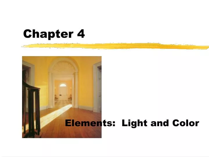
Chapter 4. Elements: Light and Color. Elements: Light and color. Color is an influential element of design cheering or relaxing, depressing, distressful affect apparent size of a room make ceilings seem higher or lower can simulate sunlight can speed up recovery in a healthcare setting.

E N D
Chapter 4 Elements: Light and Color
Elements: Light and color • Color is an influential element of design • cheering or relaxing, depressing, distressful • affect apparent size of a room • make ceilings seem higher or lower • can simulate sunlight • can speed up recovery in a healthcare setting
When we talk about color... • We have to talk first about light • without light, we cannot see color or any other elements discussed last week. • without light reflecting off the surface of an object, we cannot physically see the color. • So does color exist in the dark?
NO • Color is dependent on the element of light.
Technical Definition • Light is the electromagnetic energy from the sun or other celestial bodies, from fire, from artificial sources that travel in wavelengths that range from too long (infrared) to too short (ultraviolet) for us to see.
In other words... • When light hits an object, some of the colors of light rays are absorbed and others are reflected. The wavelengths that are reflected give the object its color. • White objects reflect almost all the colors in light, while black objects absorb most of them.
Example: • A yellow lemon absorbs all wavelengths of color except yellow. That is why we see it as yellow.
If White Objects • reflect almost all the color wavelengths, • Then what color do we see if an object absorbs all color wavelengths?
The color of an object that we see results from three factors: • The way in which the object reflects light. • The kind of light that makes the object visible. (moonlight, sunlight, light bulb etc.) • and the physical condition of the viewer’s eyes.
Did you know? • You can actually change colors by changing the color of your light sources. • You can use filters, reflectors, diffusers, sheers, and special light bulbs to alter the colors we see. • A warm light will intensify red, yellow and orange, but will neutralize blue and violets. • Light that is cool and bluish neutralizes red, yellow and orange.
Color Psychology • You must consider more than aesthetics • You must understand the importance of light and color upon people’s physical and psychological responses to the environment as well as their health. • You will need to know what result is desired, how to achieve it and how to predict its effects. • Table 4.2 page 95
Three dimensions of color (page 87) 1. Hue: The name of a color 2. Value: The lightness or darkness of a color 3. Intensity: its degree of purity or strength: brightness vs. dullness
Hue – The name of a color • The simplest and most familiar color theory is based on the concept that there are three primary hues that cannot be produced by mixing any other hue • Red • Blue • Yellow
Primary Hues (see color wheel on page 84-85) • Primary hues cannot be created by mixing any other color together. Red, yellow and blue are the three primary hues used to create all other colors. • Memorize this color wheel!
Secondary Hue • Secondary hues stand midway between the primary colors of which it is the product • Green between blue and yellow • Orange between yellow and red • Violet between blue and red
Tertiary • Tertiary hues are the colors that stand midway between a primary and a secondary color. For example: • Yellow-green • Yellow-orange • Red-Orange • Blue-green • Blue-Violet • Red-violet • Note: The primary color is written first.
Background • The effects of background also lead to apparent changes in colors. • Orange placed against a blue background seems warmer and brighter • The same orange placed against orange and yellow seems duller and darker.
Interaction of Hues • When placed next to each other, colors produce effects ranging from unity to decisive contrast. • Blue, blue-green and green give a restful unified effect • Blue and orange produces more excitement and contrast
Analogous Hues • Near each other on the color wheel • Create a unified interior • Yellow, orange, red • Blue, blue-green and green
Complementary Hues • These colors lie directly opposite each other on the color wheel. • Creates contrast in an interior • Red and Green • Yellow and Violet • Orange and Blue
Monochromatic • Only one hue is used
Warmth and Coolness of Hues • All colors have a “temperature” • Red, orange and yellow seem warm • Blues and greens seem cool
Advancing Colors • Warm colors: Red, Orange and Yellow • They are considered advancing because they seem nearer to us than they actually are. • Upholstering a piece of furniture in intense red increases its apparent size • Painting a wall red will visually make a room seem smaller, because the color advances.
Receding Colors • Cool Colors: Blues and Greens • Reduces the apparent size of objects. On a piece of furniture, cool colors will make it appear smaller • Used on a wall, it will help visually increase the size of a room
V ALUE • The relative lightness and darkness of a hue • Easy to understand when done without color. (page 88, fig. 4.18) where it indicates the lightness or darkness between pure white and pure black
However • Value gradations apply equally to colors and are determined by the amount of light the colors reflect.
How can a color’s value be made lighter? • By adding white to the color, which we call a tint. • Pink is a tint of Red. • Tints are very pale, clear and cool.
How can a color’s value be made darker? • By adding black to the color, which is called a shade. • Maroon is a shade of red. • Can also be created by adding gray or brown.
A room composed almost entirely of light values seems • Bright • Airy • Cheerful • Uplifting
A room consisting of all dark values brings • A sense of security • Solidity
A final word about Value • In a monochromatic room, value is a key element in providing transition and avoiding monotony and harshness. • Value can also affect the apparent size of objects, light values increase the size because they reflect light and dark colors reduce the size because they absorb light. • When perception is concerned, value is the single most critical characteristic of color. Value contrasts are vital in distinguishing forms, judging depth and distinguishing changes in plane, especially for the very young, elderly and those with limited vision.
Intensity • Refers to a colors purity and strength. • In other words, the degree to which it differs from gray. • Example: pink is always red in hue and light in value, but it can be vivid, almost pure pink or it can be neutralized or grayed pink.
Example: pink is always red in hue and light in value, but it can be vivid, almost pure pink or it can be neutralized or grayed pink. High Intensity or Strong Low Intensity or weak
Playing with intensities If a hue is placed next to an analogous color, it will appear to have a lower intensity than when it is placed next to its complement.
In other words • If you want to decrease the intensity of a color, use an analogous scheme, filter the light (less light), or provide an object that is more intense such as a painting. • If you want to increase the intensity of a color, use a complementary color scheme and illuminate with bright light.
Color Harmonies • Planning a color scheme for a room is one of the fun steps of the design process. • As a designer, you will need to know what happens when colors are combined in order to produce the desired effects for your customer.
Two Categories • Related – harmony and unity • Monochromatic • Achromatic • Analogous • Contrasting – variety • Complementary • Double Complement • Triad • Tetrad
Monochromatic Colors Scheme • Literally one hue is used • Can vary in regard to light and dark • Can vary in intensity • If done right, this room will be unified and harmonious, however, a major danger is monotony. • You must provide variety in other elements.