Download
1 / 24
240 likes | 388 Views
Guidelines. for the Development of Power Point Presentations for Audiences that may Include Persons with Low Vision. This is a presentation developed by the American Printing House for the Blind. Viewers are invited to download and use this presentation for the dissemination of

E N D
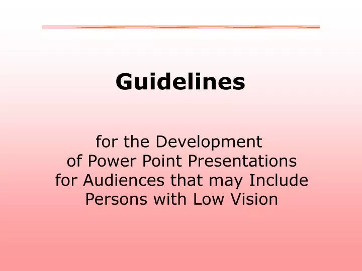
Guidelines for the Development of Power Point Presentations for Audiences that may Include Persons with Low Vision
This is a presentation developed by the American Printing House for the Blind. Viewers are invited to download and use this presentation for the dissemination of information about accessibility issues for persons with low vision. Distribution of this presentation for payment is strictly prohibited, as is changing the content thereof. C 2005 American Printing House for the Blind
Sans Serif Fonts should always be used for text and headings of more than one line. Some good choices are: Verdana Tahoma Antique OliveArial
Headings should be 32 points or larger.
WOW! Subheadings should be 30 points or larger.
Text should be 28 points or larger, if possible. Bold text is more visible than standard text.
Backgrounds • should be simple, not graphical, and should be one • color, preferably light pastel or white if black print • is used. • Two color gradients are acceptable where one is • white and the other is pastel. • Two color gradients are also acceptable where one • is not white if the pastel colors are adjacent on the • color wheel. • Gray should be avoided in both text and background.
Text and background should be of high contrast. If the text is dark, the background should be light. If the text is light, the background should be dark.
Some good text/background color combinations are: Dark green and white Dark red and white Yellow and violet Violet and white Dark blue and yellow Black and white Black and yellow Pink and black Dark blue and white
Because they provide only poor contrast, certain colors should not be used together either as graphic features, background or text: Red and green Blue and black Red and black Green and black Dark blue and violet Violet and black
Shades of gray should not be used together either as graphic features, background or text Shades of gray should not be used together either as graphic features, background or text
Acceptable animation features include Fly in from left Wipe right Appear Typewriter Laser from right
Slides should be simple with no more than 3 different blocks of information, nor more than six individual lines of information per block .
Avoid putting information in columns if possible. Lines of text of 28-39 characters are preferred • Bulleted lists are an exception. • No more than six bulleted lines
Where bulleted lists occur side by side, text of one list should be on a different colored background to avoid confusion: • zebra • emu • gazelle • flamingo • giraffe • fur • feathers • horns • legs • neck
Avoid divided words at the ends of lines. I pledge allegiance to the flag of the U- nited States of America, and to the re- public for which it stands, one nation under God, indivisible with justice and lib- erty for all.
Graphics should be of high contrast and have good clarity. Black and white line drawings are preferred over grayscale graphics. This is grayscale.
Graphics that contain mainly bold areas of bright color are preferred over black and white. Patterned areas should be limited, if possible.
Where maps or charts are included, color is preferred over grayscale. Text on maps or charts should adhere to APH large print guidelines.
Avoid italics, if possible. Better choices are: Underscoring, “enclosing in quotation marks,” or bolding.
When making printed handouts from Power Point slides, two or fewer slides per page is preferred. Remember, what you do to make your presentation accessible for the person with low vision will ultimately make it more readable for everyone.
For more information please see, Kitchel, E. (2004). Guidelines for the Development of PowerPoint Presentations for Audiences that may Include Persons with Low Vision. American Printing House for the Blind. Available at http://www.aph.org/tests/ppguide.html Kitchel, E. (2001). Large Print: Guidelines for Optimal Readability and APHont(TM) a font for low vision. American Printing House for the Blind. Available at http://www.aph.org/edresearch/lpguide.htm
This power point presentation was developed by Elaine Kitchel, M.Ed. for The American Printing House for the Blind 1839 Frankfort Avenue Louisville, KY 40206 1 (800) 223-1839 c 2005