Download
1 / 3
0 likes | 19 Views
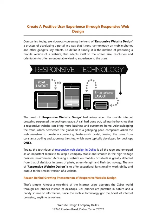
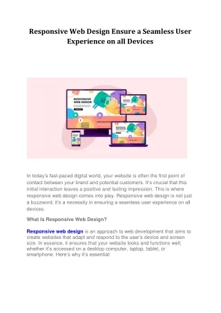
Responsive web design is a design approach that emphasizes the creation of websites that provide an optimal viewing and interaction experience across various devices. The goal is to ensure that users can easily navigate and consume content regardless of their device. This is achieved through flexible grid layouts, fluid images, and media queries.

E N D
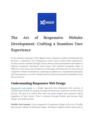
The Development: Crafting a Seamless User Experience Art of Responsive Website In the dynamic landscape of the digital world, responsive website development has become a cornerstone for creating user-centric and versatile online experiences. As users access websites through various devices, from smartphones and tablets to desktop computers, developers must ensure that websites seamlessly adapt to different screen sizes and resolutions. In this blog, we’ll delve into the intricacies of responsive website development, exploring its significance, fundamental principles, and best practices to create websites that look good and perform optimally across diverse devices. Understanding Responsive Web Design Responsive web design is a design approach that emphasizes the creation of websites that provide an optimal viewing and interaction experience across various devices. The goal is to ensure that users can easily navigate and consume content regardless of their device. This is achieved through flexible grid layouts, fluid images, and media queries. Flexible Grid Layouts: A key component of responsive design is the use of flexible grid layouts. Instead of fixed pixel values, developers employ relative units such as
percentages and ems to create layouts that adapt to different screen sizes. This ensures the content remains proportionate and maintains a harmonious structure regardless of the device. Fluid Images: Images play a crucial role in web design; in a responsive context, making them fluid is essential. This means using CSS properties like ‘max width: 100%’ to ensure that images scale proportionally within their containing elements. This prevents images from overflowing or breaking the layout on smaller screens. Media Queries: Media queries are CSS techniques that allow developers to apply different styles based on the device’s characteristics, such as screen width, height, or resolution. Developers can use media queries to create custom styles for various breakpoints, ensuring a smooth transition and optimal user experience across different devices. Best Practices for Responsive Website Development: Mobile-First Approach: A mobile-first approach involves designing and developing for mobile devices first and then progressively enhancing the layout for larger screens. This ensures the website’s core functionality is optimized for smaller screens, providing a solid foundation for a responsive design.
Performance Optimization: Performance is crucial for user experience, especially on mobile devices with varying network conditions. Developers should prioritize optimizing images, leveraging browser caching, and minimizing HTTP requests to enhance page load times. User-Centric Navigation: Navigation is a critical aspect of responsive design. Ensuring that navigation menus are easily accessible and user-friendly on all devices is essential. Consider using techniques like off-canvas menus or navigation bars that collapse into a toggle button on smaller screens. Testing Across Devices: Testing is a continuous process in responsive website development. Testing the website on various devices and browsers is essential to identify and address any issues. Embracing tools like browser developers and online emulators can help streamline this process. Responsive website development is not just a trend; it’s a necessity in the digital era. By adopting a mobile-first approach, implementing flexible grid layouts, fluid images, and media queries, and following best practices, developers can craft websites that provide a seamless and enjoyable user experience across diverse devices. As technology evolves, staying attuned to responsive design principles is critical to ensuring that websites remain relevant, engaging, and accessible to a broad audience.