Composing With Color
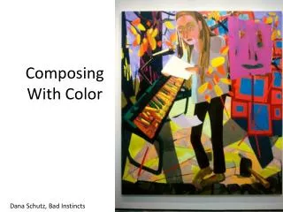
Composing With Color. Dana Schutz , Bad Instincts. Spatial effects of colors. Brighter, more saturated (high keyed) colors will seem to pull closer to the viewer than duller colors.

Composing With Color
E N D
Presentation Transcript
Composing With Color Dana Schutz, Bad Instincts
Spatial effects of colors Brighter, more saturated (high keyed) colors will seem to pull closer to the viewer than duller colors. Colors that are lighter at pure saturation seem (yellows) will seem to take up more space when covering the same area than darker saturated colors (blues) Full saturation colors will seem closer than dark keyed colors (shades) Larger areas of brighter colors appear closer Smaller shapes appear farther Peter Halley
Luminosity: The appearance of Light in an image Lighter colors placed within darker colors will create an illusion of luminosity, as will warm colors contrasted with cool colors. Tobey Archer
Color weight: color’s tendency to seem to rise or fall in a composition (depending on it’s relationships) LIGHTER HEAVIER Achromatic Colors High Saturation Colors High Value (light) Colors Dark Value Colors High Saturation Warm Colors Medium-value Cool Colors Low Saturation Light Colors High Saturation Dark Colors Inherently Dark Hues Inherently Light Hues
Traditional Color Contrasts, thought to balance a composition Light/Dark Contrast Hue Contrast Cool/Warm Contrast Complementary Contrast
Light/Dark Contrast JWM Turner, Storm at Sea
Warm/Cool Contrast Graham Nickson
Hue Contrast Stuart Davis
Compositional Tools to create harmony Harmony: compositional oneness and cohesion. The following elements help create harmony: • Repetition: The use of the same visual element (in this case, colors) to create unity • Continuity: degree of flow between parts of a composition • Focal points: Parts of the composition that command the viewer’s attention and allow them to look closer
Ben Vautier, Store Repetition
Dana Schutz Continuity: elements that lead the viewer’s eye from one part of the composition to the next. As these colors blend into one another (white to yellow, blue to grey to yellow) they create continuity, allowing the viewer’s eye to travel from one section and one element to another
Emphasis will depend on a contrast of value, color, or saturation, causing one color-area to stand out. Kaye Donachie
Balance • The equal distribution of weight or force among elements of a composition • Symmetry: mirror imaging across an axis • Asymmetrical balance: uneven yet balanced components to a composition (think of balance like a scale—it needn’t be identical to be balanced—one ten lb. brick weights the same as ten one lb. bricks)
How is this painting balanced through color? Wassily Kandinsky
This book jacket is not based on any color scheme. However, it ‘works’. The blue/green and red are similar values, as are the pink and yellow. The black stands out in contrast. Red, pink, and yellow are all warm, so the blue/green adds additional contrast. Bruno Paul


