Download
1 / 31
310 likes | 425 Views
A Story of Functions. Module 2: Modeling with Descriptive Statistics. Modeling. Modeling Cycle. Session Objectives. Discuss the key ideas of what students learn in the module Modeling with Descriptive Statistics.

E N D
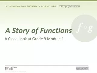
A Story of Functions Module 2: Modeling with Descriptive Statistics
Session Objectives Discuss the key ideas of what students learn in the module Modeling with Descriptive Statistics. Examine sample problems to learn how students progress through the Common Core Standards in Statistics and Probability. Participate in the process of how students learn the big ideas of this module.
Module Topics Topic A: Shapes and Centers of Distributions 3 Lessons S-ID.1 / S-ID.2 / S.IS.3 Topic B: Describing Variability and Comparing Distributions 5 lessons S-ID.1 / S-ID.2 / S.IS.3 Mid-Module Assessment
Module Topics Topic C: Categorical Data on Two Variables 3 Lessons S-ID.5 / S-ID.9 Topic D: Numerical Data on Two Variables 9 Lessons S-ID.6 / S-ID.7 / S-ID.8 / S-ID.9 End-of-Module Assessment
Update 1. Where are you, or the teachers you work with, in this module? 2. How is it going? 3. What specific challenges are you and your colleagues facing?
Activity 1: Distributions and Their ShapesTopic A Examples Organize in small groups. Discuss and complete selected problems from Lesson 1 of this module. After you have completed the problems, we will discuss how students learn to uncover the story behind the data. What do students specifically address as they summarize data distributions?
Key ideas of this set of problems • Students use informal language to describe the shape, center and variability of a distribution based on a dot plot, histogram, or box plot. • Students recognize that a first step in interpreting data is making sense of the context. • Students make meaningful conjectures to connect data distributions to their context and the questions that could be answered by studying the distribution.
What can you summarize about each of the following data distributions?
What questions do students answer to summarize a data distribution? What is the shape of the distribution? What is the center of the distribution? What is a measure of the variability of the distribution?
Shape What is the shape of the distribution? Is it nearly symmetrical? Is it skewed?
Center What center is the best indicator of the typical value of the data distribution? Mean? Median?
Spread or Variability of the Data Distribution What is the best measure of spread or variability for a data distribution? Mean Absolute Deviation (or MAD)? Interquartile Range (or IQR)?
Activity 2: Comparing DistributionsTopic B Example (Lesson 8) Country Data A science museum has a “Traveling Around the World” exhibit. Using 3D technology, participants can make a virtual tour of cities and towns around the world. Students at Waldo High School registered with the museum to participate in a virtual tour of Kenya, visiting the capital city of Nairobi and several small towns. Before they take the tour, however, their mathematics class decided to study Kenya using demographic data from 2010 provided by the United States Census Bureau. They also obtained data for the United States from 2010 to compare to Kenya.
The representation of a data distribution tells us about the story behind the data. Each representation tells us various summaries of the story. Examine the representations of two distributions. The first representations are histograms of two samples. The first sample is 200 people from Kenya and the second sample is 200 people from the United States. The second presentations are box plots of the same samples. Think of 2 questions students could answer from either the box plot or the histogram or both. Also, think of a question that cannot be answered by either representation.
Key Points of Topic B • Data distributions are represented by dot plots, histograms, and box plots. • Data distributions are defined by their shape, center, and spread. • Distributions that are skewed use the median and interquartile range (IQR) for measures of center and variability • Distributions that are nearly symmetrical use the mean and the mean absolute deviation (or MAD) for measures of center and variability
Activity 3: Two-way TablesTopic C Example (Lesson 9) Students in a mathematics class to pose the statistical question, “Do high school males have different preferences for superhero powers than high school females?” Use the following table to think about how that question might be answered.
What summaries can you make of the above data that could be used to answer our statistical question? Think of at least two, and discuss.
Key Points of Topic C • Categorical bivariate data are summarized by two-way frequency tables. • Conditional relative frequencies are used to evaluate the possible association between two categorical variables. • Many of the 9th grade standards and learning expectations are started in grade 6, 7, and 8, and are continued in this grade.
Activity 4: Numerical Data on Two Numerical VariablesTopic D Example (Lesson 12) Examine a scatter plot of elevation and mean number of clear days for 14 cities. Do you see a pattern in the scatter plot?
Key Ideas of Topic D Topic D continues to present scatter plots. Students particularly focus on deciding whether or not a scatter plot has a linear model and that that model tells us about the data. A linear model is introduced in grade 8, and then expanded in grade 9 as students develop a “best-fitting” line. The decision of whether or not the linear model is a good model is based on a residual plot. The next slides introduce the topic of a residual and a residual plot. The topic involving residuals concludes Topic D and the module.
Summary Grade 9 is a key grade level. Review in the Module Overview the Focus Standards. Key ideas: • Data Distributions • The role of shape, center, and spread (variability) in summarizing a data distribution. • Analyzing categorical data from two-way frequency tables. • Association • Linear models and Best-fitting Lines