Maximizing Impact: Effective Data Management for Nonprofit Organizations
Nonprofit organizations are inundated with data, yet struggle to translate it into actionable insights. This session will explore strategies to improve data management, helping organizations assess and enhance their programs. Attendees will learn how to develop sustainable data management strategies, set effective data evaluation targets, and utilize analysis tools. Participants will also gain skills in storytelling with data through performance indicators, ensuring they tell a compelling narrative of their community impact and organizational achievements.

Maximizing Impact: Effective Data Management for Nonprofit Organizations
E N D
Presentation Transcript
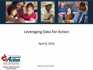
Leveraging Data For Action April 8, 2014
Background Nonprofit organizations are no strangers to data, in fact, many are experts in consolidating lots and lots of data points. We try to collect it, we try to analyze it, and we try to respond to it. More often than not, the time and effort is just that – time and effort with little to show for how our data can be utilized to assess and improve our programs. What’s on the horizon… • The demand for data will continue to increase as organizations try to link effective organizational and fiscal stewardship over: • Community impacts • Resources • Assets • Budgets
Learning Objectives • Participants will learn how to develop a sustainable data management strategy. • Participants will learn how to set and evaluate data targets. • Participants will increase their understanding of data analysis techniques and tools that will help them make sense of their data. • Participants will learn how to prioritize and apply a quality improvement processes in response to their data findings. • Participants will learn how to tell a compelling story utilizing NPI and agency performance indicators.
What is a Data Management Strategy? It is a … • Strategic approach by which data is acquired, validated, stored, protected, and analyzed, and by which its accessibility, reliability, and timeliness is ensured to satisfy the needs of the data users. When the data management strategy is working well it … • Provides the right data at the right time, by ensuring data are regularly collected, analyzed, reported, and effectively used to make improvements.
Acquisition • What data is currently manually entered into the system? • Interviews, observations, tracking • Is the data automatically tracked by a system? • Is the data coming from multiple sources? • Community Action Agencies • Public Sources • Are staff able to to collect additional data about actions, perceptions, or processes that they aren’t currently collecting? • Are there consistent data templates? Tip: Templates assist in consistent data delivery. Data acquisition can be a challenge with different partner agencies, however there is a shared goal – we all want to showcase the impact our program is having in our communities.
Data Format • Clear definition of the desired data format (%s, #s, $s). • Percentages (%s) • Numbers (counts, cumulative, ratios) • Dollars (Budgets, Expenses, Revenues, Assets) • Clear understanding of what comprises the numerator and denominator. • Data is submitted in uniform format. Tip: Develop a Measure Definition Sheet that details goals, performance indicators, and format of the data. (see examples in Appendix) A consistent data format is essential if we are going to compare years, counties, or similar programs.
Validation • Historical Trend • Does it make sense? • Outliers • Is there just one? Or are there many? • Spot Checking / Quality Control • Small random sample to validate the accuracy of data findings. • Do we need to spend significant amount of time cleaning it up? Tip: Line graphs are your friends in visually assessing potential issues with the data. Different programs or partners will require more scrutiny until the validation process is more consistent.
Accessibility • Is the data readily available? • Monthly, Quarterly, Bi Annually, Annually • Is the data cloud-based? Or server-based? • What type of system houses the data? • CAP 60, ServTraq • Microsoft Excel, Access • MySQL, Oracle • Attendance Logs • Who runs the reports? Who is responsible for pulling the data? • Do we have a backup that can run the reports? Data accessibility is critical for tracking and measuring community impact. The sooner you have the information the faster you can make the necessary course corrections.
Timeliness • What is the frequency in which I will be able to collect the information? • Monthly,Quarterly, Bi Annually, Annually • Do we have to consistently chase down the data? • Same program • Same individuals Tip: Try to minimize the use of indicators where data are only available at the end of the year. Find or develop a more timely source. Utilize a balanced approach when dealing with data availability. Some data may be available on a daily basis posing its own challenges, while other data may not be available until the very end of the fiscal year which is truly too late.
Reliability • How reliable is the data? • Is the data consistently of good quality? • Is there too much variability in the numbers to accurately tell the story? Tip: Quality data is your strongest point of view in telling your story and rebuffing critics. It’s unerring proof that the organization is making progress and delivering on its mission. Spend the necessary time ensuring the data is consistently of good quality. The old adage is correct ….“Garbage in equals garbage out.”
Storage and Protection • Can I access the historical record? • Where do we store and backup the data? • What types of protection protocols do we have in place? • Do we have a Business Continuity Plan? • What is the procedure if the data is inaccessible, erased, corrupted, or we’ve experienced a natural disaster? There is nothing worse than losing or not having access to all of the data and corresponding analysis at a time when you need to. Plan for it.
Let’s Assess Our Data Management Strategy • Assess and prioritize those measures with issues that need to be improved first. • The Key to Success in implementing a data management strategy is to prioritize and focus on the metrics that are mission critical to your community impact. Quarterly Review
Clearing Up Terminology Confusion Setting and Evaluating Targets
Step 1: Setting Annual Targets A target is the desired end of the year performance outcome which is typically determined by past performance. What needs to be in place before setting targets? • Aim Statements • Typically 4 to 5 statements that encompass community and organizational needs. • Goal statements • Often range from 3 to 6 goal statements in support of 1 Aim • Performance Indicators • Typically 2 to 5 quantitative measures are selected in assessing progress against defined goals.
Step 2: Setting Annual Targets Scenario: We have defined our organizations aim statements, goals, and have aligned on which performance indicators to track, measure, and report on. How do I determine what should be the target?
Step 3: Setting Annual Targets In addition to annual targets, Red Line targets are just as important because they help determine the minimum level of acceptability. • Red line targets are unacceptable outcomes at any point and time that require immediate program or organizational attention and intervention. • Setting redline targets is essential, and often left out, to help your organization gauge and prioritize your program improvement efforts. Fell Short of Red Line Target Performed Above Red Line & Below Annual Target Achieved or Exceeded Target Red Line Target Annual Target
Visual Analysis: Leveraging SQVID • Series of 5questions that we walk our initial idea through in order to bring visual clarity. • Helps us imagine what visual messages we’d like to convey before we start worrying about which picture we’re going to use. Simple Elaborate vs Quality Quantity vs Vision Execution vs Individual Attributes Comparison vs Delta (or Change) Status Quo vs Source: Roam, Dan. The Back of the Napkin, Solving Problems and Selling Ideas with Pictures.
Visual Model Source: Roam, Dan. The Back of the Napkin: Solving Problems and Selling Ideas with Pictures.
Visual Model (cont’d) Source: Roam, Dan. The Back of the Napkin: Solving Problems and Selling Ideas with Pictures.
Visual Model (con’td) Source: Roam, Dan. The Back of the Napkin: Solving Problems and Selling Ideas with Pictures.
Rules of Thumb for Visual Modeling • Portrait • Think simple. • Illuminate lists. • Visually describe. • Charts • It’s the data that matters, so let it show. • Pick the simplest model to make your point. • Bar charts: comparing absolute quantities • Lines & Area charts: For comparing absolute quantities between two different criteria or times. • If you start with one model, stay with one model. • Maps • Everything has a geography. • North is a state of mind. • Look beyond the obvious hierarchy. • Timelines • Time is a one-way street. • Repeating timelines create life cycles. • Round versus linear. (clock or ruler) • Flowchart • Showcasing cause and effect. • Plots • Multiple-variable plots aren’t hard to make, but they require patience, practice, anda point. • Create a scale model of an entire business universe or business problem. • The biggest danger of multiple-variable plots is that they invite the layering of many data types. Source: Roam, Dan. The Back of the Napkin: Solving Problems and Selling Ideas with Pictures.
What is Quality Improvement? • An integrative process linking .. …throughout an organization. • Allows us to ask, “given our resources and authority, are we improving the lives within our communities in the most efficient way possible? • Ultimately, it is a journey of continuous improvement, allowing organizations to maximize their impact and outcomes. “Doing the right thing for the right reason at the right place in the right ways at the right time.” Knowledge Structures Processes Outcomes Source: NNPHI, Proctor & Gamble
How does ROMA fit in a Performance Management System? Source: Turning Point, From Silos to System, “Embracing Quality in Public Health: A Practitioner’s Performance Management Primer”
When Do I Launch a Quality Improvement Project? QI is an essential piece of performance management. • When your performance management system shows a gap that is not closing between a performance target and your programs current performance, you have an opportunity to implement QIP to improve program and service impacts. Popular QI Methodologies • Plan-Do-Study-Act (PDSA) • Lean / Six Sigma • 5s • FADE
Prioritize and Select Quality Improvement Projects • Review the measures that performed at the redline or below. • Review the measures that performed above redline and below the annual target. • As a team, leverage a matrix exercise to help you prioritize and evaluate which measures are candidates for a QIP. (See Appendix for QIP Matrix) • Out of the prioritization matrix, select a max of 3 potential measures that may be candidates for a QIPs, • Three may be too many if there are significant resource constraints or process complexity, in which case target just 1 measure for a QIP.
Closing Gaps: Plan-Do-Study-Act (PDSA) Iterative four-step management method used in business for the control and continuous improvement of processes and products. • Request corrective actions on significant differences between actual and planned results. Analyze the differences to determine their root causes. Determine where to apply changes that will include improvement of the process, product, or service. Plan • Establish objectives and processes necessary to deliver results in accordance with the expected target or goals. When possible start on a small scale to test possible effects. Do • Implement the plan, execute the process, deliver the service. Study • Study the actual results (measured and collected in "DO" above) and compare against the expected results (targets or goals from the "PLAN") to ascertain any differences or gaps. Act
Closing Gaps: Lean Overproduction Motion Over Processing Waiting Transportation Correction Inventory Unused Employee Ideas & Talent Photos www.alverdyan.com
Telling the story Source: Non Profit Data Decision-Making Workbook, January 2013
Telling the story “If a metric measures in a forest with no one around to hear it, it does not make a sound…” • Who will be the recipients of the story? • In what meetings will they be used? • What decisions shouldn’t be made without them? • How frequently will you plan to adjust your actions based on what the metrics say? Source: Non Profit Data Decision-Making Workbook, January 2013
Effective Ways to Structure Your Story Beginning • Given the short attention spans and the need to move from one activity to the next as quickly as possible, you want to highlight the momentous and game changing results first. Middle • The body of your story should focus on those areas where we are improving and making significant strides. End • The end of the story is where you will want to talk about the proactive steps that will be taken to bring under performing metrics back on track. Filter down the most important themes you wish to convey. Ask your self what do we need to know to ensure we are making progress and report on those measures.
Leverage a combination of text and graphic to reinforce your story making it more memorable. Source: Ontario’s Health System Yearly Report, 2013
Resources • Getting Started with Data-Driven Decision Making: A Workbook. http://www.nten.org/research/2013-data-workbook-download. • Organizational Research Services, A Handbook of Data Collection Tools: Companion to “A Guide to Measuring Advocacy and Policy.” http://www.organizationalresearch.com/publicationsandresources/a_handbook_of_data_collection_tools.pdf. • Sample Size Estimator. http://www.surveysystem.com/sscalc.htm. • Roam, Dan. The Back of the Napkin, Solving Problems and Selling Ideas with Pictures. • Measuring Your Impact: Using Evaluation to Demonstrate Value. http://nnlm.gov/evaluation/workshops/measuring_your_impact/DataCollectionHandout.pdf. • Turning Point, From Silos to System, “Embracing Quality in Public Health: A Practitioner's Performance Management Primer.” http://www.phf.org/resourcestools/Documents/silossystems.pdf. • “10 Steps to Creating the Perfect Infographic.” http://www.creativebloq.com/design/10-steps-creating-perfect-infographic-3145672. • 10 Free Tools for Creating Infographics. http://www.creativebloq.com/infographic/tools-2131971.
Further Questions or Comments • allison@hensleit-hss.com This presentation was created by California/Nevada Community Action Partnership in performance of the California Department of Community Services and Development CSBG Discretionary Grant #13F-3122. Any options, findings, and conclusions, or recommendations expressed in this materials are those of the author(s) and do not necessarily reflect the views of the U.S. Department of Health and Human Services, Administration for Children and Families.