Chapter 15 Descriptive Statistics
Chapter 15 Descriptive Statistics. Descriptive Statistics consists of methods for organizing, displaying, and describing data by using tables, graphs, and summary measures.

Chapter 15 Descriptive Statistics
E N D
Presentation Transcript
Descriptive Statistics consists of methods for organizing, displaying, and describing data by using tables, graphs, and summary measures. • A variable is a characteristic under study that assumes different values for different elements. A variable on which everyone has the same exact value is a constant. • The value of a variable for an element is called an observation or measurement. • A data set is a collection of observations on one or more variables. • A distribution is a collection of observations or measurements on a particular variable.
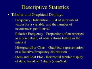
Frequency Distributions One useful way to view the data of a variable is to construct a frequency distribution (i.e., an arrangement in which the frequencies, and sometimes percentages, of the occurrence of each unique data value are shown).
• When a variable has a wide range of values, you may prefer using a grouped frequency distribution (i.e., where the data values are grouped into intervals and the frequencies of the intervals are shown). • For the above frequency distribution, one possible set of grouped intervals would be 20,000-24,999; 25,000-29,999; 30,000-34,999; 35,000-39,999; 40,000-44,999. • Note that the categories developed for a grouped frequency distribution must be mutually exclusive (the property that intervals do not overlap) and exhaustive (the property that a set of intervals or categories covers the complete range of data values).
Graphic Representations of Data Another excellent way to describe your data (especially for visually oriented learners) is to construct graphical representations of the data (i.e., pictorial representations of the data in two-dimensional space). • Some common graphical representations are bar graphs, histograms, line graphs, and scatterplots.
Bar Graphs A bar graph uses vertical bars to represent the data. • The height of the bars usually represent the frequencies for the categories that sit on the X axis. • Note that, by tradition, the X axis is the horizontal axis and the Y axis is the vertical axis. • Bar graphs are typically used for categorical variables. • Here is a bar graph of one of the categorical variables included in the data set for this chapter (i.e., the data set shown on page 435).
Histograms • A histogram is a graphic that shows the frequencies and shape that characterize a quantitative variable. • • In statistics, we often want to see the shape of the distribution of quantitative variables; having your computer program provide you with a histogram is a simple way to do this. • • Here is a histogram for a quantitative variable included in the data set for this chapter:
Line Graphs • A line graph uses one or more lines to depict information about one or more variables. • • A simple line graph might be used to show a trend over time (e.g., with the years on the X axis and the population sizes on the Y axis). • Line graphs have in common their use of one or more lines within the graph (to depict the levels or characteristics of a variable or to depict the relationships among variables).
Scatterplots A scatterplot is used to depict the relationship between two quantitative variables. • Typically, the independent or predictor variable is represented by the X axis (i.e., on the horizontal axis) and the dependent variable is represented by the Y axis (i.e., on the vertical axis). • Here is an example of a scatterplot showing the relationship between two of the quantitative variables from the data set for this chapter:
Measures of Central Tendency • Measures of central tendency provide descriptive information about the single numerical value that is considered to be the most typical of the values of a quantitative variable. • • Three common measures of central tendency are the mode, the median, and the mean. • The mode is simply the most frequently occurring number. • The median is the center point in a set of numbers; it is also the fiftieth percentile. • • To get the median by hand, you first put your numbers in ascending or descending order. • • Then you check to see which of the following two rules applies: • • Rule One. If you have an odd number of numbers, the median is the center number (e.g., three is the median for the numbers 1, 1, 3, 4, 9). • • Rule Two. If you have an even number of numbers, the median is the average of the two innermost numbers (e.g., 2.5 is the median for the numbers 1, 2, 3, 7).
Measures of Central Tendency • Mode – The most frequent score in a distribution • Median – The score that divides the distribution into two groups of equal size • Mean – The center of gravity or balance point of the distribution
Median The calculation of the median consists of the following two steps: • Rank the data set in increasing order • Find the middle number in the data set such that half of the scores are above and half below. The value of this middle number is the median.
Arithmetic Mean The meanis obtained by dividing the sum of all values by the number of values in the data set. Mean for sample data:
Example: Calculation of the mean Four scores: 82, 95, 67, 92
The Mean is the Center of Gravity 95 92 82 67
The Mean is the Center of Gravity X (X – X) 82 82 – 84 = -2 95 95 – 84 = +11 67 67 – 84 = -17 92 92 – 84 = +8 ‡”(X – X) = 0
A Comparison of the Mean, Median, and Mode The mean, median, and mode are affected by what is called skewness (i.e., lack of symmetry) in the data.
• Look at the above figure and note that when a variable is normally distributed, the mean, median, and mode are the same number. • When the variable is skewed to the left (i.e., negatively skewed): mean < median < mode. • When the variable is skewed to the right (i.e., positively skewed: mean > median > mode. • If you go to the end of the curve, to where it is pulled out the most, you will see that the order goes mean, median, and mode as you “walk up the curve” for negatively and positively skewed curves.
Measures of Variability Measures of variability tell you how "spread out" or how much variability is present in a set of numbers. They tell you how different your numbers tend to be. Note that measures of variability should be reported along with measures of central tendency because they provide very different but complementary and important information. To fully interpret one (e.g., a mean), it is helpful to know about the other (e.g., a standard deviation). An easy way to get the idea of variability is to look at two sets of data, one that is highly variable and one that is not very variable. For example, which of these two sets of numbers appears to be the most spread out, Set A or Set B? • Set A. 93, 96, 98, 99, 99, 99, 100 • Set B. 10, 29, 52, 69, 87, 92, 100
Three indices of variability: the range, the variance, and the standard deviation. Range A relatively crude indicator of variability is the range (i.e., which is the difference between the highest and lowest numbers). • For example the range in Set A shown above is 7, and the range in Set B shown above is 90. Variance and Standard Deviation Two commonly used indicators of variability are the variance and the standard deviation. • Higher values for both of these indicators indicate a larger amount of variability than do lower numbers. • Zero stands for no variability at all (e.g., for the data 3, 3, 3, 3, 3, 3, the variance and standard deviation will equal zero). • When you have no variability, the numbers are a constant (i.e., the same number).
• The variance tells you (exactly) the average deviation from the mean, in "squared units." • The standard deviation is just the square root of the variance (i.e., it brings the "squared units" back to regular units). • The standard deviation tells you (approximately) how far the numbers tend to vary from the mean. (If the standard deviation is 7, then the numbers tend to be about 7 units from the mean. If the standard deviation is 1500, then the numbers tend to be about 1500 units from the mean.)
Variance • Measure of how different scores are on average in squared units: • ‡”(X – X)2 / N
Standard Deviation • Returns variance to original scale units • Square root of variance = sd • (sd / highest possible score) times 100 gives sd as % of max; 10-20% “good” variability
Other Descriptors of Distributions • Skew – how symmetrical is the distribution • Kurtosis – how flat or peaked is the distribution
Three distributions that differ in kurtosis leptokurtosis mesokurtosis platykurtosis x ì = 50
Kinds of Distributions • Uniform • Skewed • Bell-shaped or Normal • Ogive or S-shaped
Normal distribution with mean ì and standard deviation ó Standard deviation = ó Mean =ì x
Total area under a normal curve. The shaded area is 1.0 or 100% ì x
A normal curve is symmetric about the mean Each of the two shaded areas is .5 or 50% .5 .5 ì x
Areas under a normal curve • For a normal distribution approximately • 68% of the observations lie within one standard deviation of the mean • 95% of the observations lie within two standard deviations of the mean • 99.7% of the observations lie within three standard deviations of the mean
99.7% 95% 68% ì – 3ó ì – 2óì – ó ì ì + ó ì + 2ó ì + 3ó
Areas of the normal curve beyond μ ± 3σ. Each of the two shaded areas is very close to zero ì ì – 3ó ì + 3ó x
Score Scales • Raw Scores • Percentile Ranks • Grade Equivalents (GE) • Standard Scores • Normal Curve Equivalents (NCE) • z-scores • T-scores • College Board Scores (SAT)
Raw Scores • Raw scores are usually not very interpretable because the score depends on the particular test or measurement at one point in time. • Percentile Ranks • A percentile rank provides a common scale that tells the percentage of scores in a distribution that fall at or below a particular raw score (NOT the same as percent correct) • • For example, if your percentile rank is 93 then you know that 93 percent of the scores in the reference group have the same or a lower score. • Percentile ranks contain only ordinal information.
Standard Scores • Standard scores provide comparability across test, measurements, content, and occasions. Raw scores are converted to a common scale that uses the same mean and standard deviation. • Converting an X Value to a z Value • For a raw score variable X, a particular value of x can be converted to its corresponding z value by using the formula • where μ and σ are the mean and standard deviation of the normal distribution of x, respectively.
Examining and Quantifying Relationships Among Variables • Contingency Tables (categorical variables) • Correlations (linear relationships) • Other measures of association • Multiple regression (more than two variables at a time)
Contingency Tables When all of your variables are categorical, you can use contingency tables to see if your variables are related. • A contingency table is a table displaying information in cells formed by the intersection of two or more categorical variables. • When interpreting a contingency table, remember to use the following two rules: • Rule One. If the percentages are calculated down the columns, compare across the rows. • Rule Two. If the percentages are calculated across the rows, compare down the columns. • When you follow these rule you will be comparing the appropriate rates (a rate is the percentage of people in a group who have a specific characteristic). • When you listen to the local and national news, you will often hear the announcers compare rates. • The failure of some researchers to follow the two rules just provided has resulted in misleading statements about how categorical variables are related; so be careful.
Examining and Quantifying Relationships Among Variables • Measures of association • Correlation coefficient, r • Other strength of association measures, eta (ç), omega (ù) • Percentage of Variance Explained (PVE): (association measure)2 X 100 • For example, r = .7, PVE = (.7)2 X 100 = 49%
Pearson’s correlation coefficient • Correlation – measure of the linear relationship between two variables • Coefficient can range from 0 to +/- 1.00 • Size of number indicates strength or magnitude of relationship • Sign indicates direction of relationship
Four sets of data with the same correlation of 0.81, as described by F. Anscombe.
Regression Analysis • Regression analysis is a set of statistical procedures used to explain or predict the values of a quantitative dependent variable based on the values of one or more independent variables. • • In simple regression, there is one quantitative dependent variable and one independent variable. • • In multiple regression, there is one quantitative dependent variable and two or more independent variables. • Here is the simple regression equation showing the relationship between starting salary (Y or your dependent variable) and GPA (X or your independent variable) (two of the variables in the data set included with this chapter on page 435). • Y = 9,234.56 + 7,638.85 (X)