Download
1 / 4
40 likes | 60 Views
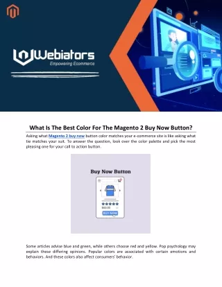
Get your custom Magento 2 buy now button up and running quickly and easily with Webiators! Increase website traffic and sales with our easy to use buy now button.<br>Buy on: https://store.webiators.com/magento-2-extensions/buy-now-button.html<br>

E N D
What Is The Best Color For The Magento 2 Buy Now Button? Asking what Magento 2 buy now button color matches your e-commerce site is like asking what tie matches your suit. To answer the question, look over the color palette and pick the most pleasing one for your call to action button. Some articles advise blue and green, while others choose red and yellow. Pop psychology may explain these differing opinions. Popular colors are associated with certain emotions and behaviors. And these colors also affect consumers' behavior.
Emotional Connectivity With Colors Yellow: Active, optimistic, and youthful. Yellow attracts young customers. Orange: The ultimate attention-getter. It's a forceful "Buy me now!" Pink: Feminine and romantic, pink is thought to appeal to women in marketing. Red: Danger, tension; look before proceeding. We value stop signs, stop lights, and "danger" signs. Green: Money or nature. The viewer's mindset may determine this. Blue: Innocent, peaceful, and safe. Purple is another calming color. Black: Black is strong but subtle. It's stylish. According to the descriptions above, you can justify any color for buy now in Magento 2. As tastes change—or influencer preferences change—the default "best" will alter. If the optimal checkout button color changes over time, fashion determines it. But avoid fashion in this case. Instead of obsessing about color, check your site and ensure your Magento 2 buy now button is big enough and in a good spot. Alternative logos, near the end of the bottom right of an information process flow, or in the center of an uncluttered space are all good places. Examples Of Good Cta Button Color And Placement Amazon The "Add to Cart" button is easily lost among the navigation, search bar, gallery images, related goods, and product details. You glance at the top for the title, then start combing from left to right and top to bottom for each section: product images, price and variations. Then they surprise you by closing the deal: how many do you want, do you want free, two-day shipping (in bold), and then that nice, enticing yellow-orange button. The page has five oranges. They always employ orange in precise, actionable ways. "Don't just stop with this product," advises the small orange blob with the magnifying lens. Shop more. "We have whatever you want." Peer ratings drive customers today. Thus, Google offers a seller rating extension for e-commerce sites. Under the rating, there is a "#1 Best Seller" banner. The "Add to Cart" button, the biggest orange on the page. Orange is their action color, highlighting the product's review rating, best seller status, Amazon Prime promotion, and "Add to Cart" button.
Firefox The button stands out against the page's muted colors. It is centered below the Firefox emblem to the left and the Mozilla name to the right. Navy blue stands out on the page. Its placement makes it hard to ignore. That two-word explanation eliminates any hesitation before clicking. Ajio Ajio's layout is overly busy. Their purchase buttons, on the other hand, have a good amount of screen space just off-center. They also show how much you'll save if you buy now while the products are on sale. They use black color to highlight their Magento 2 buy now button.
Conclusion As you can see, the Magento 2 buy now button needs more than color choices. A successful CTA button depends on page design, positioning, text, and color and how that color contrasts with and ties into other page elements. This blog post cannot tell you what will work best. Testing is essential. Test different product pages with users. Test Google Analytics Solutions, Optimizely, or other services. After collecting data, you can choose the best design. Experiment sometimes. Replace failed experiments with successful ones. You may build very effective calls to action by testing, collecting data, and observing. Take help of Magento 2 buy now button extension to create a lucrative call to action button. Vist more : https://bityl.co/HByV